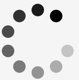
Here is (yet another) WPF circular busy indicator control based on Sacha Barber's Circular Progress Bar. This type of control is useful to indicate that a part of your user interface is waiting for the result of an asynchronous call. The user control is hosts a Canvas in which 9 circles are displayed, with decreasing opacity. A rotation transformation produces the spinning effect. Here's its default look:
The canvas is embedded in a Viewbox for easy resizing. To keep the circles round, the control is kept square (you might want to read this again ;-). This is done by binding its Width to its Height. It's a two-way binding, so you can set either property to set the control's size:
Width="{Binding RelativeSource={RelativeSource Self}, Path=Height, Mode=TwoWay}"
The CPU-consuming rotation is only triggered when the Visibility is set to Visible. The control keeps a low GUI profile: it is by default invisible, its background is transparent, it even has a zero opacity:
Visibility="Hidden"
IsVisibleChanged="HandleVisibleChanged"
Opacity="0"
Background="Transparent"
Here's the code that is executed when the Visibility changes:
/// <summary>
/// Visibility property was changed: start or stop spinning.
/// </summary>
/// <param name="sender">Sender of the event.</param>
/// <param name="e">Event arguments.</param>
private void HandleVisibleChanged(object sender, DependencyPropertyChangedEventArgs e)
{
// Don't give the developer a headache.
if (System.ComponentModel.DesignerProperties.GetIsInDesignMode(this))
{
return;
}
bool isVisible = (bool)e.NewValue;
if (isVisible)
{
this.StartDelay();
}
else
{
this.StopSpinning();
}
}
The Fill property of the ellipses is bound to the control's Foreground property, through a Style. This is very intuitive, and requires no extra dependency properties:
<Style
TargetType="Ellipse">
<Setter Property="Width" Value="20" />
<Setter Property="Height" Value="20" />
<Setter Property="Stretch" Value="Fill" />
<Setter Property="Fill">
<Setter.Value>
<Binding Path="Foreground">
<Binding.RelativeSource>
<RelativeSource
Mode="FindAncestor"
AncestorType="{x:Type local:CircularProgressBar}" />
</Binding.RelativeSource>
</Binding>
</Setter.Value>
</Setter>
</Style>
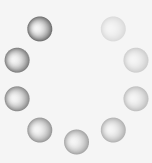
Remember that the Foreground property is more than just a color, it can be any type of Brush. Here are some examples:
|

|
|

|
| SolidBrush |
RadialGradientBrush |
ImageBrush |
To give you control over the spinning speed, I created a dependency property called RotationsPerMinute:
/// <summary>
/// Spinning Speed. Default is 60, that's one rotation per second.
/// </summary>
public static readonly DependencyProperty RotationsPerMinuteProperty =
DependencyProperty.Register(
"RotationsPerMinute",
typeof(double),
typeof(CircularProgressBar),
new PropertyMetadata(60.0));
There is a similar dependency property that allows to to specify the delay before the control becomes visible: StartupDelay. This is actually why I needed to start with a zero Opacity. When the control becomes visible, we wait for a short while before setting its Opacity to 1. This keeps the user interface nice and easy without too briefly flashing indicators. I (re-)used the animation timer to implement the delay. This way we are sure not to freeze the user interface. To show the user that something was started, we show a wait cursor while ... waiting. When the control becomes really visible, we reset the cursor to its original image:
/// <summary>
/// Startup Delay.
/// </summary>
private void StartDelay()
{
this.originalCursor = Mouse.OverrideCursor;
Mouse.OverrideCursor = Cursors.Wait;
// Startup
this.animationTimer.Interval = new TimeSpan(0, 0, 0, 0, this.StartupDelay);
this.animationTimer.Tick += this.StartSpinning;
this.animationTimer.Start();
}
/// <summary>
/// Start Spinning.
/// </summary>
/// <param name="sender">Sender of the event.</param>
/// <param name="e">Event Arguments.</param>
private void StartSpinning(object sender, EventArgs e)
{
this.animationTimer.Stop();
this.animationTimer.Tick -= this.StartSpinning;
// 60 secs per minute, 1000 millisecs per sec, 10 rotations per full circle:
this.animationTimer.Interval = new TimeSpan(0, 0, 0, 0, (int)(6000 / this.RotationsPerMinute));
this.animationTimer.Tick += this.HandleAnimationTick;
this.animationTimer.Start();
this.Opacity = 1;
Mouse.OverrideCursor = originalCursor;
}
Here's how you use the control (all properties have a default value, so it could be shorter):
<local:CircularProgressBar
StartupDelay="500"
Foreground="SteelBlue"
RotationsPerMinute="120"
Width="200" />
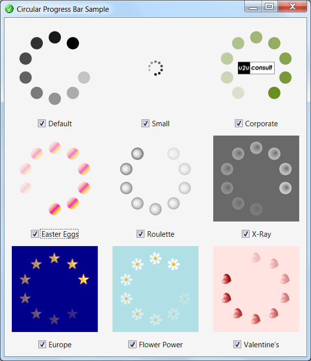
I also built a sample client, so you can experiment with the settings. Here's how it looks like:
Here's the full source code: U2UConsult.CircularProgressBar.Sample.zip (42,66 kb)
Enjoy !