This article describes how you can navigate through large amounts of data in a Metro application, on the Windows 8 Consumer Preview. We'll use a grouped and a non-grouped GridViews, a SemanticZoom, a WrapGrid, and a VariableSizedWrapGrid control. The app was built with the brand new Visual Studio 11 Beta. By the way, here's how that beta looks like:
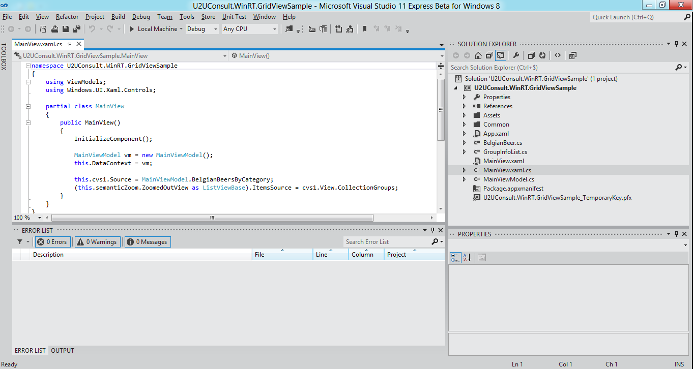
Cool, isn't it ?
The Data
The app will display a small collection of Belgian beers. In real life Belgian beer has a wonderful aroma, an excellent flavor and ditto mouthfeel. In the demo app Belgian beer just has a name, a category, and an image. Here's how the base list is created:
/// <summary>
/// Returns a list of some Belgian beers.
/// </summary>
public static IEnumerable<BelgianBeer> BelgianBeers
{
    get
    {
        List<BelgianBeer> result = new List<BelgianBeer>();

        result.Add(new BelgianBeer() { Name = "Saison 1900", Category = "Belgian Saison", ImagePath = "Assets/Images/1900.jpg" });
        // And we have plenty more of these ...
        result.Add(new BelgianBeer() { Name = "Slaapmutske Tripel", Category = "Belgian Strong Ale", ImagePath = "Assets/Images/Slaapmutske.jpg" });
        result.Add(new BelgianBeer() { Name = "Westmalle Tripel", Category = "Belgian Strong Ale", ImagePath = "Assets/Images/Westmalle.jpg" });

        return result;
    }
}
Here's how this beer collection will be displayed by the app. It will nicely group the individual beers by their category:
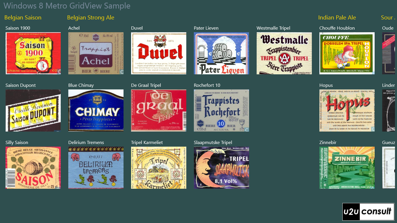
The data will be pulled from a CollectionViewSource that we define in XAML:
<UserControl.Resources>
    <CollectionViewSource x:Name="cvs1"
                          IsSourceGrouped="True" />
</UserControl.Resources>
We're working in grouped mode here, so don't forget to set the IsSourceGrouped property. Since yesterday (the day the Consumer Preview was launched) the collection view source is happy with the result of a grouped LINQ query:
/// <summary>
/// Returns the same list of beers, grouped by category.
/// </summary>
public static IEnumerable<object> BelgianBeersByCategory
{
    get
    {
        var query = from item in BelgianBeers
                    orderby item.Category
                    group item by item.Category into g
                    select g;

        return query;
    }
}
When the main view is created, we populate the collection view source with the result of that LINQ query:
this.cvs1.Source = MainViewModel.BelgianBeersByCategory;
Displaying grouped data in a GridView
The collection view source will be used as items source for a GridView. That GridView will do all the formatting through its many templates:
<GridView ItemsSource="{Binding Source={StaticResource cvs1}}"
          IsSwipeEnabled="True">
    <GridView.ItemTemplate>
        <DataTemplate>
            <!-- Insert Item Data Template Here -->
            <!-- ... -->
        </DataTemplate>
    </GridView.ItemTemplate>
    <GridView.ItemsPanel>
        <ItemsPanelTemplate>
            <!-- Insert Panel Template Here -->
            <!-- ... -->
        </ItemsPanelTemplate>
    </GridView.ItemsPanel>
    <GridView.GroupStyle>
        <GroupStyle>
            <GroupStyle.HeaderTemplate>
                <DataTemplate>
                    <!-- Insert Group Header Template Here -->
                    <!-- ... -->
                </DataTemplate>
            </GroupStyle.HeaderTemplate>
            <GroupStyle.Panel>
                <ItemsPanelTemplate>
                    <!-- Insert Group Panel Template Here -->
                    <!-- ... -->
                </ItemsPanelTemplate>
            </GroupStyle.Panel>
        </GroupStyle>
    </GridView.GroupStyle>
</GridView>
Here's a graphical overview of the templates in a grouped GridView:
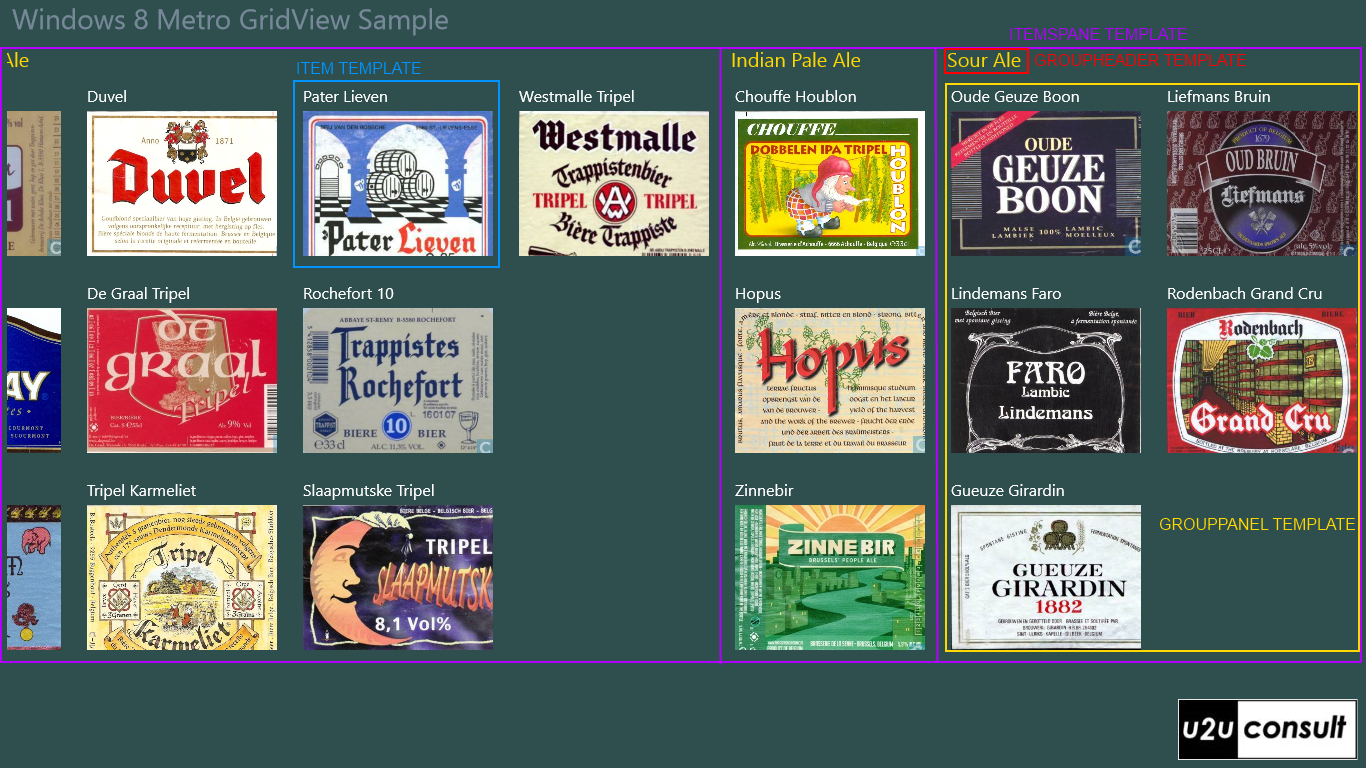
The Item Data Template (blue rectangle) describes how each item (beer) will be represented:
<StackPanel Margin="8">
    <TextBlock Text="{Binding Name}"
               Foreground="White" />
    <Image Source="{Binding Image}"
           Height="145"
           Width="190"
           Stretch="UniformToFill" />
</StackPanel>
The Item Panel Template (purple rectangle) describes how the groups (beer categories) will be arranged. I went for a horizontal stackpanel, so scrolling or swiping sideways will move you through the categories. Read on to discover why this was a bad idea:
<StackPanel Orientation="Horizontal" />
In grouped mode you have to fill the GroupStyle property. The Group Header Template (red rectangle) describes how the group header (beer category header) looks like:
<TextBlock Text="{Binding Key}" Foreground="Gold" />
The Group Panel Template (yellow rectangle) describes the arrangement of items (beers) in each group (beer category). In our app, the items are displayed in a VariableSizedWrapGrid. That's an advanced version of the old WrapPanel: elements are positioned in sequential order and go to the next row or column if there isn’t enough room. This control allows me to display some of the beers in a different size, by binding to the RowSpan and ColumnSpan properties. I'm not going to use these, so the panel will behave like just an ordinary WrapPanel:
<VariableSizedWrapGrid Orientation="Vertical" />
Semantic Zoom
We're merely displaying 21 beers here. What happens if you have a very large dataset ? Some of the local shops here have 300, 500 or even over 800 Belgian beers  ! You will get very thirsty when scrolling to the last category...
Well, I have good news for you: there's a new control that allows you to jump easily into a specific group (beer category) in the data. It's called the SemanticZoom, the control that was formerly known as JumpViewer. This control allows you configure and combine two GridViews or anything else that implements the ISemanticZoomInformation interface: a details view -ZoomedInView- and a summary view -ZoomedOutView-. You can easily navigate between these two. The SemanticZoom is highly customizable, as you can see in the Guidelines for Semantic Zoom.
In our app, we're using the beer label GridView as details view. The summary view looks like this:
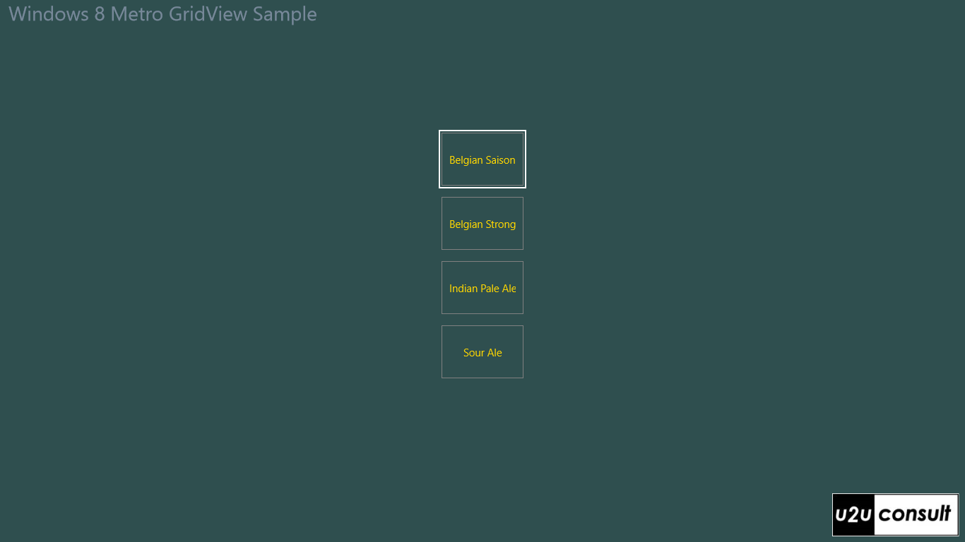
The summary view is also a GridView, but it's populated directly with the list of beer categories. Its item template is just a TextBlock:
<TextBlock Text="{Binding Group.Key}" Foreground="Gold" />
The items are arranged in a regular WrapGrid:
<WrapGrid MaximumRowsOrColumns="4" HorizontalAlignment="Center" VerticalAlignment="Center" />
You call the summary view via a pinch gesture in the details view. In the summary view, tapping on a category brings you directly to the corresponding group in the detailed view. At least, that's were you should return to. In the Developer Preview this code worked fine, but the Consumer Preview seems to always navigate to the first group. Anyway, the issue was reported...
... and solved. Apparently the item panel template (purple rectangle) has to be a WrapGrid:
<WrapGrid Orientation="Vertical" MaximumRowsOrColumns="1" />
Here's an overview of the semantic zoom structure:
<SemanticZoom x:Name="semanticZoom">
    <!-- Details View -->
    <SemanticZoom.ZoomedInView>
        <GridView ItemsSource="{Binding Source={StaticResource cvs1}}"
                  IsSwipeEnabled="True">
            <!-- Configure Details View Here -->
            <!-- ... -->
        </GridView>
    </SemanticZoom.ZoomedInView>
    <!-- Summary View -->
    <SemanticZoom.ZoomedOutView>
        <GridView>
            <!-- Configure Summary View Here -->
            <!-- ... -->
        </GridView>
    </SemanticZoom.ZoomedOutView>
</SemanticZoom>
Both GridViews use the same data, but you have to glue them together programmatically:
(this.semanticZoom.ZoomedOutView as ListViewBase).ItemsSource = cvs1.View.CollectionGroups;
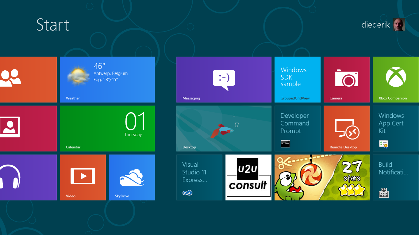
Here's the app's tile after deployment, next to the highly addictive Metro version of Cut the Rope (that's an old screenshot by the way: I cut many more ropes since then). It's another VariableSizedWrapGrid in action:
Source Code
Here's the source code, it was written with VS11 beta for the Windows 8 Consumer Preview: U2UConsult.WinRT.GridViewSample.zip (2,72 mb)
Enjoy ... and Cheers !