This article covers two solutions for working with conditional XAML in a Universal Windows app. I created a sample app that illustrates the capabilities. It’s a standard Hub based universal app with a shared project, a Windows app project, and a Windows Phone project. Each platform has its own title, background image, and logo on the first HubSection, while the ToggleSwitch in the second HubSection modifies the visual XAML tree. However, the platform specific projects do not contain any XAML and the solution code does not contain any C# value converters. All is done through conditional XAML in the shared project. Here’s how the app looks like:
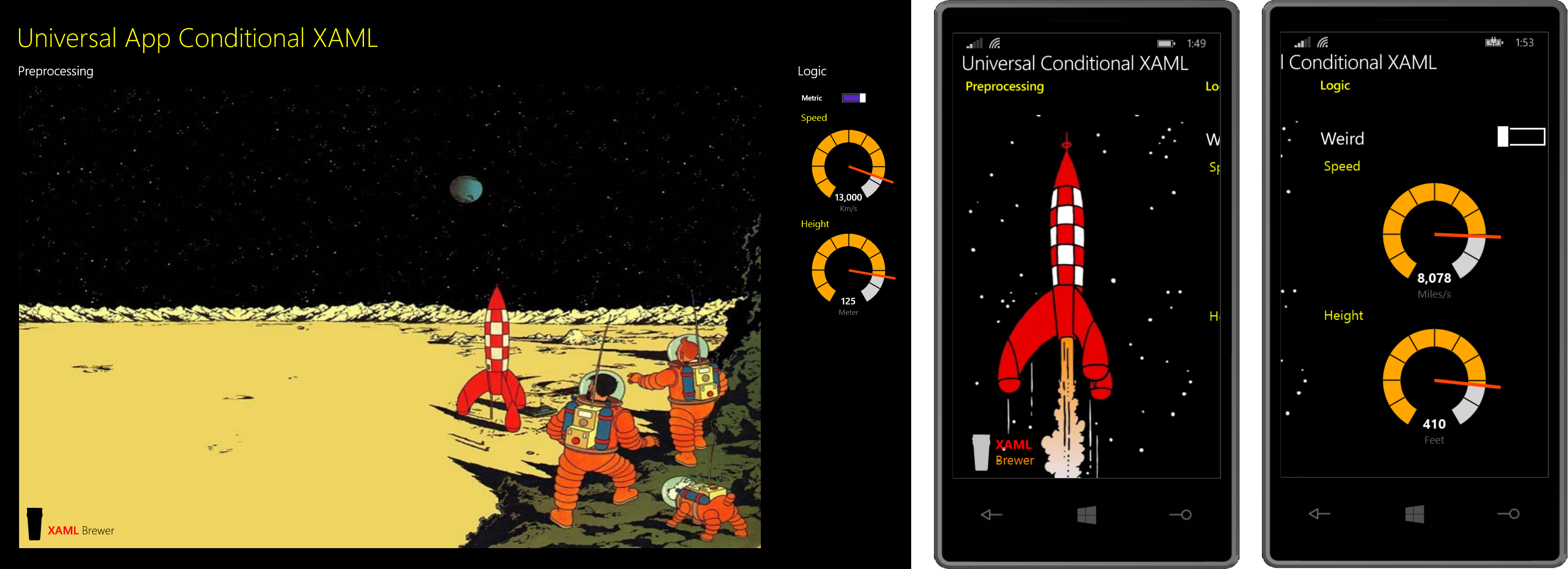
Conditional XAML Preprocessing
The XAML Conditional Compilation (XCC) project by Koen Zwikstra defines a set of custom XAML namespaces. These namespaces allow you to mimic the behavior of the standard symbols for the C# preprocessor #if directive, such as DEBUG, RELEASE, WINDOWS_APP, and WINDOWS_PHONE_APP. The project comes with an extra MSBuild task that does the heavy lifting - you find more details on the concept here.
XCC is extremely useful when you want to share XAML files between the Windows and the Phone projects in a universal app solution. You can drop the XAML in the shared project of a universal app solution, and decorate the platform specific elements with the win81 or wp81 namespaces.
Just add the XCC Nuget package to the solution, and you’re ready to go:
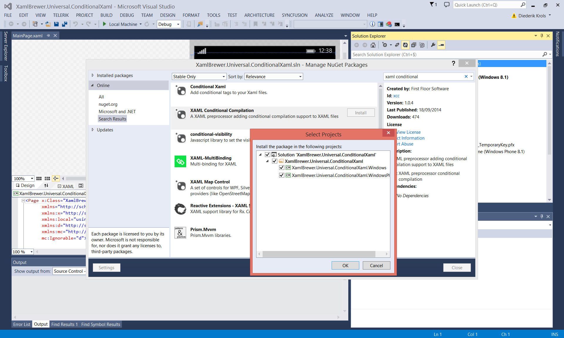
You should add these declaration at the top of the page (mind: the order matters):
<Page x:Class="XamlBrewer.Universal.ConditionalXaml.MainPage"
      ...
      xmlns:win81="condition:WINDOWS_APP"
      xmlns:wp81="condition:WINDOWS_PHONE_APP"
      mc:Ignorable="d win81 wp81"
      ...
      mc:ProcessContent="win81:* wp81:*">
Here’s a first example of XCC. Depending on the platform, we go for a different background picture (a portrait or a landscape one). While the assets themselves are in the platform specific project, the XAML is in the shared project:
<!-- Win Background -->
<win81:Image Source="Assets/tintin_horizontal.jpg"
             Grid.RowSpan="2"
             Stretch="UniformToFill"
             VerticalAlignment="Bottom"
             HorizontalAlignment="Right" />
<!-- Phone Background -->
<wp81:Image Source="Assets/tintin_vertical.jpg"
            Grid.RowSpan="2"
            Stretch="UniformToFill"
            VerticalAlignment="Bottom"
            HorizontalAlignment="Right" />
The namespace prefixes can not only be applied to main UI elements, but also to child elements and attributes. In the following example we adapt the looks of a TextBlock to the platform. It’s a part of the XAML Brewer logo, which –as you see in the screenshots- looks different on the tablet and the phone. However both looks come from the same XAML:
<Run Text="XAML" />
<wp81:LineBreak />
<Run Text="Brewer"
     Foreground="Silver"
     win81:Foreground="Black"
     wp81:Foreground="DarkOrange"
     FontWeight="Light" />
Visual Studio’s designer ignores the wp81 and win81 prefixes. But you can still use non-prefixed properties. They will be overridden on compilation. Here's a screenshot of the designer in action:
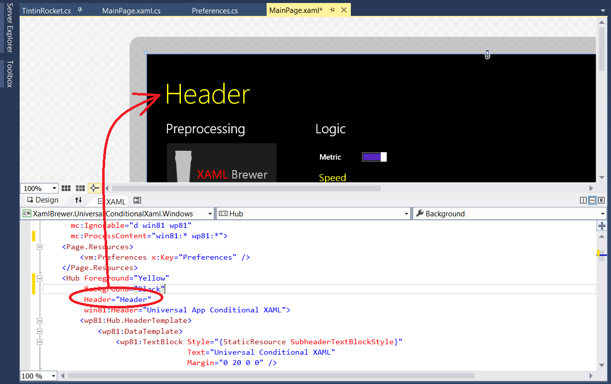
Here’s the full XAML for that Hub header. It contains a text for the Visual Studio designer, a text for the Windows app, and a complete data template for Windows Phone:
<Hub Foreground="Yellow"
     Header="Header"
     win81:Header="Universal App Conditional XAML">
     <wp81:Hub.HeaderTemplate>
        <wp81:DataTemplate>
            <wp81:TextBlock Style="{StaticResource SubheaderTextBlockStyle}"
                            Text="Universal Conditional XAML"
                            Margin="0 20 0 0" />
        </wp81:DataTemplate>
     </wp81:Hub.HeaderTemplate>
     ...
</Hub>
Pretty powerful stuff, right?
If–Then–Else as XAML syntax
The second project is Conditional XAML by Samuel Blanchard. It adds if-then-else syntax to your XAML. This one is also available as a Nuget package:
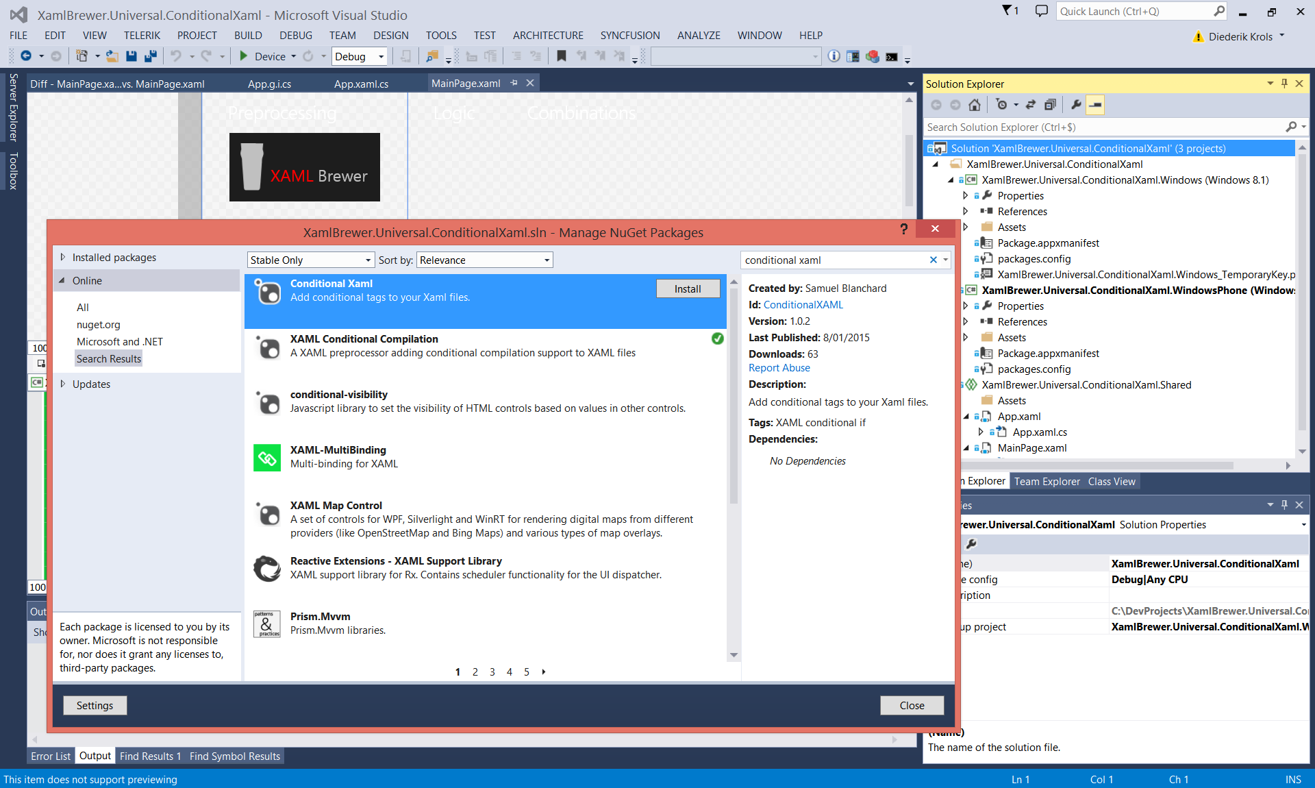
Again, start with declaring the namespace on top of the page or control:
<Page x:Class="XamlBrewer.Universal.ConditionalXaml.MainPage"
      ...
      xmlns:cond="using:SamuelBlanchard.Controls.Statements"
      ...>
Now you’re able to use if-then-else in XAML. Here’s how to show a specific control based on the value of a ToggleSwitch. That ToggleSwitch is called SettingsSwitch and it is two-way bound to Preferences.IsMetric in the viewmodel. The data binding is only there because I wanted to test this project in a more or less representative environment (i.e. using MVVM). Both the BooleanConditions in the next code snippet will do the trick:
<cond:Statement>
    <cond:If>
        <!-- Bind to UI Element -->
        <!--<cond:BooleanCondition Value1="{Binding ElementName=SettingsSwitch, Path=IsOn}"
                                   Operator="Equal"
                                   Value2="True" />-->
        <!-- Bind to viewmodel -->
        <cond:BooleanCondition Value1="{Binding Source={StaticResource Preferences}, Path=IsMetric}"
                               Operator="Equal"
                               Value2="True" />
        <cond:If.Then>
            <toolkit:Gauge Unit="Km/s"
                           Value="{Binding Speed}"
                           Maximum="15000"
                           wp81:Height="200" />
        </cond:If.Then>
        <cond:If.Else>
            <toolkit:Gauge Unit="Miles/s"
                           Value="{Binding SpeedInMiles}"
                           Maximum="10000"
                           wp81:Height="200" />
        </cond:If.Else>
    </cond:If>
</cond:Statement>
Here’s how the app looks like when ‘Metric’ is selected (the above code snippet refers to the top Gauge):
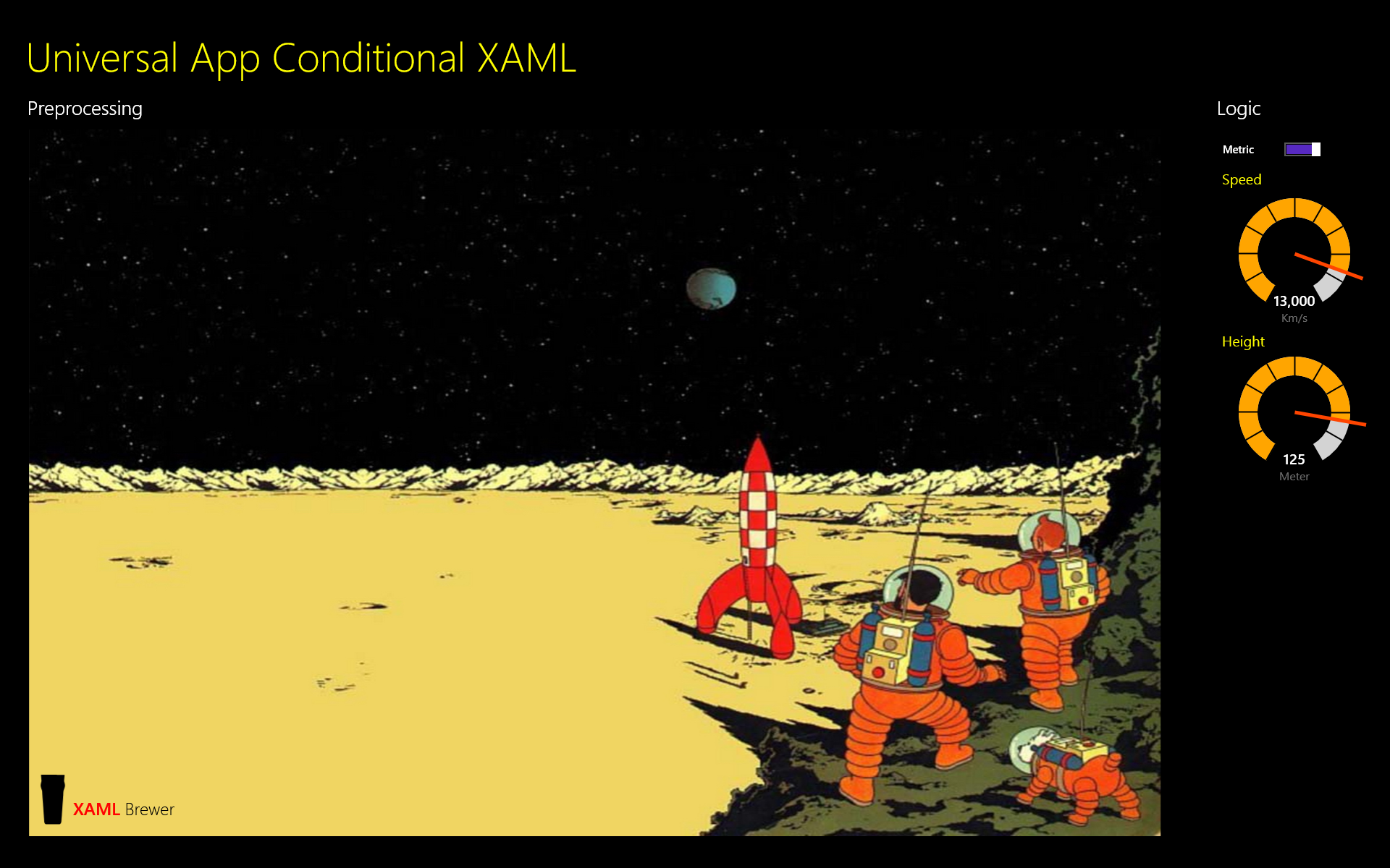
And here’s the non-metric option. Please mind that these are actually two different gauges:

The package contains more conditions than just BooleanCondition. Here’s an overview:
- BooleanCondition
- DoubleCondition
- StringCondition
- DateTimeCondition
- DateTimeOffsetCondition
- TimeSpanCondition
- ScreenOrientationCondition
- IsDesignTimeCondition
If you add multiple conditions inside an If statement, then all of them should evaluate to true before the Then takes place. So the And is implemented. On top of that, there is explicit syntax support for the Or, Xor and Not Boolean operators. You find a lot more samples here.
I guess these could replace a lot of value converters and visual state managers.
Unfortunately the Statement element can not be used inside other controls, so you can not use apply it to attributes. I tried to simulate this, however. You can give a Statement a name, and refer to the result in an element binding. In the next code snippet I defined three reusable conditions (cool!), and use these to slightly change the look and feel of a single control:
<!-- Conditional Properties -->
<cond:Statement x:Name="HeightUnit"
                Visibility="Collapsed">
    <cond:If Then="Meter"
                Else="Feet">
        <cond:BooleanCondition Value1="{Binding Source={StaticResource Preferences}, Path=IsMetric}"
                                Operator="Equal"
                                Value2="True" />
        <!--<cond:BooleanCondition Value1="{Binding ElementName=SettingsSwitch, Path=IsOn}"
                                Operator="Equal"
                                Value2="True" />-->
    </cond:If>
</cond:Statement>
<cond:Statement x:Name="MaxHeight"
                Visibility="Collapsed">
    <cond:If Then="150"
                Else="500">
        <cond:BooleanCondition Value1="{Binding Source={StaticResource Preferences}, Path=IsMetric}"
                                Operator="Equal"
                                Value2="True" />
        <!--<cond:BooleanCondition Value1="{Binding ElementName=SettingsSwitch, Path=IsOn}"
                                Operator="Equal"
                                Value2="True" />-->
    </cond:If>
</cond:Statement>
<cond:Statement x:Name="HeightValue"
                Visibility="Collapsed">
    <cond:If Then="{Binding Height}"
                Else="{Binding HeightInFeet}">
        <cond:BooleanCondition Value1="{Binding Source={StaticResource Preferences}, Path=IsMetric}"
                                Operator="Equal"
                                Value2="True" />
        <!--<cond:BooleanCondition Value1="{Binding ElementName=SettingsSwitch, Path=IsOn}"
                                Operator="Equal"
                                Value2="True" />-->
    </cond:If>
</cond:Statement>
<toolkit:Gauge Unit="{Binding ElementName=HeightUnit, Path=Content}"
                Maximum="{Binding ElementName=MaxHeight, Path=Content}"
                Value="{Binding ElementName=HeightValue, Path=Content}"
                TickBrush="Transparent"
                ScaleTickBrush="Black"
                ValueBrush="White"
                wp81:Height="200"
                VerticalAlignment="Center" />
This works ... almost. The bindings in the Gauge control are only triggered when the switch is toggled. So here’s how the app looks like on startup. Observe the lack of initialization in the bottom Gauge:
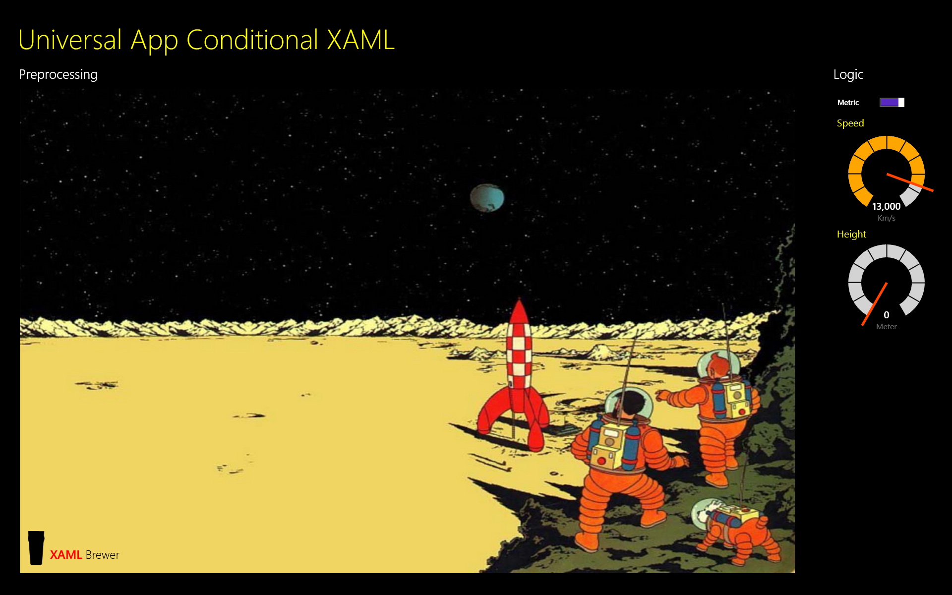
Here are some attempts to solve this issue. I tried refreshing the data context and trigger property change notifications, all in vain. The Gauge is only properly initialized when the main property to which everything is bound (Preferences.IsMetric) is really changed:
public MainPage()
{
    this.InitializeComponent();

    this.GaugeSection.Loaded += this.GaugeSection_Loaded;
}

/// <summary>
/// Too early.
/// </summary>
// protected override void OnApplyTemplate()
// {
//     base.OnApplyTemplate();
//     this.GaugeSection_Loaded(this, null);
// }

private void GaugeSection_Loaded(object sender, RoutedEventArgs e)
{
    // Reset data context. Not good enough.
    // var context = this.GaugeSection.DataContext;
    // this.GaugeSection.DataContext = null;
    // this.GaugeSection.DataContext = context;

    // Too early.
    // var rocket = this.GaugeSection.DataContext as TintinRocket;
    // rocket.Height = 130;

    // Trigger change notification to activate the conditional bindings.
    var preferences = this.Resources["Preferences"] as Preferences;

    // This is not enough.
    // preferences.Refresh();

    // It looks like you really have to change bound properties.
    preferences.IsMetric = !preferences.IsMetric;
}
I’m not sure if this behavior is a bug, or if I’m doing something wrong. Anyway this conditional XAML project still remains valuable. It’s a ‘young’ Nuget package that is regularly updated, so I suggest to keep an eye on it…
More screenshots
All screenshots in the article came from the Windows app. Here’s how the phone version looks like:
Conclusions
The conclusions are simple:
- When you’re building a Universal Windows app for both platforms, then XAML Conditional Compilation is mandatory.
- When you’re building a Universal Windows app and are drowning in value converters, visual state managers, and custom controls to tweak the visual tree, then you must consider Conditional XAML.
There seems to be a way to achieve 'one XAML to rule them all' ...
Source Code
The source code of the sample app is right here on GitHub.
Enjoy!
XAML Brewer