In the first part of this blog post we used Power Query to create the following Data Model in Excel. As you can see the relationship between the 2 tables is still missing and we would also like to define a Hierarchy in QueryFromContact. And although we could have done this in Power Query itself we would like to give our tables and columns more meaningful names. If you later want to publish this model to Power Q&A you also should define synonyms for your columns and tables but this is something that cannot be done if you have a regular version of Excel installed. Only the Excel versions that comes with Office 365 Professional Plus or the Click-to-Run version of Office 2013 Professional Plus have this capability.
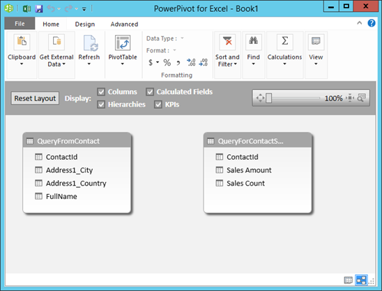
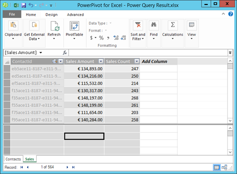
Let's first clean up the QueryForContactSales table by renaming it to Sales. The ContactId field we would like to hide from the End User in the client tools. You can do this by right-clicking on it and selecting Hide from Client Tools.
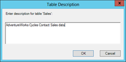
Next we can right-click on the Sales table tab and give this table a decent description. This can also be done for each column you have in your table.
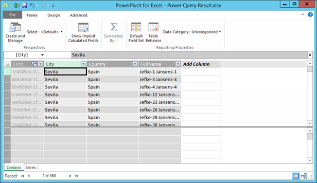
Let's rename the QueryForContacts table to Contacts. And rename Address1_City and Address1_Country to City and Country. If you have a version of Excel you also might want to define synonyms for your columns. Again hide ContactId from the client tools. The table now looks as follows.
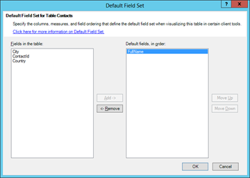
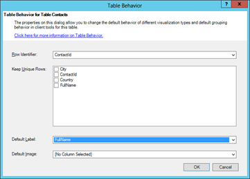
Next we will make FullName the only default field and set ContactId as the row identifier. You can find these options when you press either the Default Field Set or Table Behavior button in the ribbon.
When the City column is selected Power Pivot does not yet know that it actually contains city names. You can see this in the screenshot that shows the Contacts table in the Data Category setting. When the Data Category is explicitly set to city Power Pivot knows that this field contains city information. This is important when we later want to create Power View Reports. We also need to verify that the Data Category for the Country column is set to Country (or Country/Region).
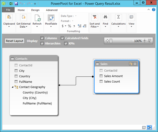
Now that we have cleaned up our two tables let's define the relationship between them and the hierarchy in Contacts. For this we which to the Diagram View. We drag ContactId from the Sales table to the Contacts table to define the relationship. Next we can right-click on the Contacts table to add the hierarchy. We name is Contact Geography. This hierarchy has the levels Country->City->FullName. Depending on which tools we want to support for end-user reporting we could hide the individual fields from the client tools like we did with ContactId. But if you want to use i.e. Power Map you have to leave the fields as is because Power Map does (currently?) not support hierarchies.
The final result looks as follows
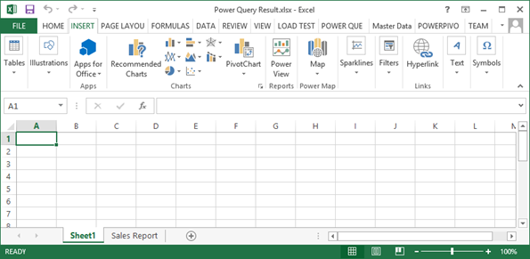
Let's now turn back to Excel and add Power View Report to the workbook. A Power View report is created in the Excel Workbook by clicking the Power View button in the Insert ribbon tab.
Once Power View opens you will see the Power View report designer with the Power View Field List on the right. First we drag the Contact Geography hierarchy in the field list. Next we can add our 2 measures from the Sales table. We do not want to go to the sale of each customer however so FullName can be removed from the field list.
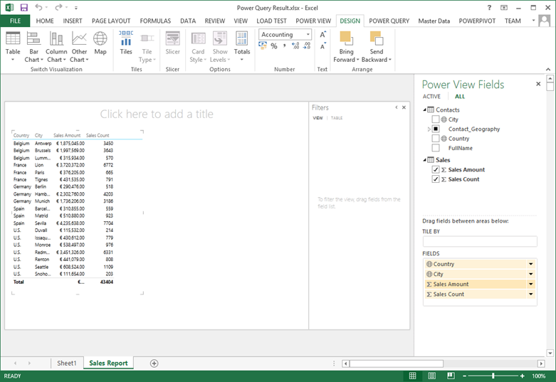
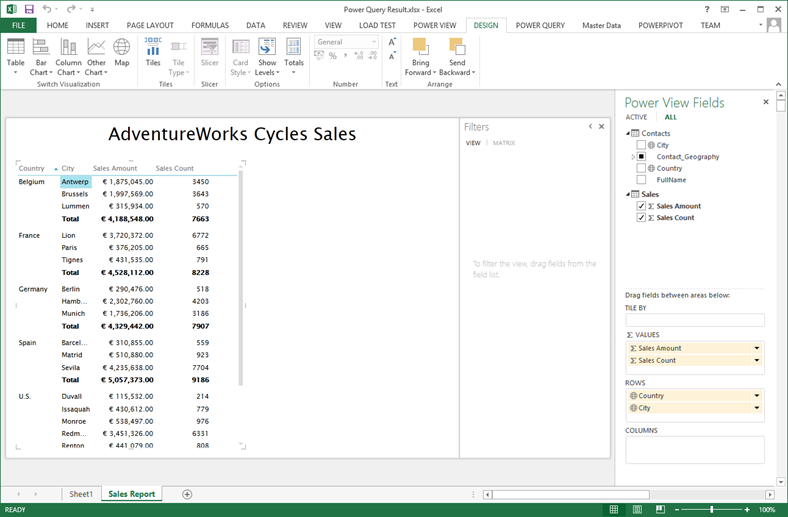
Each report you create in Power View initially starts as a table. Tables do not support hierarchies however. Only matrices do. We can switch to a matrix report by pressing the table button in the ribbon and selecting Matrix. In the Options section of the ribbon we could then use do enable Drill-Down/Drill up (via the Show Levels button) and show or hide the (sub) totals (via the Totals button).
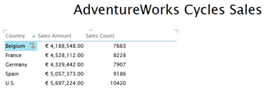
In the image below we drilled into the country of Belgium and the totals where hidden. The up arrow can be used to go back to the Country level.
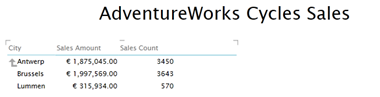
Drill up to country.
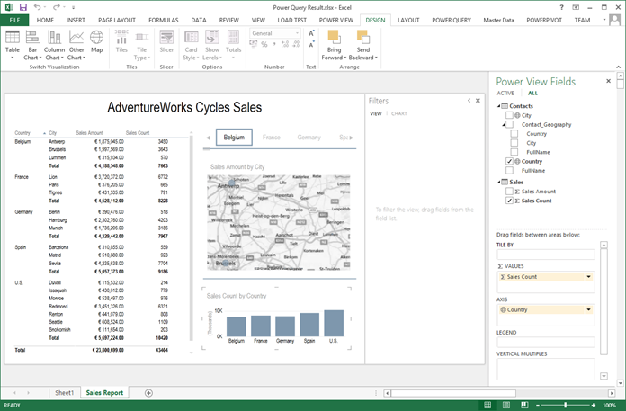
Although it's a little bit small we could add a Map to the left displaying the cities as Locations and Sales Amount in the Size field. The Map itself is tiled by the Country field. In the screenshot below a Column chart was added on the Country and Sales Count. Note that this chart also becomes a slicer for the 2 other report items. If you were to click on the bar for U.S. the Matrix and Map would only show U.S. data.
Our Excel workbook is finished and we will save it on the desktop of our local computer. If you have a on premise SharePoint 2013 environment this document could be uploaded to a Power Pivot Gallery.
In the third and final part of this blog post we will upload the Excel workbook to a Power BI site in Office 365.