The last version of SPFX, the SharePoint Framework, comes with a new extension: the Adaptive Card Extension. This allows you to create a webpart-like thing to use in Microsoft Viva. The extension allows you to create a Viva Connections Card, that can be added on a Viva Connections Dashboard.
The naming might be a bit confusing, because you are making a Viva Connections Card, and when developing it, you use an adaptive card (more here). The names of the generating classes also makes it somewhat confusing. You get a CardView.ts file, and a QuickView.ts file. The name of the Cardview class refers to the Viva card, but it does not use any adaptive card. It just allows you to mainly show some textfields. One of the things you can have on the cardview is a button. When clicking on the button you can show the quickview, and that one is using the adaptive card which can be found in QuickViewTemplate.json.
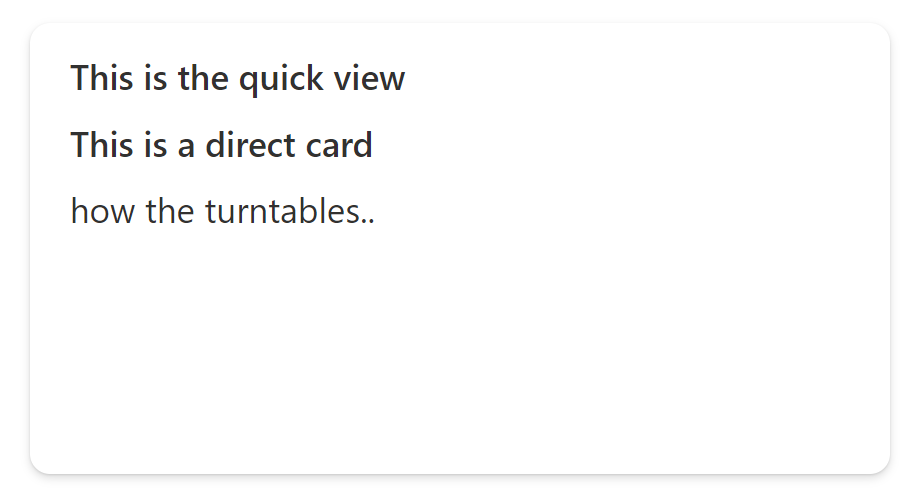
To be honest, I was a bit dissapointed. Why can't I just use an adaptive card directly instead of first showing something overly simple, and then having the adaptive card after clicking a button ? No problem, you can have that in a pretty easy way. You just have to tweak the CardView class a bit. Start by adding a getter for the template property. You can simply copy it from the QuickView class.
public get template(): ISPFxAdaptiveCard {
  return require('../quickView/template/QuickViewTemplate.json');
}
The data property of your Cardview normally returns the text to show on your Viva card. This should now return the properties you use in your adaptive card, where you refer to them with e.g. "${title}". This could cause a little problem because of the return type IBasicCardParameters, but it works nicely if you return any. So we get this:
public get data(): any {
  return {
    subTitle: 'This is the adaptive card',
    title: 'make it so !',
    description: 'how the turntables..'
  };
}
I also got rid of the buttons by simply returning undefined.
public get cardButtons(): [ICardButton] | [ICardButton, ICardButton] | undefined {
  return undefined;
}
And there you go, you can directly use a card for your card.