This article presents a FlipView context indicator control for Windows 8 UI Style apps. FlipView is a Windows 8 items control that displays one item at a time. It allows traversing its collection of items through a horizontal flick gesture. There are some limitations in its usage. In an app, the maximum size of a flipview is the size of the page. If you make the FlipView wider than its container, you're just going to confuse your user (and probably also the runtime): does a horizontal flick triggers scrolling, or are we moving to the next (or previous) page ? This is one of the reasons why I personally prefer the single page GridView style over a FlipView. If you decide to stick to the FlipView, you're not only limited in the size of the data template. You'll also bump into another problem: how are you going to make it clear to your user that he can navigate to other items ? Well, the Guidelines for FlipView Controls prescribe the usage of a context indicator, but they don't specify how it should look like.
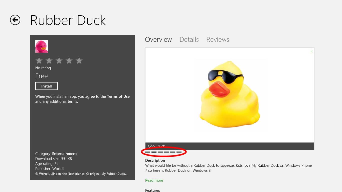
The official FlipView Control Sample only has a HTML/JS version. There used to be XAML/C# sample for the Release Preview -my control templates are based on it. But that sample app seems to have been lost in RTM translation. So the best functional example of a FlipView Context Indicator can be found in the store:
Here's how I built my control. Its design is very simple and so is the implementation. [Warning:spoiler in next statement] It is just a templated ListBox that is bound to the ItemsSource and SelectedItem of its associated FlipView.
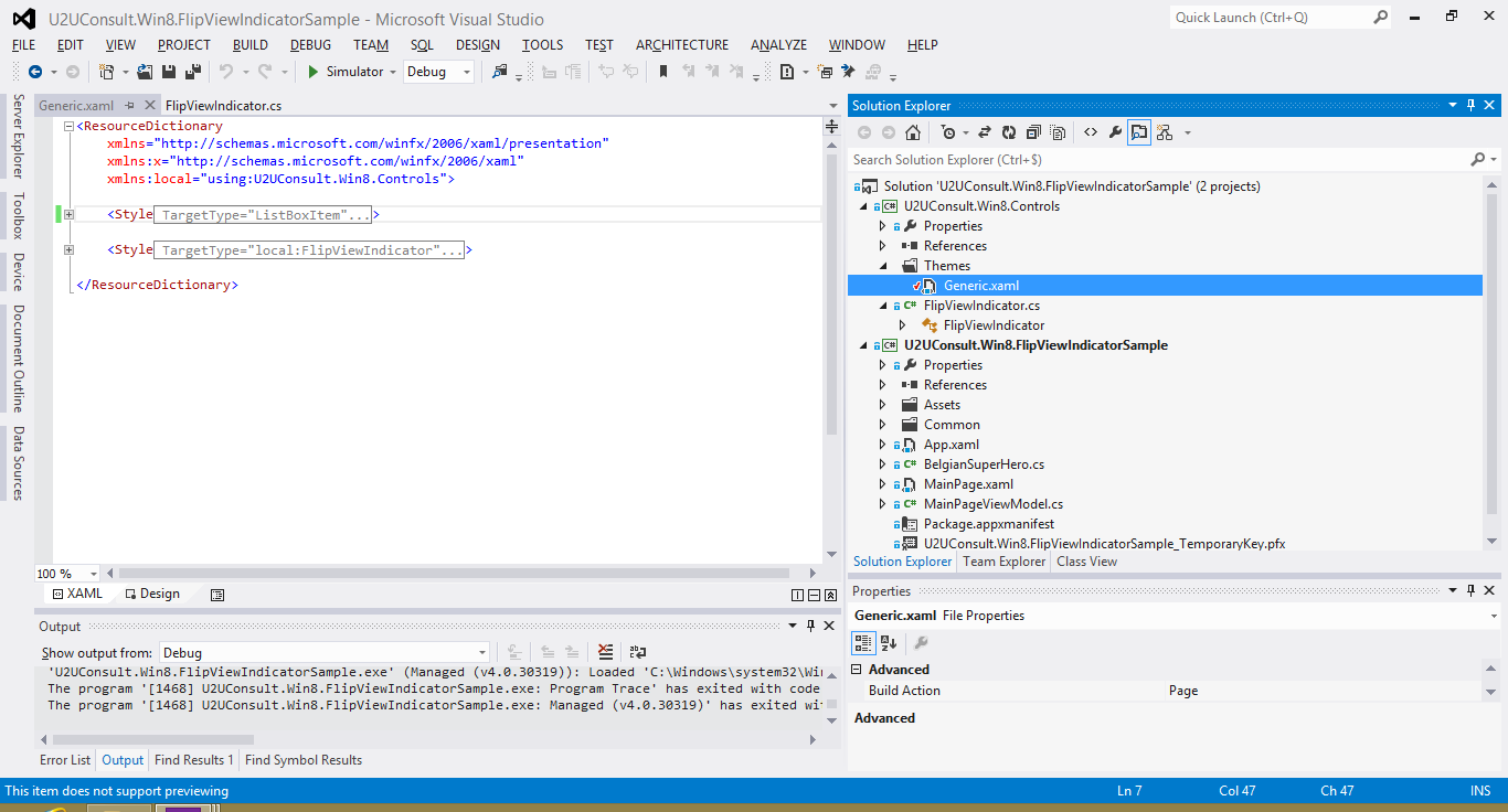
In Visual Studio, I created a new project of the type 'Windows Store Apps Class Library' and added a new 'Templated Control'. I made that control inherit from ListBox. In the Generic.xaml resource dictionary, I added the two styles from the (now disappeared) FlipView Control Sample: a style for the ListBox itself (just a rectangle), and a style for the ListBoxItem (another rectangle). That's a lot of XAML to just define two rectangles.
I gave the control a dependency property -called FlipView- of the type ... FlipView:
public static readonly DependencyProperty FlipviewProperty =
    DependencyProperty.Register("Flipview", typeof(FlipView), typeof(FlipViewIndicator), new PropertyMetadata(null, FlipView_Changed));

        public FlipView Flipview
{
    get { return (FlipView)GetValue(FlipviewProperty); }
    set { SetValue(FlipviewProperty, value); }
}
When the property is assigned or changed -e.g. through XAML- I set the ItemsSource of the context indicator to the ItemsSource of the FlipView. I also create a two-way binding to the SelectedItem.
private static void FlipView_Changed(DependencyObject d, DependencyPropertyChangedEventArgs e)
{
    FlipViewIndicator that = d as FlipViewIndicator;
    FlipView flip = (e.NewValue as FlipView);
    that.ItemsSource = flip.ItemsSource;
    Binding binding = new Binding();
    binding.Mode = BindingMode.TwoWay;
    binding.Source = flip;
    binding.Path = new PropertyPath("SelectedItem");
    that.SetBinding(FlipViewIndicator.SelectedItemProperty, binding);
}
This way, the context indicator can be used to navigate through the items collection - just by tapping one of the small rectangles. That's why I made these rectangles wider than the ones in the Store. Here's how it looks like in the attached sample app. For the record: the flipview context indicator is the small bar in the lower left corner:
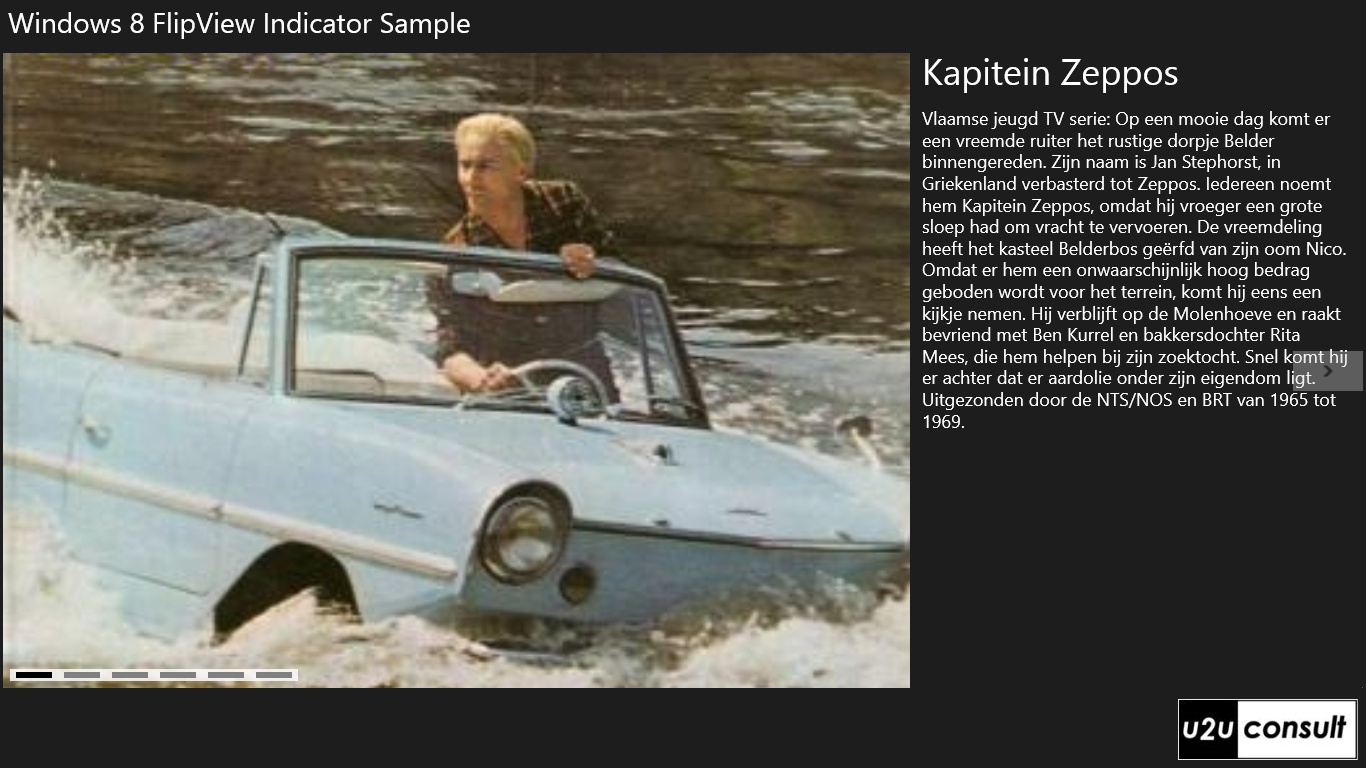
This app is just a FlipView and Context Indicator on a list of Belgian Super Heroes. The description is in Dutch, which may look weird if you don't know the language. But I assure you: if you translate them in English, they will still look weird. The bottom line is that Belgian Super Heroes evolved from men in mini skirts in the 1970s, to men in fluorescent leather catsuits in the 2010s:
O, I almost forgot: here's how to add the control on a page, and link it to a FlipView:
<FlipView x:Name="heroFlipView"
               ItemsSource="{Binding Heroes}">
               ...
</FlipView>
<controls:FlipViewIndicator Flipview="{Binding ElementName=heroFlipView}"
                                        VerticalAlignment="Bottom"
                                        HorizontalAlignment="Left"
                                        Margin="8" />
That's all there is.
Here's the code of the control and sample app. It was written in Visual Studio 2012 Ultimate, for the Windows 8 RTM: U2UConsult.Win8.FlipViewIndicatorSample.zip (587.48 kb)
Update: This is the very first version of the FlipViewIndicator. A newer version of this control is embedded in Tim Heuer's Callisto framework, were it will continue its life cycle.
Enjoy!