This article describes a way to enhance the user friendliness of a standard slider control in a Windows 8 Store App.
Problem
In a touch oriented application, we often allow -or force- the user to set the value for an integer or an enumeration through a slider control. In most cases this is more comfortable and less error prone than working with the soft keyboard. Unfortunately it’s not always ideal: if the range of values becomes too huge, or the slider becomes too narrow (e.g. when in portrait or snapped mode), then it becomes too difficult for the user to position the slider at the correct value. In this scenario, a textbox is a much more appropriate input control. This article proposes a UX design –and implementation- that offers the best of both worlds, and lets the end user decide on it.
Proposed solution
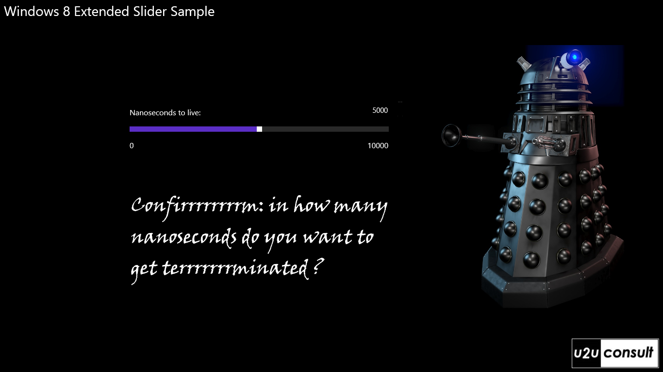
A slider control never walks alone: it’s always surrounded by controls that display its topic, its minimum and maximum values, and its current value, like this:

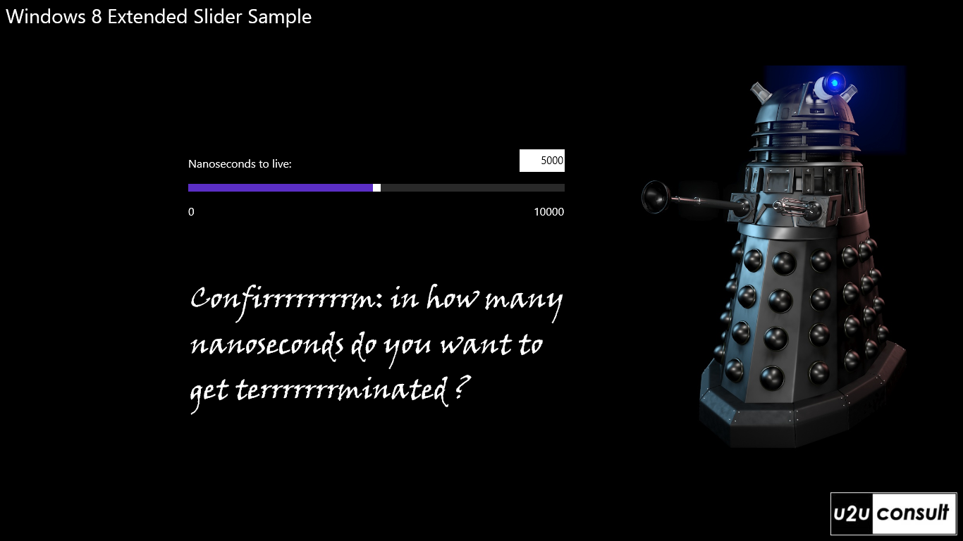
So there’s always a label that displays the current value. Wouldn’t it be nice to replace that simply it by a textbox? This gives the end user direct access to the desired value:

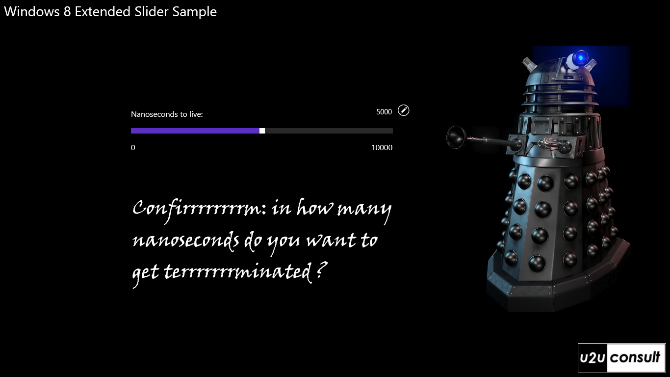
Now this may look confusing, so by default we allow only input through the slider and display the current value as a label. Next to the label, we add a small button to activate the ‘direct input mode’, like this:

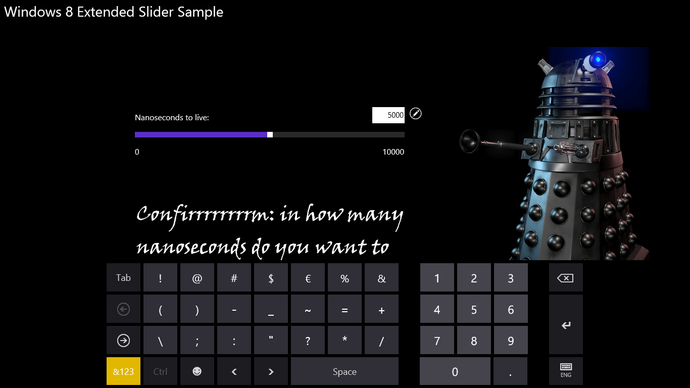
When pressed, the button activates the direct input mode. The label transforms into a textbox, and if there's no keyboard attached, we pop up the soft keyboard (preferably a numeric one):

When the user leaves the textbox by tapping somewhere else on the screen, the slider is updated - after validation of the input. This article ignores the validation part.
Implementation
Here's how the sample solution was implemented. I didn’t want to bring too much extra controls in the equation, so the current value is *always* displayed in the same textbox. In ‘slider input’ mode this textbox is simply disabled. It’s the style that makes it look like a textblock – default theme foreground, no border. Here's the relevant modification to the standard style:
<VisualState x:Name="Disabled">
    <Storyboard>
        <!-- ... -->
        <ObjectAnimationUsingKeyFrames Storyboard.TargetProperty="Foreground" Storyboard.TargetName="ContentElement">
            <DiscreteObjectKeyFrame KeyTime="0" Value="{StaticResource ApplicationForegroundThemeBrush }" />
        </ObjectAnimationUsingKeyFrames>
        <ObjectAnimationUsingKeyFrames Storyboard.TargetProperty="BorderThickness" Storyboard.TargetName="BorderElement">
            <DiscreteObjectKeyFrame KeyTime="0" Value="0" />
        </ObjectAnimationUsingKeyFrames>
    </Storyboard>
</VisualState>
The look-and-feel of the small button is also defined by a style, a copy of the standard AppBarButtonStyle - just a bit smaller, and without a label. All styles are stored in a resource dictionary customstyles.xaml.
The textbox’s text is bound to the sliders value. It also favors the numeric keyboard:
<TextBox x:Name="TheTextBox"
              Text="{Binding Value, Mode=TwoWay, ElementName=TheSlider}"
              InputScope="Number"
              IsEnabled="False"
              LostFocus="TheTextBox_LostFocus"
              KeyUp="TheTextBox_KeyUp"
              TextAlignment="Right"
              Style="{StaticResource LabelTextBoxStyle}" />
The button’s only job is to enable the textbox and give focus to it. In most cases -I've noticed some buggy behavior here- that will pop up the numeric soft keyboard immediately:
private void SliderButton_Click(object sender, RoutedEventArgs e)
{
    this.TheTextBox.IsEnabled = true;
    this.TheTextBox.Focus(FocusState.Programmatic);
}
The textbox updates the current value when it loses focus, by updating the binding. We don't have to write code for that: it's the default behavior in Modern UI. However we still need to disable the textbox:
private void TheTextBox_LostFocus(object sender, RoutedEventArgs e)
{
    this.TheTextBox.IsEnabled = false;
}
Although it’s not a Modern UI standard, I still expect the value to be committed by pressing the Enter key, so here’s the routine to do that. Remember, it’s optional:
private void TheTextBox_KeyUp(object sender, KeyRoutedEventArgs e)
{
    if (e.Key == Windows.System.VirtualKey.Enter)
    {
        this.TheTextBox.IsEnabled = false;
    }
}
I was also thinking of implementing some undo logic behind the Escape key, but then discovered that there is no Escape key on the soft keyboard.
Sample
Here’s the source code of the sample project. It was built with the free Visual Studio 2012 Express Edition: U2UConsult.Win8.ExtendedSliderSample.zip (205.01 kb)
Enjoy!