This article explains how to style a WPF ListBox. I know: there must be a million articles about this subject. So if you're looking for kaleidoscopic brushes, dazzling effects, and animations from outer space, then feel free to press the Back button in your browser to return to your search engine page, and click the next hit. If however you're interested in some details on how to put the cherry on the templated ListBox cake, then please continue reading.
Styling the content
The first step in styling any list control is creating a data template for the list items. So let's get it over with.
A simple data template
The list control will be populated with objects with properties (obviously, because there's nothing else in .NET ;-). The following data template displays the name property of its source. The DataType property in the XAML is mandatory and then ignored.
<DataTemplate
x:Key="RockstarTemplate"
DataType="Whatever">
<Border
x:Name="TheBorder"
BorderBrush="Gray"
BorderThickness="1"
Padding="4"
CornerRadius="4"
Margin="2">
<TextBlock
Text="{Binding Name}"
Width="320">
</TextBlock>
<Border.Background>
<LinearGradientBrush EndPoint="0.5,1" StartPoint="0.5,0">
<GradientStop Color="AliceBlue" Offset="0.15" />
<GradientStop Color="White" Offset="0.85" />
<GradientStop Color="Lavender" Offset="1" />
</LinearGradientBrush>
</Border.Background>
</Border>
</DataTemplate>
Styling the selected items
The selected items deserve to be highlighted, so we define an extra brush for these:
<LinearGradientBrush
x:Key="SelectedItemBrush"
EndPoint="0.5,1" StartPoint="0.5,0">
<GradientStop Color="Lavender" Offset="0.15" />
<GradientStop Color="AliceBlue" Offset="0.85" />
<GradientStop Color="CadetBlue" Offset="1" />
</LinearGradientBrush>
The following code applies the brush through a data trigger. The XAML is quite complex, but very clear. We walk up the visual tree to discover the parent list box item, and apply the brush if it IsSelected:
<DataTemplate.Triggers>
<DataTrigger
Binding="{Binding RelativeSource={RelativeSource Mode=FindAncestor,AncestorType={x:Type ListBoxItem}},Path=IsSelected}"
Value="True">
<Setter
TargetName="TheBorder"
Property="Background"
Value="{StaticResource SelectedItemBrush}" />
</DataTrigger>
</DataTemplate.Triggers>
This is as far as I will go regarding data templates. Check out the WPF Themes at CodePlex for some good in-depth data template examples.
Apply the template
Here's how to apply the template to a listbox:
<ListBox
x:Name="ItemTemplateBox"
ItemTemplate="{StaticResource RockstarTemplate}"
BorderBrush="Transparent"
Background="Transparent"
/>
Styling the listbox itself
A data template is not enough
Creating the data template is the fun part. Here is were most blog and other articles end - leaving you in frustration. Because just applying a data template to style a listbox's items is not sufficient to provide a nice user experience. Here's how the current listbox -with just a data template- looks like when running the application:
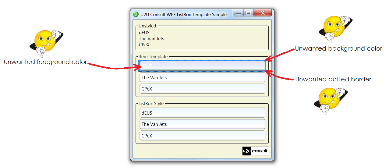
Even when the focus went to another control, the data-template-only listbox shows unwanted side effects:
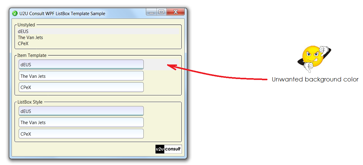
Actually, some important looks of the selected list item(s) are not defined in the data template itself, including:
- the (blue) background color,
- the (white) foreground color, and
- the dotted border to express keyboard focus.
While it's possible to improve the looks by tweaking the data template (e.g. by using negative padding), the right place to style these settings is the parent listbox itself.
Where are the original control templates?
The XAML resource dictionaries for the builtin themes (Classic, Aero, ...) can be found here at MSDN (4.0 versions apparently are not yet available). The source code of the themes also come with Expression Blend (search for the SystemThemes folder), and can be found in a lot of other places. If you open one of these files and search for the ListBoxItem styles, you'll find stuf like this:
<Setter Property="Padding"
Value="2,0,0,0"/>
This code is responsible for that horrible thin blue line on the left side of your data template.
In the default XAML template for ListBoxItem you'll also find this trigger:
<Trigger Property="IsSelected"
Value="true">
<Setter TargetName="Bd"
Property="Background"
Value="{DynamicResource {x:Static SystemColors.HighlightBrushKey}}"/>
<Setter Property="Foreground"
Value="{DynamicResource {x:Static SystemColors.HighlightTextBrushKey}}"/>
</Trigger>
Here's where the blue background and the white text color comes from.
Overriding default brushes
Instead of redefining the whole ListBoxItem style, you can easily get away with overriding the brushes that are used as static resource. You can use the following XAML to make the unwanted stylings disappear:
<ListBox.Resources>
<!-- Style used if item is selected and listbox has keyboard focus -->
<Style x:Key="NoFocusVisualStyle" TargetType="Control">
<Setter Property="BorderBrush" Value="Transparent" />
</Style>
<!-- Apply this style -->
<Style x:Key="{x:Type ListBoxItem}" TargetType="ListBoxItem">
<Setter Property="FocusVisualStyle" Value="{StaticResource NoFocusVisualStyle}" />
</Style>
<!-- Color used if item is selected and listbox has focus -->
<SolidColorBrush
x:Key="{x:Static SystemColors.HighlightBrushKey}"
Color="Transparent"/>
<!-- Color used if item is selected and listbox does not have focus -->
<SolidColorBrush
x:Key="{x:Static SystemColors.ControlBrushKey}"
Color="Transparent"/>
<!-- Font color used if item is selected and listbox has focus -->
<SolidColorBrush
x:Key="{x:Static SystemColors.HighlightTextBrushKey}"
Color="Black" />
</ListBox.Resources>
Empty data
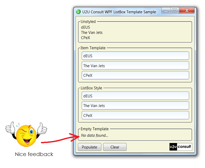
Unfortunately WPF controls don't have an EmptyDataTemplate property like their ASP.NET siblings. The empty data template describes how the list control looks like when it's bound to an empty data source.
In WPF we have to build this ourselves. Let's keep things simple and display a TextBox in front of the ListBox, and bind its visibility to the items count of the ListBox.
Here's the XAML:
<Grid>
<ListBox
...
</ListBox>
<TextBlock
Margin="4"
FontStyle="Italic"
Text="No data found..."
Grid.Row="0" Grid.Column="1" Grid.RowSpan="2">
<TextBlock.Style>
<Style TargetType="{x:Type TextBlock}">
<Setter Property="Visibility" Value="Collapsed" />
<Style.Triggers>
<DataTrigger Binding="{Binding ElementName=EmptyTemplateBox, Path=Items.Count}" Value="0">
<Setter Property="Visibility" Value="Visible" />
</DataTrigger>
</Style.Triggers>
</Style>
</TextBlock.Style>
</TextBlock>
</Grid>
Here's how it looks like when the app runs:
Source Code
As usual, here's a working sample: U2UConsult.WPF.Template.Sample.zip (17,81 kb)
Enjoy!