This article describes how to restyle the Metro GridView to host a single page app like the sample Weather and Finance apps. I'll show you how to get rid of the default disco effects of this control - like the swiping behavior and the pressed animation. For this article, I started with my own lightweight version of the weather app, but I got bored very soon. So I upgraded the app to a tribute to the iconic rock band CPeX, with some pictures, some overflowing RichTextBox controls with lyrics, and WebView controls revealing the band's web site and wikipedia page; there's even a YouTube video in it:

The GridView is a good candidate to host a single page Metro app: out-of-the-box it's layed out horizontally, and it supports panning through differently sized content pages. It was designed for selecting and moving items, so its default look-and-feel is way too busy. But Visual Studio 11 Release Candidate is the ideal environment to tame it. Visual Studio is now sharing some of its designers with Expression Blend. If you want to restyle a control on a page, all you have to do is right click in the XAML designer, and select "edit template" and "edit a copy". The control template will be pulled out of generic.xaml and applied to the control, after you decided where to save the style:
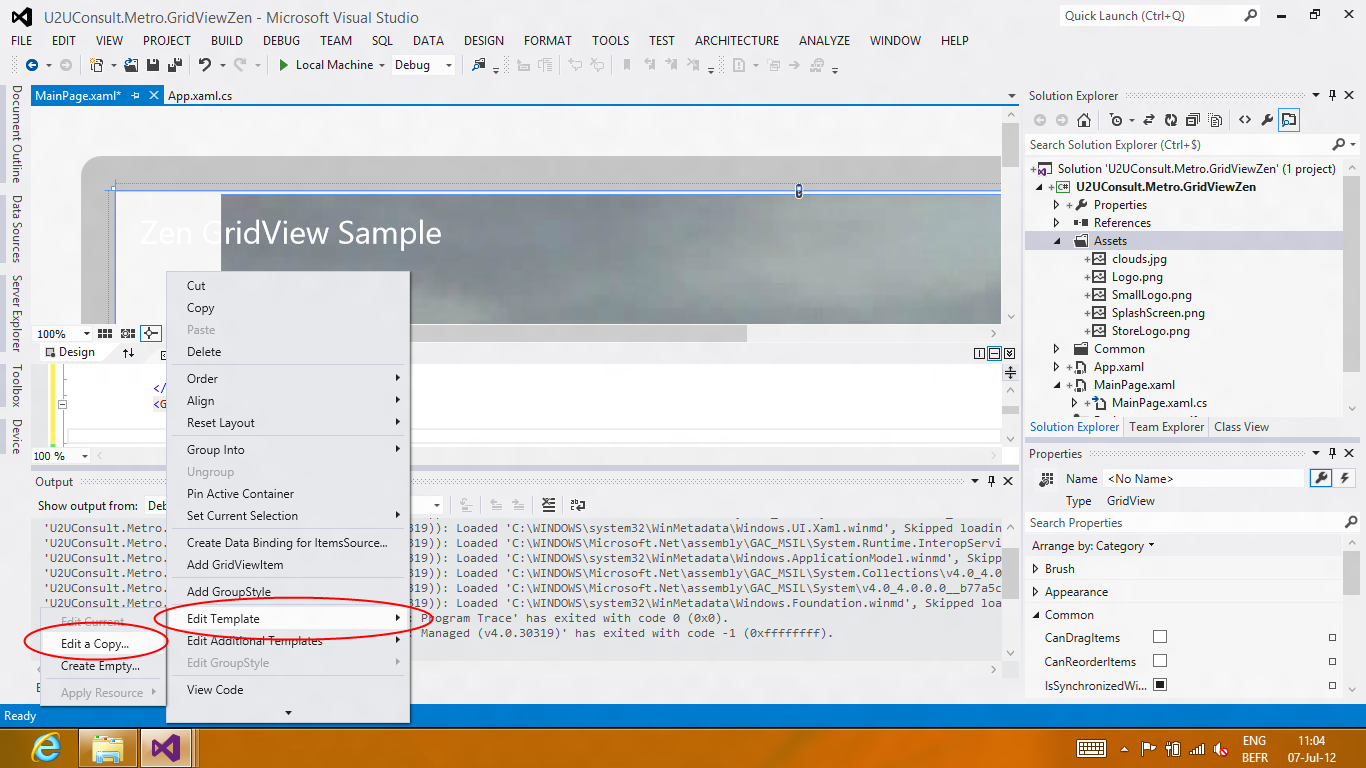
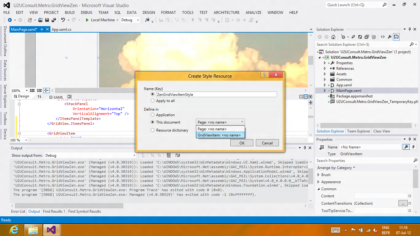
That's exactly what I did to create new copies of the templates for the GridView and GridViewItem control.
Here's the list of modifications to the default GridView style:
I changed the IsSwipeEnabled property to false:
<Setter Property="IsSwipeEnabled" Value="False" />
I added a default value for the SelectionMode property:
<Setter Property="SelectionMode" Value="None" />
I changed the ItemsPanelTemplate to a horizontal StackPanel:
<Setter Property="ItemsPanel">
    <Setter.Value>
        <ItemsPanelTemplate>
            <StackPanel Orientation="Horizontal" VerticalAlignment="Stretch" />
        </ItemsPanelTemplate>
    </Setter.Value>
</Setter>
Finally, I made the outer ScrollViewer snap to the GridViewItems:
<Setter Property="Template">
    <Setter.Value>
        <ControlTemplate TargetType="GridView">
            <Border ... >
                <ScrollViewer
                    x:Name="ScrollViewer"
                    ...
                    HorizontalSnapPointsType="Optional">
                    <ItemsPresenter .../>
                </ScrollViewer>
            </Border>
        </ControlTemplate>
    </Setter.Value>
</Setter>
After a swipe, the GridView pans smoothly to the beginning of the next (or previous) page. Heck, even the Weather and Finance apps don't do this:

Here's the list of modifications to the default GridViewItem style:
I changed the margin, so that all pages touch the borders and each other:
<Setter Property="Margin" Value="-4 -4 -4 0" />
I cleared the animations for the following visual states: PointerOver, Pressed, PointerOverPressed, and Focused:
<VisualState x:Name="PointerOver">
    <Storyboard />
</VisualState>
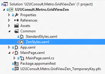
When I was happy with the result, I moved the two styles to a separate resource dictionary:
I added a reference to it in the app.xaml:
<Application.Resources>
    <ResourceDictionary>
        <ResourceDictionary.MergedDictionaries>
            <ResourceDictionary Source="Common/StandardStyles.xaml" />
            <ResourceDictionary Source="Common/ZenStyles.xaml" />
        </ResourceDictionary.MergedDictionaries>
    </ResourceDictionary>
</Application.Resources>
Here's how the main GridView uses the styles:
<GridView
    Style="{StaticResource ZenGridViewStyle}"
    ItemContainerStyle="{StaticResource ZenGridViewItemStyle}">
    ...
</GridView>
Here's the sample project. It was developed with Visual Studio 11 Ultimate RC for the Windows 8 Release Preview: U2UConsult.Metro.GridViewZen.zip (1.26 mb)
Enjoy!