In this short article I'll show you how to transform a resource dictionary with colors, brushes, styles and templates into a real theme - à la Silverlight toolkit themes - and how to apply it to a region in the user interface. I'll build a theme called Glass.
Building the theme
Each Silverlight toolkit theme is nothing more than a resource dictionary wrapped in ... er ... a wrapper and compiled as a separate dll. I you want to roll your own, you first create a class library project. The project will contain lots of references, lots of XAML, and just a couple of lines of C#. It will eventually look like this:
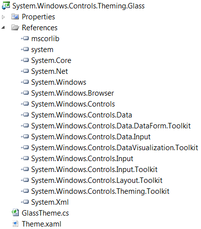
Create a resource dictionary named theme.xaml and stuff all the artefacts that your designer created - or that you downloaded somewhere - into it. Then create a very thin wrapper class around the resource dictionary. The class should inherit from the toolkit's Theme class:
Just like in the toolkit themes, it makes sense to use System.Windows.Controls.Theming as namespace.
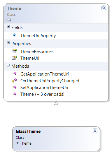
Here's the whole code for that class:
/// <summary>
/// Implicitly applies the Glass theme to all of its descendent FrameworkElements.
/// </summary>
public partial class GlassTheme : Theme
{
/// <summary>
/// Stores a reference to a Uri referring to the theme resource for the class.
/// </summary>
private static Uri ThemeResourceUri = new Uri("/System.Windows.Controls.Theming.Glass;component/Theme.xaml", UriKind.Relative);
/// <summary>
/// Initializes a new instance of the GlassTheme class.
/// </summary>
public GlassTheme()
: base(ThemeResourceUri)
{
}
}
We're done building the theme. Now it's time to test it.
Applying the theme
All you need to do to statically apply a theme to a region in the user interface, is dropping it in the XAML:
<customtheme:GlassTheme>
<!-- Your controls here. -->
</customtheme:GlassTheme>
To test a new theme, I created a small test application with controls from different sources: a handful of native Silverlight controls, some SDK controls and a pinch of Toolkit controls. It's actually a lightweight version of one of the zones from the Silverlight Samples page. Just select Theme Browser over there to get the full page. My version is a little more compact. It looks like this:
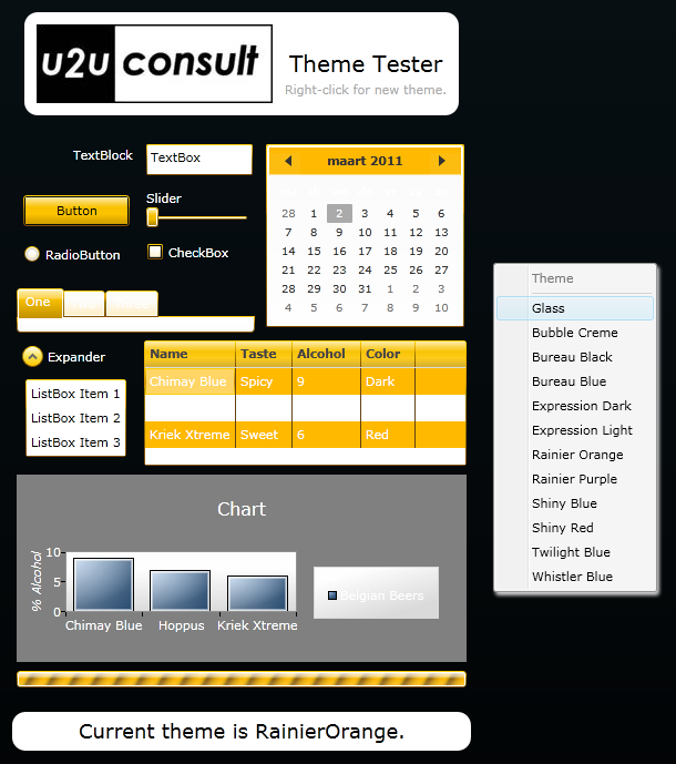
With a simple right-click you can dynamically change the theme.
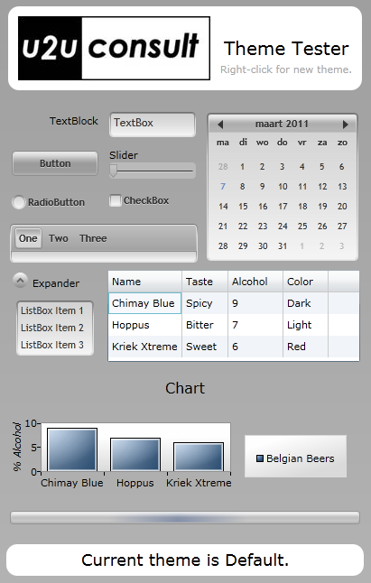
Here's how the Glass theme looks like in the test container:
The test container also applies the selected theme through XAML, but it uses the common base class to set the appropriate ThemeUri:
<toolkit:Theme x:Name="ThemedRegion"
ThemeUri="/System.Windows.Controls.Theming.Glass;component/Theme.xaml">
<!-- Your controls here ... -->
</toolkit:Theme>
After selection, a new theme is programmatically applied like this:
themedRegion.ThemeUri = new Uri("/System.Windows.Controls.Theming." + this.themeName + ";component/Theme.xaml", UriKind.RelativeOrAbsolute);
Source code
Here's the glass theme and its test container: U2UConsult.Silverlight.ThemeBuilder.zip (2,34 mb)
Enjoy!