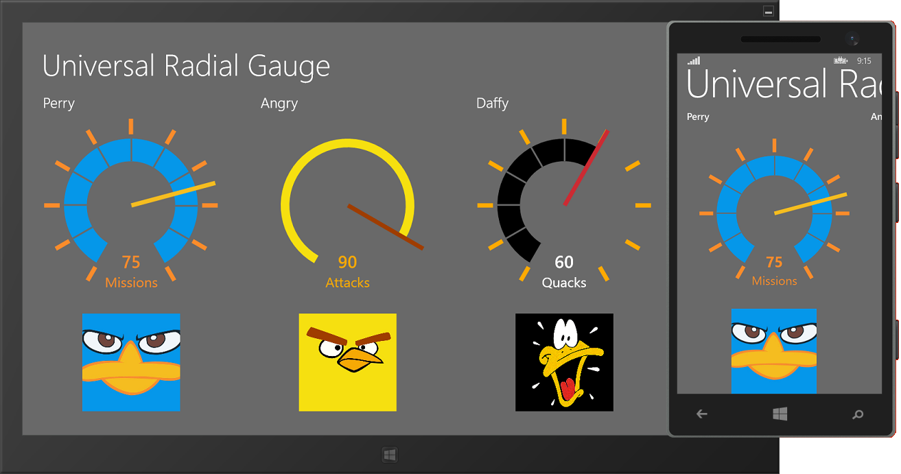
This article presents a modern radial gauge Custom Control, hosted in a Portable Class Library for Universal Windows apps. Visual Studio Update 2 comes with the concept of Universal Apps that can run on Windows PC’s, tablets, phones and the XBox. For an introduction to this new breed of apps, check this crystal clear article by Jeff Prosise. I did not develop this custom control from scratch, I just migrated my own Radial Gauge for WinRT which was designed by Arturo Toledo and is available through NuGet as part of the WinRT Xaml Toolkit. Here’s how the Universal Gauge looks like in both the emulator and the simulator:
I started by creating a new solution with a blank C# Universal App. The template creates three projects:
- a Windows Store app project,
- a Windows Phone project, and
- a so-called Shared project, that contains all common source files and assets.
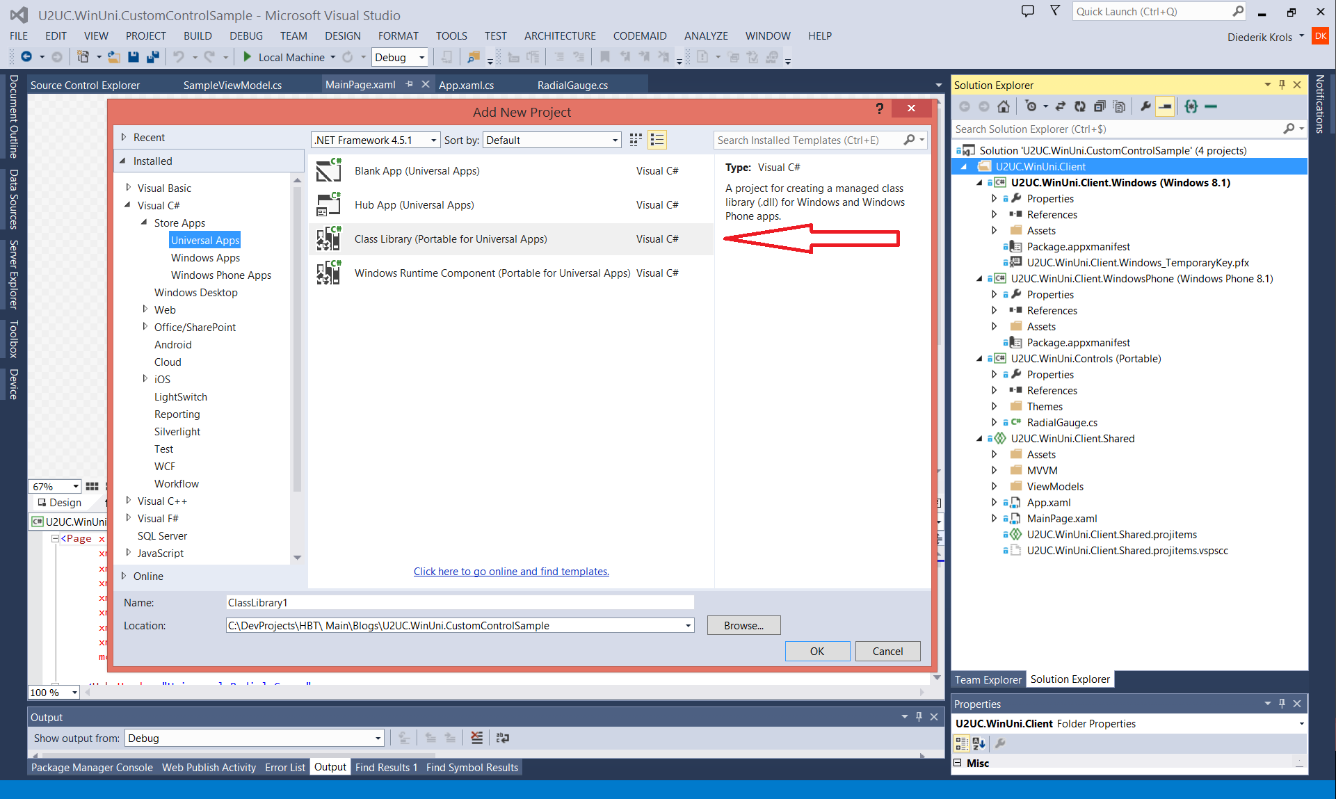
I didn’t want to create the custom control as a bunch of shared source files, so I added an empty Portable Class Library. Visual Studio 2013 Update 2 contains a project template for such a Universal PCL:
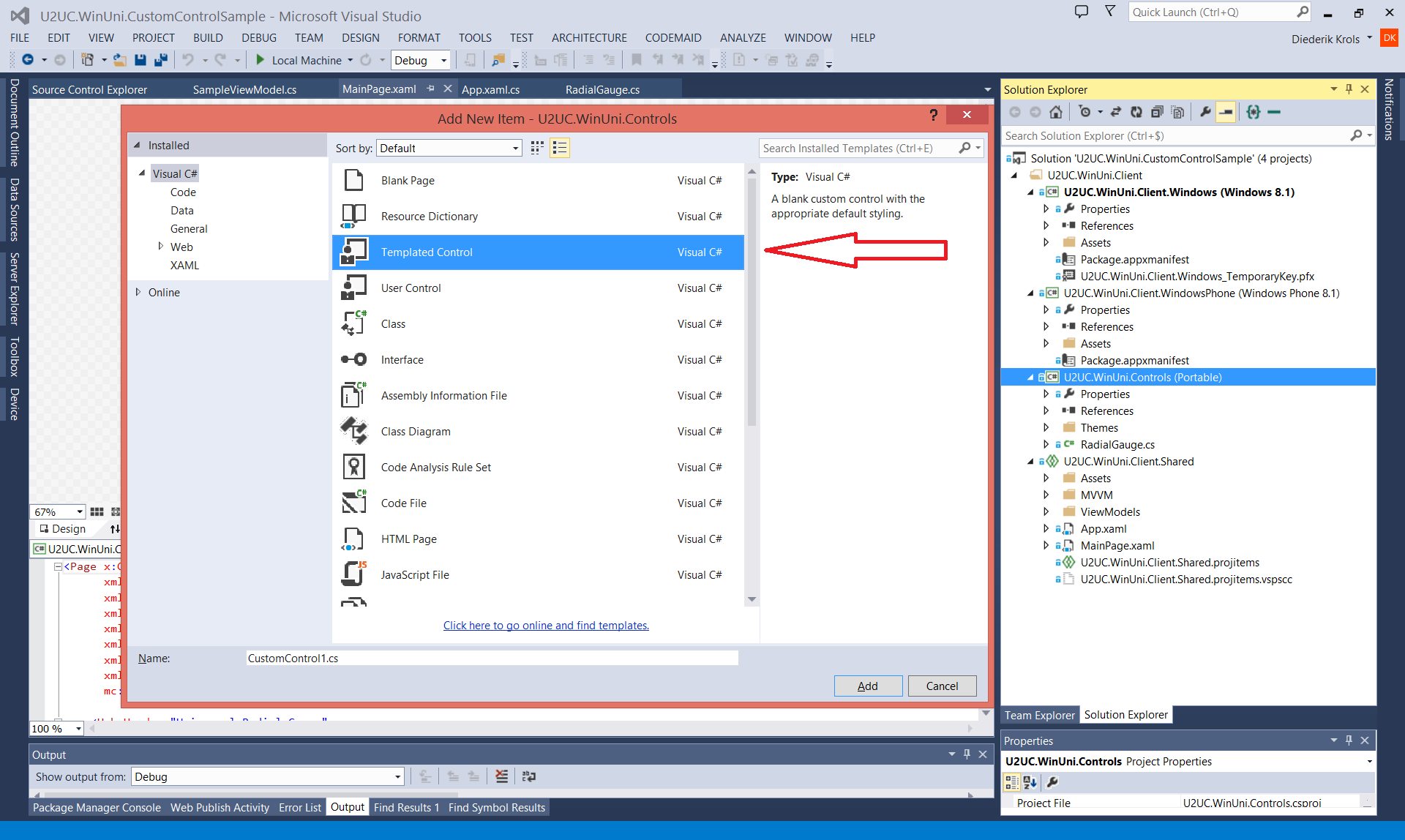
In the class library I created a new custom control. And yes, there’s again a template for that:
For more information on building customs controls from scratch, you may want to read this article of mine. It seems to apply to Universal apps too.
I copied the XAML style in the Themes folder and the C# class over from the Windows Phone version of the Radial Gauge, because that’s my most recent version. I had to just (re-)adapt a couple of namespaces, and tadaa: the radial gauge custom control was operational in less than 15 minutes, with a single code base for all XAML platforms (well, almost, not sure about WPF).
While playing with the source, I added a new property -TickSpacing- as suggested by Dennis Almond in a blog post comment. Thanks, Dennis!
/// <summary>
/// Gets or sets the tick spacing, in units.
/// </summary>
public int TickSpacing
{
    get { return (int)GetValue(TickSpacingProperty); }
    set { SetValue(TickSpacingProperty, value); }
}
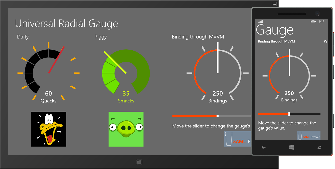
The TickSpacing allows you to specify the distance between the ticks. I used to divide the scale in 10 zones, but now you can choose your own interval for the ticks. Look at the slider-bound gauge on the right: it’s divided in 5 zones:
Here’s the updated list of configurable properties:
- Minimum: minimum value on the scale (double)
- Maximum: maximum value on the scale (double)
- Value: the value to represent (double)
- ValueStringFormat: StringFormat to apply to the displayed value (string)
- Unit: unit measure to display (string)
- TickSpacing: spacing -in value units- between ticks (int)
- NeedleBrush: color of the needle (Brush)
- TickBrush: color of the outer ticks (Brush)
- ScaleWidth: thickness of the scale in pixels – relative to the control’s default size (double)
- ScaleBrush: background color of the scale (Brush)
- ScaleTickBrush: color of the ticks on the scale (Brush)
- TrailBrush: color of the trail following the needle (Brush)
- ValueBrush: color of the value text (Brush)
- UnitBrush: color of the unit measure text (Brush)
And the taxonomy:
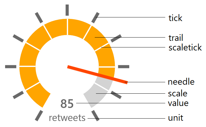
As an example, here’s Daffy’s gauge from the sample project:
<controls:RadialGauge Value="60"
                      Unit="Quacks"
                      NeedleBrush="#FFCC2B33"
                      ScaleBrush="Transparent"
                      TrailBrush="Black"
                      TickBrush="#FFFFAA00"
                      ValueBrush="White"
                      UnitBrush="White"
                      ScaleTickBrush="DimGray" />
And here’s the data bound gauge, featuring TickSpacing:
<controls:RadialGauge Minimum="{Binding Min}"
                      Maximum="{Binding Max}"
                      Value="{Binding Value, Mode=TwoWay}"
                      TickSpacing="100"
                      Unit="Bindings"
                      NeedleBrush="White"
                      ScaleBrush="LightGray"
                      TrailBrush="OrangeRed"
                      TickBrush="LightGray"
                      ValueBrush="White"
                      UnitBrush="White"
                      ScaleTickBrush="Transparent"
                      ScaleWidth="5" />
Let’s come back to the Universal app. The Store app and the Phone app have something in common: they’re absolutely empty. It shouldn't come as a surprise that the ViewModel and the BindableBase classes are easily sharable, since they're simple C# classes. But the whole user interface is actually shared between the platform-specific apps: it's Hub-based and entirely built with common Store/Phone controls. So all the code is shared: binary through the PCL, or as source in the Shared project. Needless to say I like this approach a lot…
Here’s the full project, it was built with Visual Studio 2013 Update 2 (RC): U2UC.WinUni.CustomControlSample.zip (303.6KB)
Enjoy!
XAML Brewer