Recently I had the amazing opportunity to briefly work together with Arturo Toledo and his great team of designers from Toledo2. This article presents one of the artefacts of that cooperation. It’s a Modern UI radial gauge control for Windows 8 Store apps. Arturo Toledo did the hard work of designing it, I merely wrote an implementation of it in C# and XAML. Here are some examples of how the control may look like in an app. Yes, these are all instances of one and the same control type:
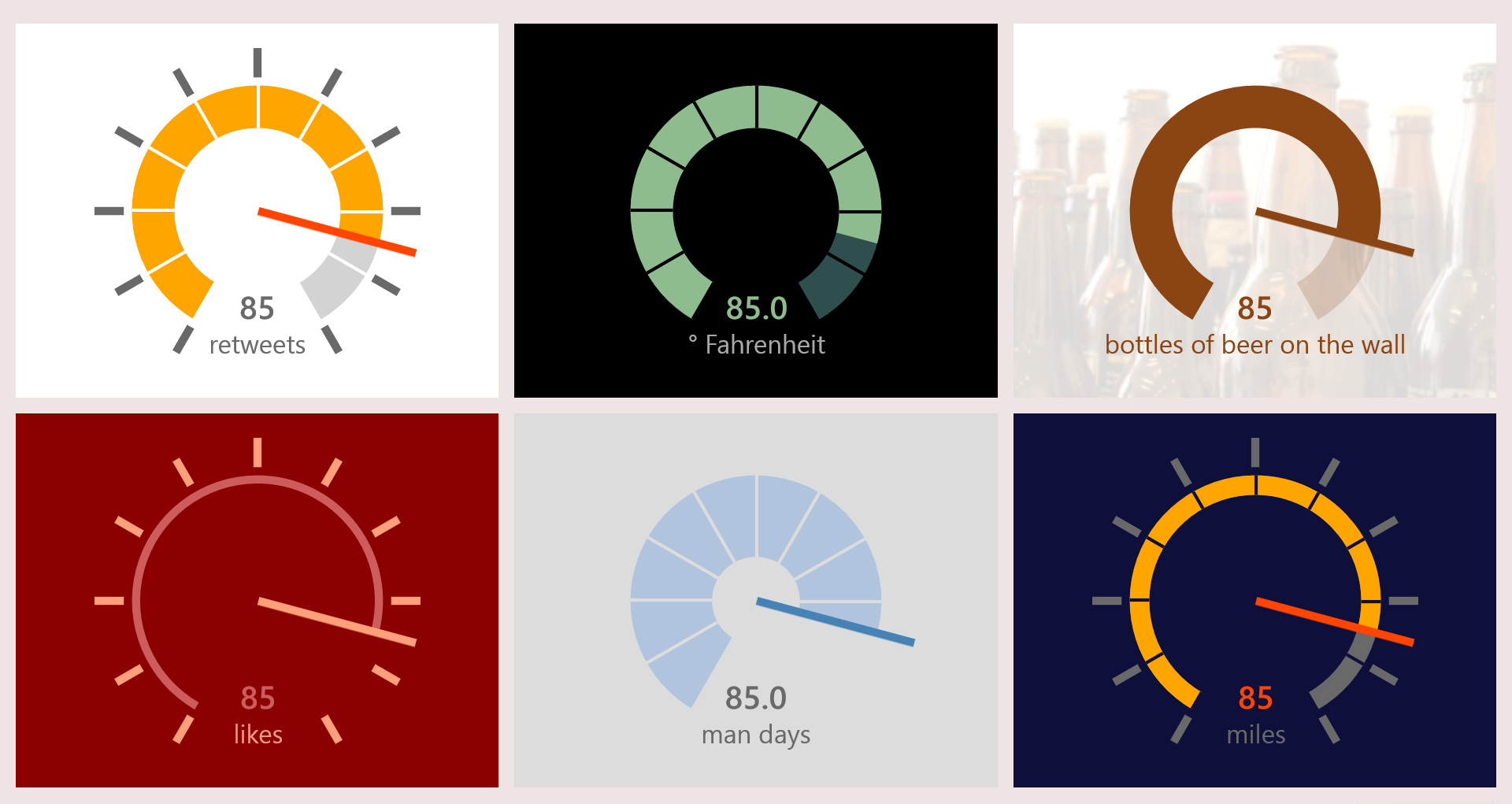
Stunning, right? And I did not even start templating it…
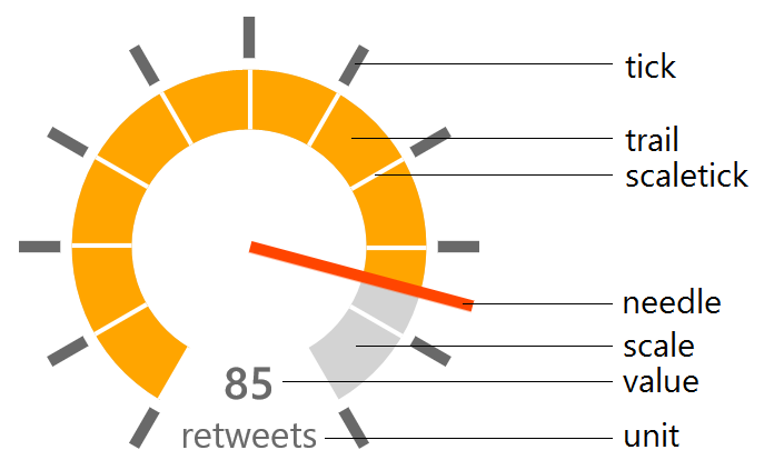
Here’s how I named the graphical regions in the control’s default style:
This is the list of configurable properties:
- Minimum: minimum value on the scale (double)
- Maximum: maximum value on the scale (double)
- Value: the value to represent (double)
- ValueStringFormat: StringFormat to apply to the displayed value (string)
- Unit: unit measure to display (string)
- NeedleBrush: color of the needle (Brush)
- TickBrush: color of the outer ticks (Brush)
- ScaleWidth: thickness of the scale in pixels – relative to the control’s default size (double)
- ScaleBrush: background color of the scale (Brush)
- ScaleTickBrush: color of the ticks on the scale (Brush)
- TrailBrush: color of the trail following the needle (Brush)
- ValueBrush: color of the value text (Brush)
- UnitBrush: color of the unit measure text (Brush)
Here's how to define an instance of this gauge in your XAML:
<controls:Gauge Minimum="0"
                Maximum="100"
                Height="{Binding Size}"
                Value="{Binding Value}"
                TickBrush="Transparent"
                ScaleTickBrush="Transparent"
                NeedleBrush="SaddleBrown"
                TrailBrush="SaddleBrown"
                ValueBrush="SaddleBrown"
                Unit="bottles of beer on the wall"
                UnitBrush="SaddleBrown">
    <controls:Gauge.ScaleBrush>
        <SolidColorBrush Color="SaddleBrown"
                            Opacity=".2" />
    </controls:Gauge.ScaleBrush>
</controls:Gauge>
All of the properties are implemented as Dependency Properties. This code –generated through the ‘propdp’ code snippet- actually accounts for more than 50% of the code-behind of the gauge. I’m not going to dive deeply in the implementation, since I already did that in this article on building custom controls. That article also presents a radial gauge - from which I borrowed the needle and ticks code. That gauge definitely looks skeumorphic compared to the new one.
For the different colors I did not use properties of type Color or String, but Brush. This gives code completing and designer support in Visual Studio:
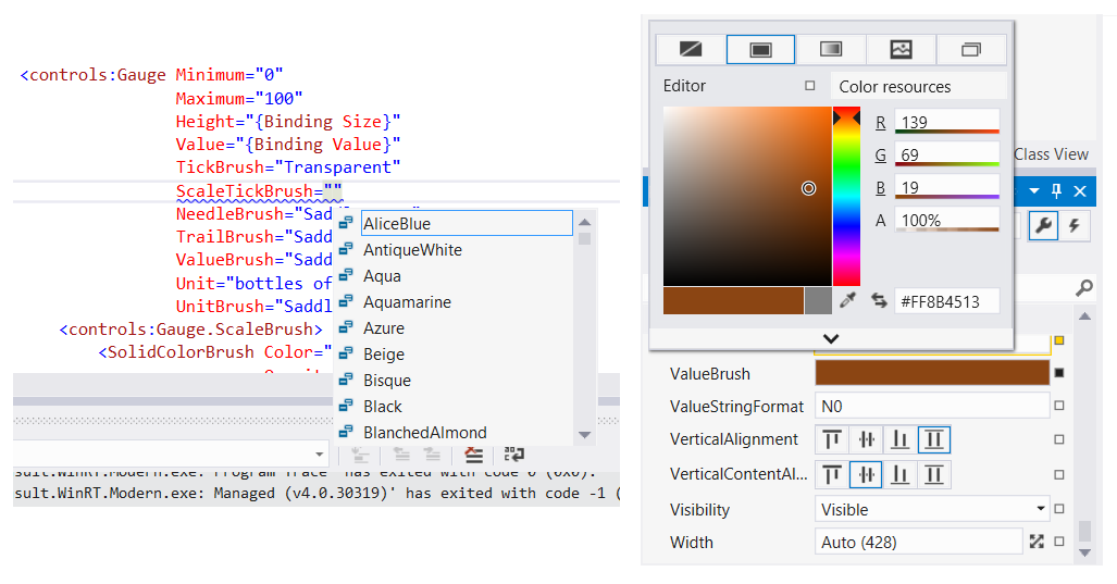
It also gives you the possibility to work with LinearGradientBrush or more exotic Brush types if you want.
The main beef of the source code draws the scale in OnApplyTemplate, and redraws the needle and trail in OnValueChanged. To keep these calculations simple, I embedded the whole control in a ViewBox with a fixed width and height of 200 pixels.
Here’s the structure of the control’s default style:
<Style TargetType="local:Gauge">
    <Setter Property="Template">
        <Setter.Value>
            <ControlTemplate TargetType="local:Gauge">
                <Viewbox>
                    <Grid Height="200"
                            Width="200">

                        <!-- Ticks -->
                        <ItemsControl ItemsSource="{TemplateBinding Ticks}"
                                        VerticalAlignment="Center"
                                        HorizontalAlignment="Center">
				<!-- ... -->
                        </ItemsControl>

                        <!-- Scale -->
                        <Path Name="PART_Scale"
                                Stroke="{TemplateBinding ScaleBrush}"
                                StrokeThickness="{TemplateBinding ScaleWidth}" />

                        <!-- Trail -->
                        <Path Name="PART_Trail"
                                Stroke="{TemplateBinding TrailBrush}"
                                StrokeThickness="{TemplateBinding ScaleWidth}" />

                        <!-- Scale Ticks -->
                        <ItemsControl ItemsSource="{TemplateBinding Ticks}"
                                        VerticalAlignment="Center"
                                        HorizontalAlignment="Center">
                        	<!-- ... -->
                        </ItemsControl>

                        <!-- Value and Unit -->
                        <StackPanel VerticalAlignment="Bottom"
                                    HorizontalAlignment="Center">
                            <TextBlock Name="PART_ValueText"
                                        Foreground="{TemplateBinding ValueBrush}"
                                        FontSize="20"
                                        FontWeight="SemiBold"
                                        Text="{TemplateBinding Value}"
                                        TextAlignment="Center"
                                        Margin="0 0 0 2" />
                            <TextBlock Foreground="{TemplateBinding UnitBrush}"
                                        FontSize="16"
                                        TextAlignment="Center"
                                        Text="{TemplateBinding Unit}"
                                        Margin="0" />
                        </StackPanel>

                        <!-- Needle -->
			<Grid>
			    <!-- ... -->
                            <Path Name="PART_Needle"
                                    Stretch="Uniform"
                                    HorizontalAlignment="Center"
                                    Fill="{TemplateBinding NeedleBrush}"
                                    Data="M 0,0 l 0,100 l 5,0 l 0,-100 l -5,0"
                                    RenderTransformOrigin="0.5,1" />
                        </Grid>
                    </Grid>
                </Viewbox>
            </ControlTemplate>
        </Setter.Value>
    </Setter>
</Style>
Most of the elements have a name that adheres to the ‘PART_*’-scheme convention. The code-behind needs these elements in its calculation. Only the Ticks and ScaleTicks ItemControls and the Unit TextBlock are done entirely in XAML. The DataTemplate required some binding, but TemplateBinding doesn’t work at that place. So I created a ‘Proxy’ for each of these to cache the control’s properties, like this:
<!-- Ticks -->
<Line x:Name="TicksProxy"
        Visibility="Collapsed"
        Fill="{TemplateBinding TickBrush}" />
<ItemsControl ItemsSource="{TemplateBinding Ticks}"
                VerticalAlignment="Center"
                HorizontalAlignment="Center">
    <ItemsControl.ItemsPanel>
        <ItemsPanelTemplate>
            <Canvas />
        </ItemsPanelTemplate>
    </ItemsControl.ItemsPanel>
    <ItemsControl.ItemTemplate>
        <DataTemplate>
            <Rectangle Height="18"
                        Width="5"
                        Fill="{Binding Fill, ElementName=TicksProxy}">
                <!-- ... -->
        </DataTemplate>
    </ItemsControl.ItemTemplate>
</ItemsControl>
I’m not sure if this is the standard way to achieve TemplateBinding inside an ItemTemplate, but it does the trick.
To avoid a proliferation of properties, I decided to go for minimal XAML and do the drawing of the ArcSegments for both the scales entirely in code-behind. As a result, they’re not templateable in [this version of] the control.
Here’s how the scale is drawn in the OnApplyTemplate method:
protected override void OnApplyTemplate()
{
    // Draw Scale
    var scale = this.GetTemplateChild(ScalePartName) as Path;
    if (scale != null)
    {
        var pg = new PathGeometry();
        var pf = new PathFigure();
        pf.IsClosed = false;
        var middleOfScale = 77 - this.ScaleWidth / 2;
        pf.StartPoint = this.ScalePoint(-150, middleOfScale);
        var seg = new ArcSegment();
        seg.SweepDirection = SweepDirection.Clockwise;
        seg.IsLargeArc = true;
        seg.Size = new Size(middleOfScale, middleOfScale);
        seg.Point = this.ScalePoint(150, middleOfScale);
        pf.Segments.Add(seg);
        pg.Figures.Add(pf);
        scale.Data = pg;
    }

    OnValueChanged(this, null);
    base.OnApplyTemplate();
}
The control is not implemented [yet] in a control library, I just created the class file and the default style inside the main project:
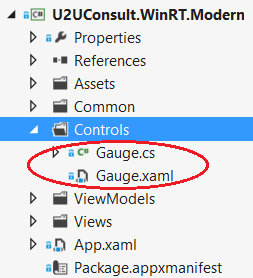
That's why the resource dictionary with the gauge’s style is not embedded in Templates\generic.xaml, but in a separate resource dictionary –Gauge.xaml- that is added to the app in app.xaml:
<Application.Resources>
    <ResourceDictionary>
        <ResourceDictionary.MergedDictionaries>
            <ResourceDictionary Source="Common/StandardStyles.xaml"/>
            <ResourceDictionary Source="Controls/Gauge.xaml" />
        </ResourceDictionary.MergedDictionaries>
    </ResourceDictionary>
</Application.Resources>
Here’s the full source code of the sample project, including the source code of the gauge: U2UConsult.WinRT.Modern.zip (78.95 kb).
Enjoy!
Diederik