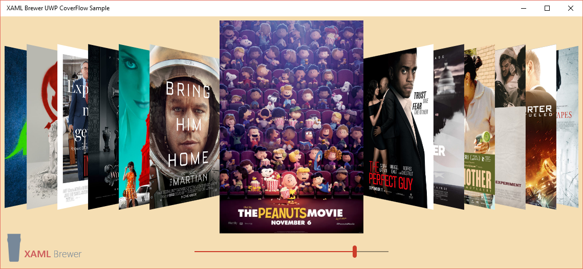
In this article I present a UWP implementation of a CoverFlow control. CoverFlow is an animated, 3D graphical user interface to browse through a list of visual items. Here's how it looks like:

It’s implemented as an ItemsControl, so all you need to do is give him an ItemsSource and an ItemTemplate.
History
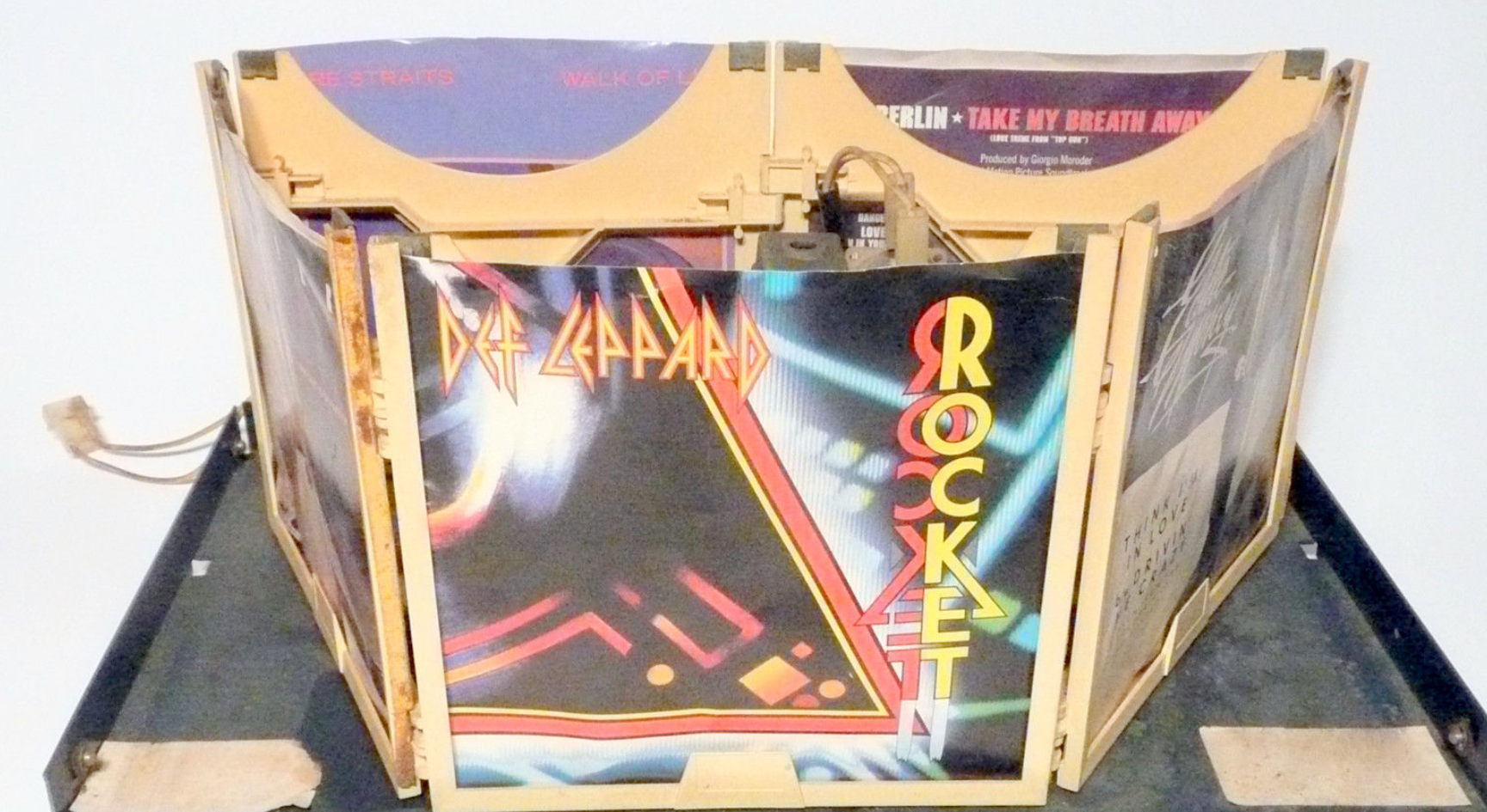
CoverFlow is an example of skeuomorphic design, it’s look-and-feel is based on a physical object: the sleeve display of a jukebox.

It was designed by Andrew Coulter Enright, you can get more info on the design process on his old blog. Here’s the designer’s opinion on the interface:
Not only does it convey more information in the less space, it makes the information presented easier to understand. Additionally amazing, this natural and subtle visual trick requires a minimal amount of processing, as it employs 2D effects to create the illusion of a 3D space.
The CoverFlow design was bought by Apple, who used it in iTunes, Safari and other products for visually flipping through snapshots of documents, website bookmarks, album artwork, or photographs.
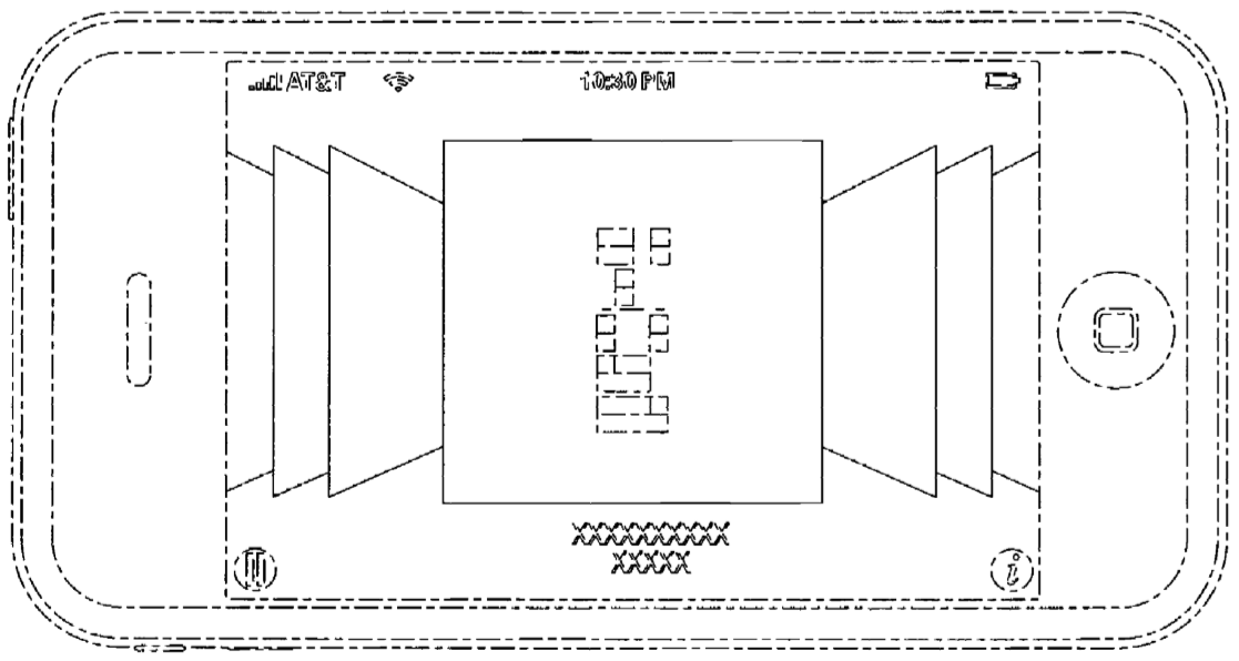
Apple was granted a design patent on the Cover Flow interface. Here’s an illustration out of that patent:

In 2009, a SilverLight version of a CoverFlow control –together with a complete iTunes movie browser sample app- appeared on CodePlex. Jeff Prosise migrated this to the WinRT platform, and added touch manipulation in the process. The UWP version that I present here, is derived from these two implementations.
The design has not been very popular in the Windows world: 3D effects with gradients and shadows in a skeuomorphic design were considered very un-Metro. But in the iOS and Android world, it’s still popular – although Apple itself don’t use it anymore. Also in web sites, you very often encounter a CoverFlow UI. For the sake of completeness, you find a JQuery and CSS implementation here.
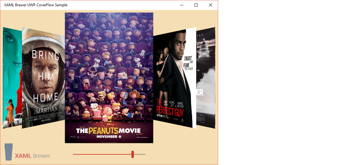
Anyway, the CoverFlow design is universal and platform neutral. On top of that, it scales to any dimension – just start the sample app, and resize it to whatever height and width. You’ll notice that the control looks good at any size; no visual state triggers needed for this one:

Manipulation
You can browse through the items by using
- the keyboard: arrows, home and end key, etc.
- the mouse scroll wheel,
- touch manipulation: horizontal translation, and/or
- binding its SelectedIndex dependency property to another control, such as a Slider.
Look & feel
The sample app just shows the control with its default UI settings, but you can do quite some tweaking. You can configure
- the space between items,
- the space between the selected item and the other items,
- the angle non selected items are at,
- the depth of non selected items,
- the scale of non selected items,
- the duration it takes to switch selected item,
- the easing function of the animations, and
- the sensitivity of touch manipulation, i.e. the number of pixels to slide before a new item is selected.
Usage
As already mentioned, CoverFlow is just an ItemsControl. Here’s how it’s defined in the sample app. The slider is not part of the control itself, but the CoverFlow exposes a SelectedIndex property (as well as a SelectedItem property) you can bind to:
<!-- CoverFlow -->
<controls:CoverFlow x:Name="CoverFlow">
   <controls:CoverFlow.ItemTemplate>
       <DataTemplate>
           <Image Source="{Binding}" />
       </DataTemplate>
   </controls:CoverFlow.ItemTemplate>
</controls:CoverFlow>

<!-- Slider -->
<Slider Value="{Binding SelectedIndex, ElementName=CoverFlow, Mode=TwoWay}" />
In the sample app, the ItemsSource is assigned in code behind, but the control is not afraid of data binding. Don’t forget to update the slider’s maximum value:
CoverFlow.ItemsSource = await GetUrls();
Slider.Maximum = CoverFlow.Items.Count() - 1;
Source
The control and sample app live on GitHub. The solution was written with Visual Studio 2015.
Enjoy!
XAML Brewer