This article explains how to build custom controls for Windows Store apps, using XAML and C#. Custom controls are the most powerful controls in the XAML department. Once you know how to design and build these, you’ll have no problems with their alternatives: user controls, derived controls, and extended controls. Let’s start with a definition: a custom control is a reusable templatable control that comes with a generic.xaml file and some code behind. Generally a custom control is stored in its own assembly to make it reusable in multiple apps. As a developer, you decorate a custom control with properties, methods, events, and a default style. The users of the control –developers who use your custom control in their apps- should live with the code behind, but are free to completely restyle the XAML part.
Hello again, Simple Slider
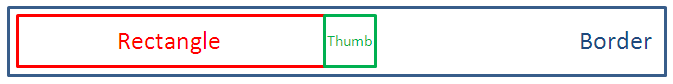
Almost a year ago, I built a custom slider control in an earlier version of Visual Studio and the Windows Runtime. A lot has changed since then – fortunately for the better. For this article, I decided to redo that slider. I’ll stick to its original anatomy: a horizontal slider is just a draggable Thumb in a Border. While dragging, a Rectangle is drawn to fill the space at the left side of the Thumb:
Getting Started
Recent versions of Visual Studio 2012 –including the free Express edition- come with a template to create a custom control. All you need to do to get started is adding a new item of the type ‘Templated Control’ to your project:
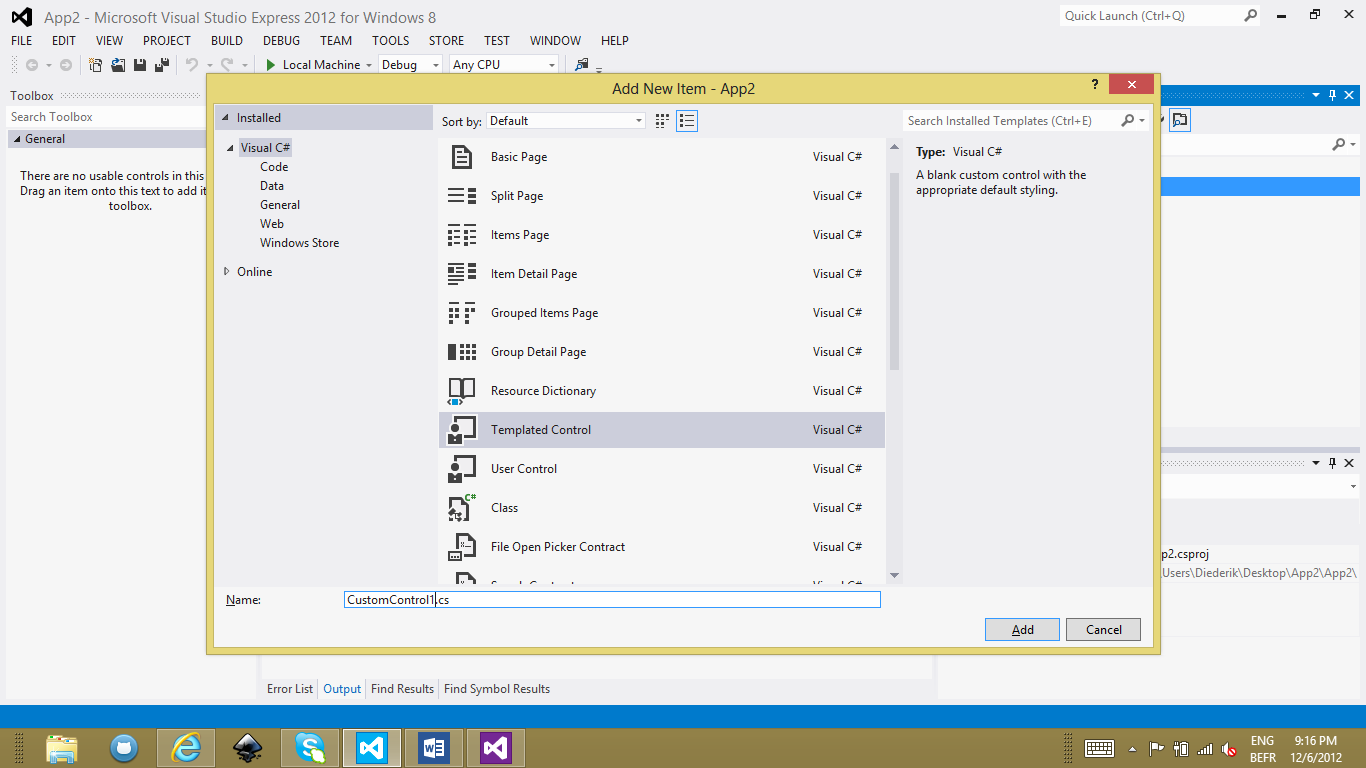
It will create the code behind file as well as the generic.xaml in the Templates folder.
Properties
A custom control directly inherits from Control itself, the mother of all controls. It immediately comes with a couple of useful properties like Height, Width, and Visibility. Of course you would want to add your own properties. A slider control e.g. should have at least properties to represent its minimum, maximum and current value. Since we’re interested in data binding, we will implement these as DependencyProperty instances. Using the propdp code snippet, you can rapidly define a property and provide its name, type, default value, and the function that will be called when the value changes. In the case of our slider, we are definitely interested in knowing when the value changed: it’s the sign to redraw the control. Here’s how the definition of the Value property looks like:
public static readonly DependencyProperty ValueProperty = DependencyProperty.Register(
    "Value", typeof(double), typeof(Slider), new PropertyMetadata(0.0, OnValueChanged));

public double Value
{
    get { return (double)GetValue(ValueProperty); }
    set { SetValue(ValueProperty, value); }
}

private static void OnValueChanged(DependencyObject dependencyObject, DependencyPropertyChangedEventArgs e)
{
    // Recalculate part sizes.
    // ...
}
Styling
The generic.xaml file will contain the default style for the control. While typing in that code, you have intellisense but no designer support. Here’s how the basic slider style looks like in XAML.
<Style TargetType="local:Slider">
    <Setter Property="Template">
        <Setter.Value>
            <ControlTemplate TargetType="local:Slider">
                <Grid>
                    <Border Height="40"
                            VerticalAlignment="Stretch"
                            Background="Gray"
                            Margin="0"
                            Padding="0"
                            BorderThickness="0" />
                    <Canvas Margin="0"
                            Height="40">
                        <Rectangle x:Name="PART_Rectangle"
                                    Height="38"
                                    Fill="SlateBlue"
                                    Margin="0 1" />
                        <Thumb x:Name="PART_Thumb"
                                Background="LightSteelBlue"
                                Width="40"
                                Height="40"
                                Margin="0" />
                    </Canvas>
                </Grid>
            </ControlTemplate>
        </Setter.Value>
    </Setter>
</Style>
The default style is assigned to the control in its constructor:
public Slider()
{
    this.DefaultStyleKey = typeof(Slider);
}
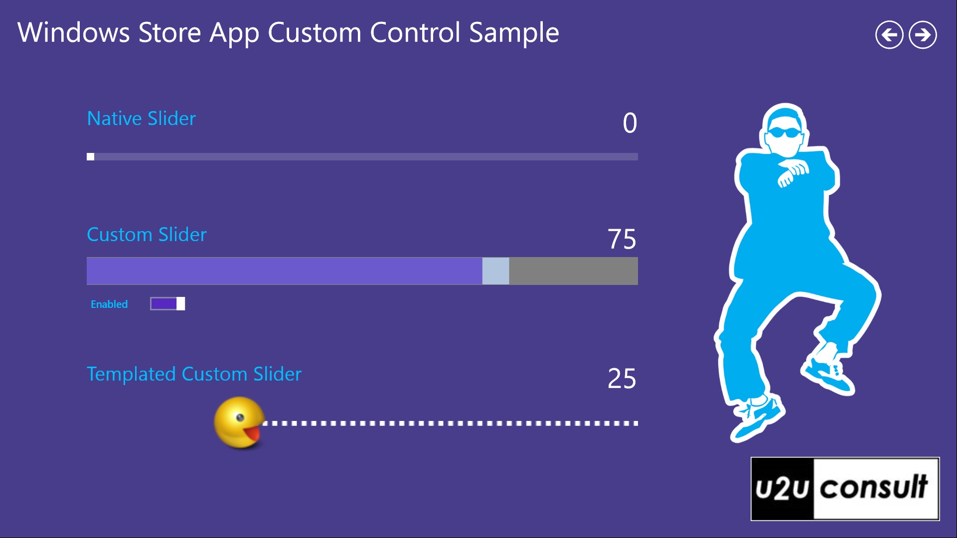
This is a screenshot of the custom slider:
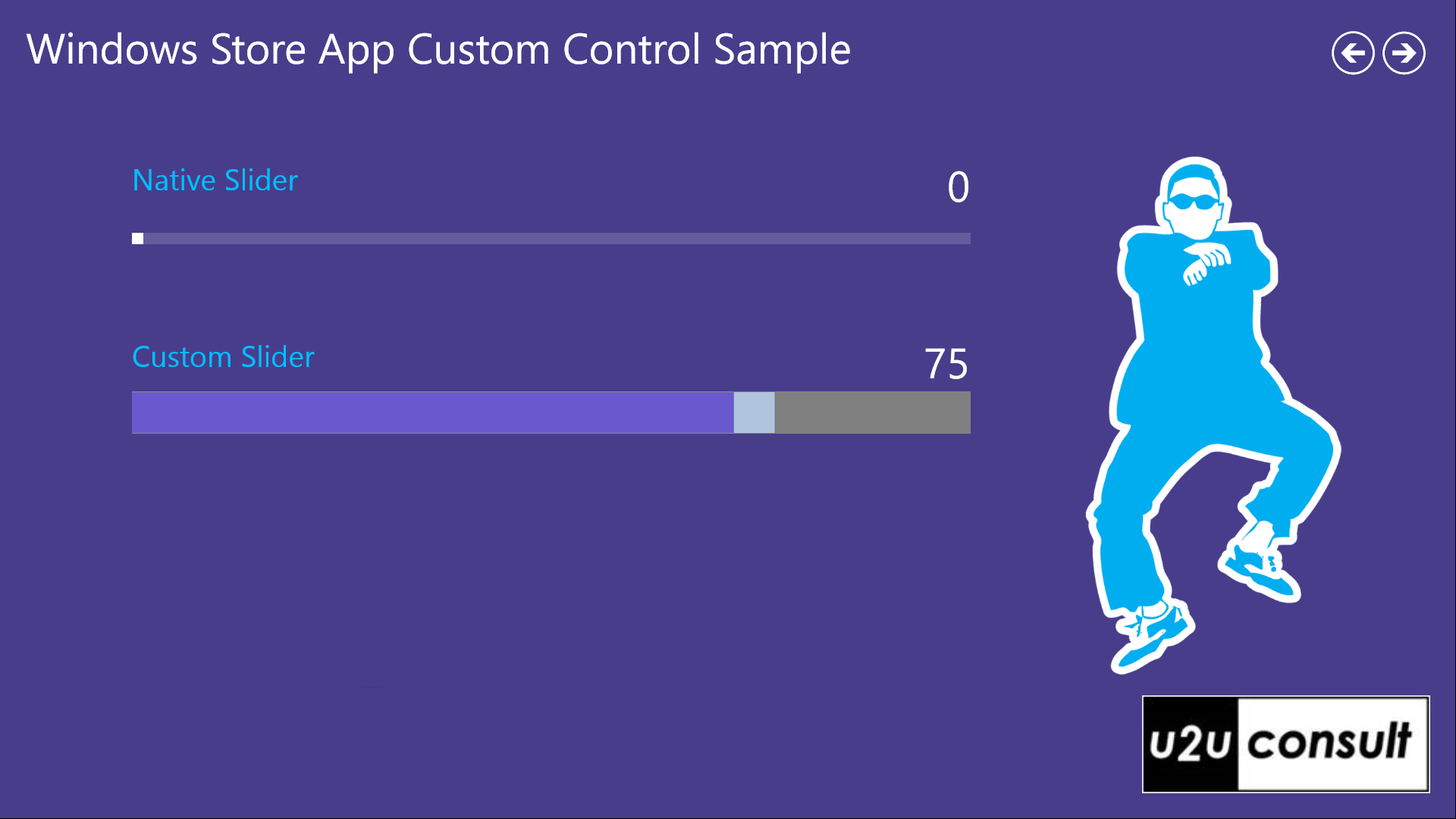
In the style definition, the Thumb and Rectangle controls were given an x:Name value. This is because we need to manipulate them when (re)drawing the slider from code behind. That puts some constraints on the ‘templatability’ of the custom control: no matter how the designer wants to make the control look like, he or she needs to make sure that the template contains a Thumb and a Rectangle with the expected name. Fortunately you have some ways to notify these constraints to the designer. First there is a naming convention that specifies that the element’s name should start with ‘PART_’. More important is the fact that you can decorate the class with TemplatePart attributes. These will be recognized by tools like Expression Blend. Here’s the definition in C#:
[TemplatePart(Name = ThumbPartName, Type = typeof(Thumb))]
[TemplatePart(Name = RectanglePartName, Type = typeof(Rectangle))]
public sealed class Slider : Control
{
    private const string ThumbPartName = "PART_Thumb";
    private const string RectanglePartName = "PART_Rectangle";

    // ...
}
You find the named parts with the GetTemplateChild method. When using your control, a designer could have ignored the expected parts, so make sure you look them up defensively:
protected override void OnApplyTemplate()
{
    this.thumb = this.GetTemplateChild(ThumbPartName) as Thumb;
    if (this.thumb != null)
    {
        this.thumb.DragDelta += this.Thumb_DragDelta;
    }

    // ...

    base.OnApplyTemplate();
}
This code is typically written in an override of the OnApplyTemplate method. Don’t use the Loaded event. The visual tree of a templated control might be still incomplete at that stage.
Visual State Management
Depending on its state (enabled, disabled, focused, snapped, etc.) a control will look and feel slightly or drastically different. This is where the VisualStateManager comes in action. The visual state manager invokes transformations when the state of the control changes. E.g. if the control is disabled, it will recolor it in fifty shades of gray. The states and transformations can be described declaratively in XAML:
<VisualStateManager.VisualStateGroups>
    <VisualStateGroup x:Name="CommonStates">
        <VisualState x:Name="Normal">
            <Storyboard>
                <ObjectAnimationUsingKeyFrames Storyboard.TargetName="PART_Thumb"
                                                Storyboard.TargetProperty="Background">
                    <DiscreteObjectKeyFrame KeyTime="0"
                                            Value="LightSteelBlue" />
                </ObjectAnimationUsingKeyFrames>
                <ObjectAnimationUsingKeyFrames Storyboard.TargetName="PART_Rectangle"
                                                Storyboard.TargetProperty="Fill">
                    <DiscreteObjectKeyFrame KeyTime="0"
                                            Value="SlateBlue" />
                </ObjectAnimationUsingKeyFrames>
            </Storyboard>
        </VisualState>
        <VisualState x:Name="Disabled">
            <Storyboard>
                <ObjectAnimationUsingKeyFrames Storyboard.TargetName="PART_Thumb"
                                                Storyboard.TargetProperty="Background">
                    <DiscreteObjectKeyFrame KeyTime="0"
                                            Value="LightGray" />
                </ObjectAnimationUsingKeyFrames>
                <ObjectAnimationUsingKeyFrames Storyboard.TargetName="PART_Rectangle"
                                                Storyboard.TargetProperty="Fill">
                    <DiscreteObjectKeyFrame KeyTime="0"
                                            Value="DimGray" />
                </ObjectAnimationUsingKeyFrames>
            </Storyboard>
        </VisualState>
    </VisualStateGroup>
</VisualStateManager.VisualStateGroups>
When the control is used inside a LayoutAwarePage, then it will listen automagically to state changes. But we can’t make assumptions on how and where our control is going to be used. Fortunately, in code behind it is possible to trigger the visual state manager programmatically. Here’s an example where we disable the control from C#:
private void Slider_IsEnabledChanged(object sender, DependencyPropertyChangedEventArgs e)
{
    if (this.IsEnabled)
    {
        VisualStateManager.GoToState(this, "Normal", true);
    }
    else
    {
        VisualStateManager.GoToState(this, "Disabled", true);
    };
}
Here's the result when the app is running:
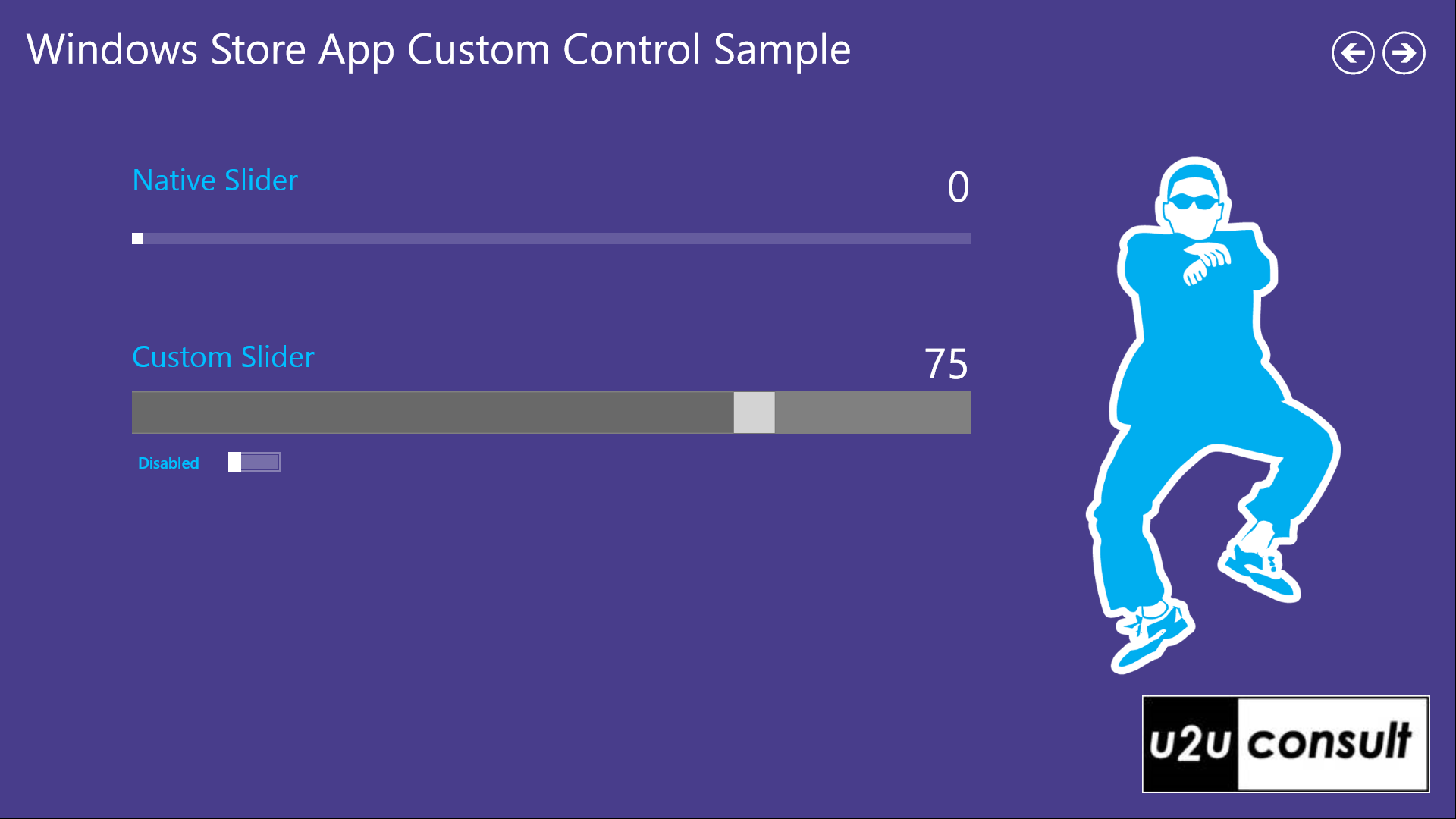
Again, this puts some constraints on the templatability of the control: the designer has to make sure that the visual states that we invoke programmatically exist in the overridden style. Again we as developer can document these constraints by decorating the class with TemplateVisualState attributes:
[TemplateVisualState(Name = "Normal", GroupName = "CommonStates")]
[TemplateVisualState(Name = "Disabled", GroupName = "CommonStates")]
public sealed class Slider : Control
{
   // ...
}
Templating
The style in the generic.xaml is just a default style. It can be completely overridden, as long as the TemplatePart and VisualState constraints are respected. Here’s an example of how to give the default slider a brand new jacket:
<cc:Slider>
    <cc:Slider.Template>
        <ControlTemplate TargetType="cc:Slider">
            <Grid>
                <Border Height="80"
                        VerticalAlignment="Stretch"
                        Background="Transparent" />
                <Line VerticalAlignment="Center"
                        X1="0"
                        Y1="0"
                        X2="3000"
                        Y2="0"
                        StrokeThickness="7"
                        Stroke="White"
                        StrokeDashArray="1" />
                <Canvas Margin="0"
                        Height="80">
                    <Rectangle x:Name="PART_Rectangle"
                                Height="12"
                                Canvas.Top="34"
                                Fill="DarkSlateBlue" />
                    <Thumb x:Name="PART_Thumb"
                            Width="80"
                            Height="80">
                        <Thumb.Template>
                            <ControlTemplate>
                                <Image Source="Assets/Pacman.png"
                                        Height="80" />
                            </ControlTemplate>
                        </Thumb.Template>
                    </Thumb>
                </Canvas>
            </Grid>
        </ControlTemplate>
    </cc:Slider.Template>
</cc:Slider>
Here’s how it looks like:
Events
To add an event to your control, just declare it and raise it at the appropriate time. I have decorated the slider with an event ‘BoundHit’ that is raised when the value hits minimum or maximum:
public event EventHandler BoundHit;

private void OnBoundHit(EventArgs e)
{
    if (this.BoundHit != null)
    {
        this.BoundHit(this, e);
    }
}

private void Thumb_DragDelta(object sender, DragDeltaEventArgs e)
{
    // ...
    this.OnBoundHit(EventArgs.Empty);
    // ...
}
The page that hosts the slider can now react to it:
<cc:Slider BoundHit="ccSlider_BoundHit" />
This is what it does in the attached sample project:
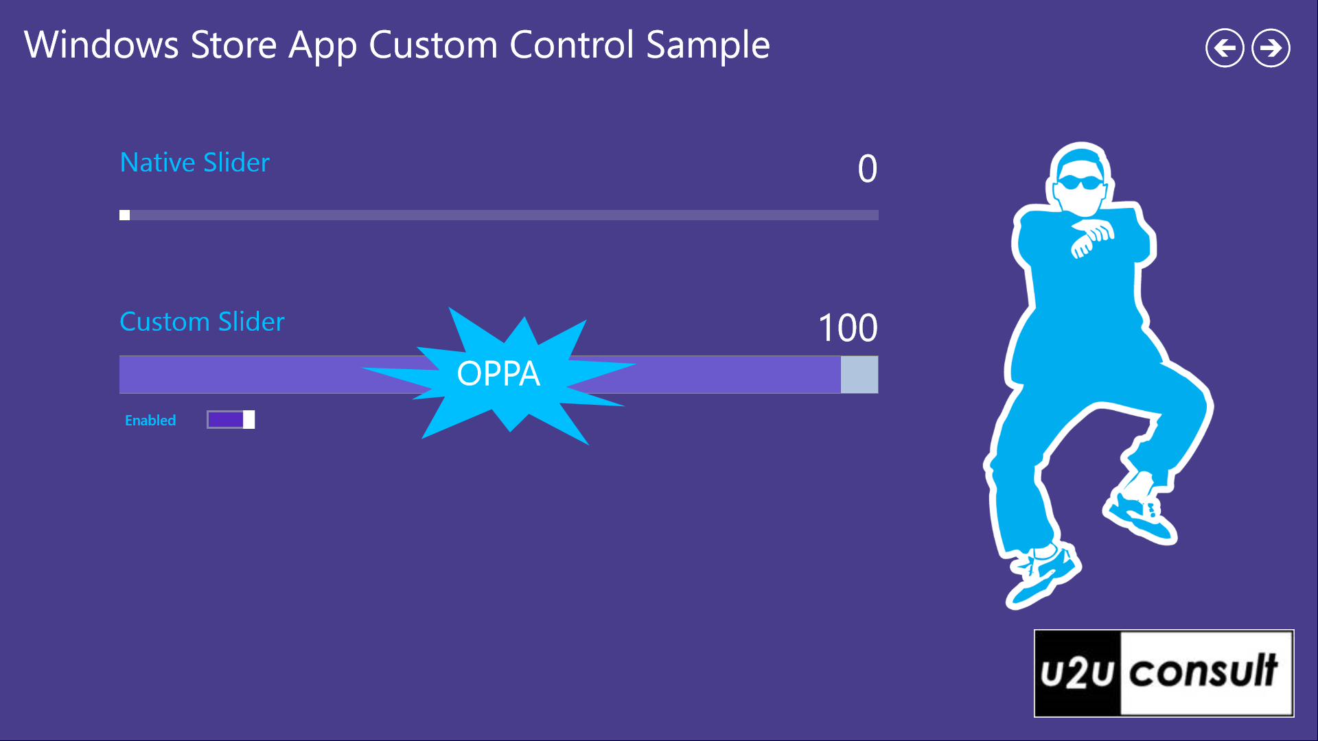
Admit it: you never saw a slider do this ;-)
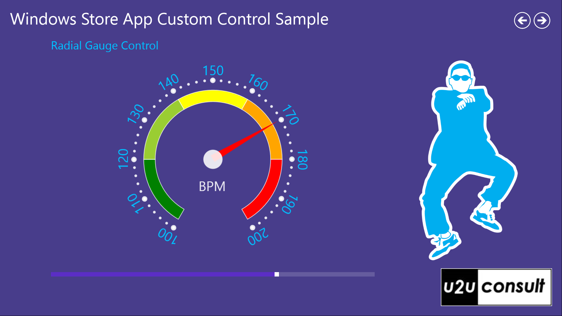
From Slider to Gauge
This is basically all you need to know to roll your own custom controls. If you don’t believe me, feel free to dive into the attached source code of the following Radial Gauge control. It’s a new version of a control I built some months ago: you find its story here. Since then the .NET framework improved and so did my code. Now the radial gauge may be a bit more complex than the slider: there are some animations and converters involved. But apart from that, it only contains stuff we covered in this article: a default style in generic.xaml, an override of OnApplyTemplate, and a TemplatePart - no visual states. Functionally all that a radial gauge does is rotating a needle when its value changes. That basically makes it a templated … slider. Anyway if you’re looking for a basic radial gauge with a color scale, here you have one:
Alternatives
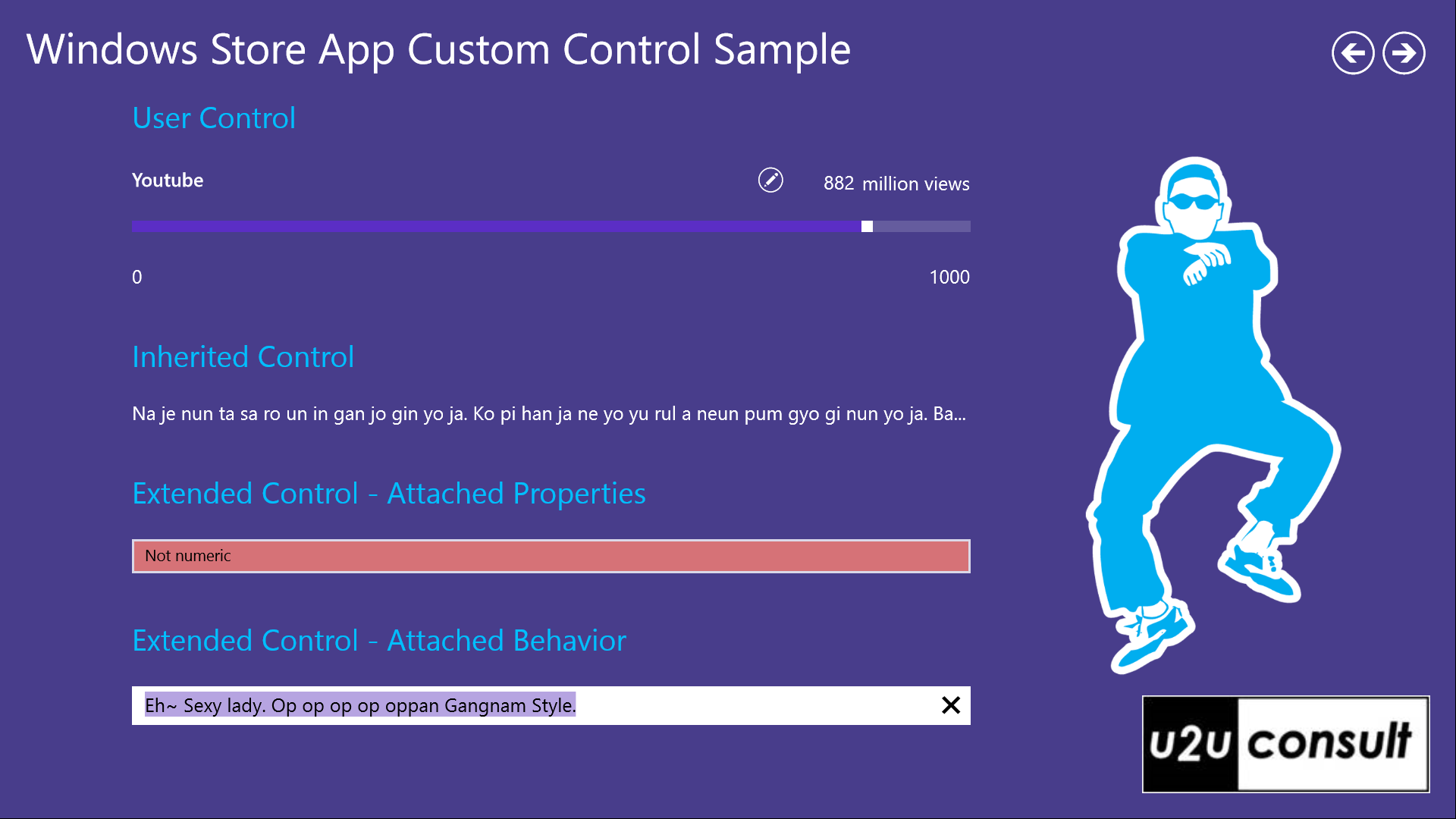
User Controls
Custom controls are the most powerful controls to build, although not always the most developer-friendly: you don’t have support from Visual Studio’s designer when defining the style. Fortunately this is not the case with User Controls. For more details, check my previous blog item.
Derived Controls
Another alternative is to create a Derived Control, by creating a subclass of an existing control. You can then add properties, methods, and events at will, or override some of its methods. You find examples of derived controls in the Callisto framework. Among other useful controls, that framework contains the DynamicTextBlock control, a textblock that does trimming at word boundary. It inherits from ContentControl:
public class DynamicTextBlock : ContentControl
{
    // ...
}
Another example of a derived control can be found in the WinRT XAML Toolkit: the WatermarkTextBox inherits from the native TextBox, and adds a watermark.
Extended Controls
Using Attached Properties, you can add extra properties to existing instances, e.g. of controls. This allows you to create new controls without defining control subclasses. Again Callisto as well as WinRt XAML Toolkit have examples of such extensions. You’ll remember the TextBoxValidationExtensions from my blog post on input validation. These extensions allow you to add validation logic to a native textbox:
<TextBox ext:TextBoxValidationExtensions.Format="NonEmptyNumeric"
            ext:TextBoxValidationExtensions.InvalidBrush="Salmon" />
You can take the concept of attached properties one step further to create a Behavior, like the ‘select-all-on-focus’ from another previous blog post:
<TextBox Text="Eh~ Sexy lady. Op op op op oppan Gangnam Style.">
    <WinRtBehaviors:Interaction.Behaviors>
        <local:SelectAllOnFocusBehavior SelectAllOnFocus="True" />
    </WinRtBehaviors:Interaction.Behaviors>
</TextBox>
The attached solution contains the source code for all mentioned alternative controls. Here’s how the corresponding sample page looks like:
Code Code Code
Here’s the full source code of all the featured controls in this article (o, and a free forward-button style). It was written in Visual Studio 2012 Ultimate, without SP1: U2UConsult.CustomControls.Sample.zip (256.78 kb).
Enjoy!
Diederik