Lots of Windows 8.1 Store Apps come with a page that shows a list of items that have commands attached to them (like edit, copy, and delete). This article describes how to bind the command bar experience of this type of screen to the capabilities of the device. I created a Windows 8.1 XAML MVVM-style sample app that detects the presence of a mouse and/or a touch screen, and then decides to display the commands that are specific to an item in one of three ways:
- inside the item that has the mouse, or
- inside the item that is selected, or
- in the main bottom app bar.
Here’s how the app looks like. For testing purposes, it allows to change the input mode at runtime:
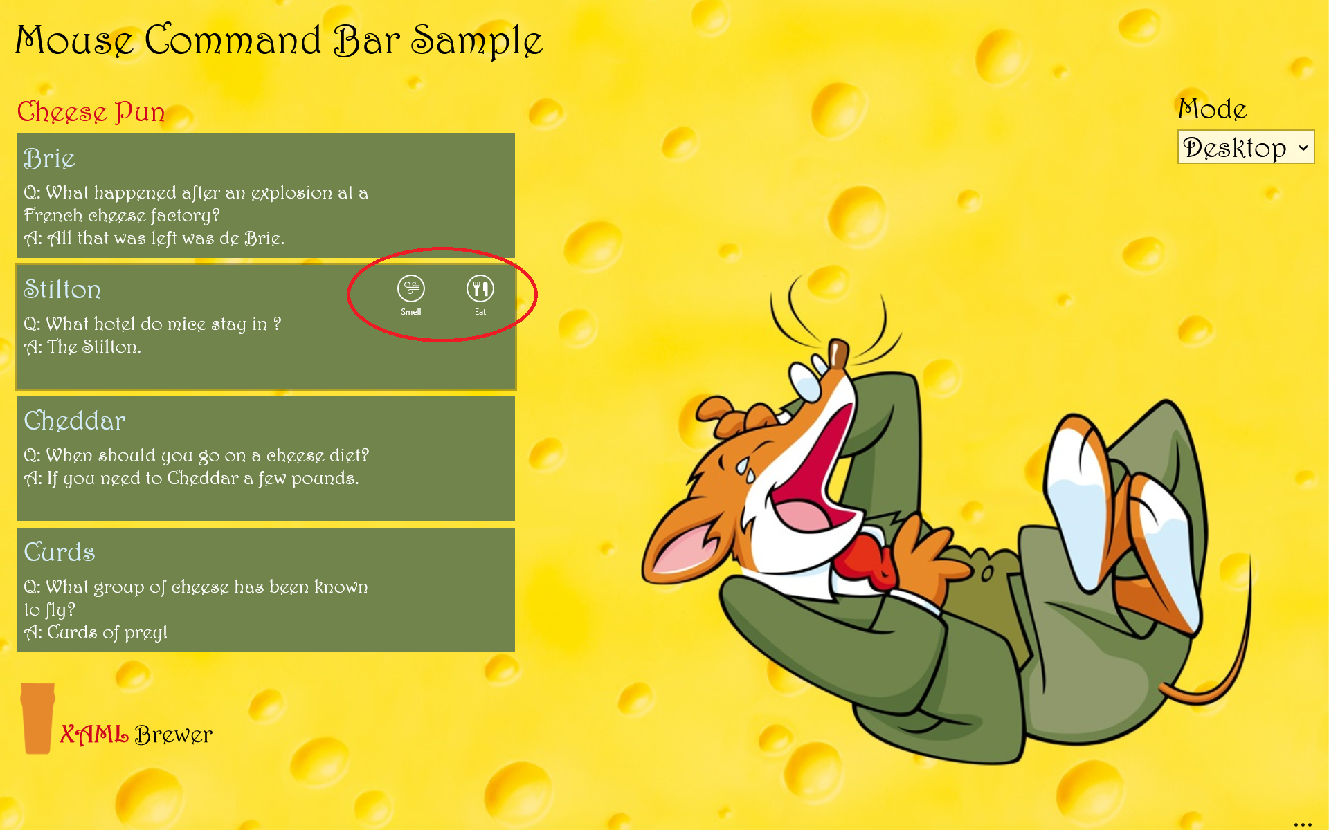
According to the Store App user interface guidance, we should always display such action commands in the bottom app bar (and navigation commands at the top). That what I always did in my apps … well … until users started to complain. The “Touch First” principle has always been one of the main drivers of the Store app UI experience. In reality, the vast majority of PC’s that run these apps still has NO touch screen, and the mouse is the main input device. Here’s the standard workflow for editing a listview item using the mouse in a touch-first environment:
- Select the item,
- assume the presence of a bottom app bar with related commands (not obvious for users that don’t use the Modern UI on a daily basis),
- open the command bar (e.g. by right clicking),
- click the corresponding app bar button (which on a large screen can be VERY far away from the item you selected), and finally
- explicitly close the app bar again (e.g. by clicking somewhere on the page). Clicking another item doesn’t select that item, but it closes the app bar. Confusing.
Here’s that same scenario in Microsoft’s standard Mail app:
- Hover with the mouse over an item, and
- click on the inline button. Done.
I think it’s clear that non-touch users would prefer the latter scenario. Here’s how this looks like in the Mail app:
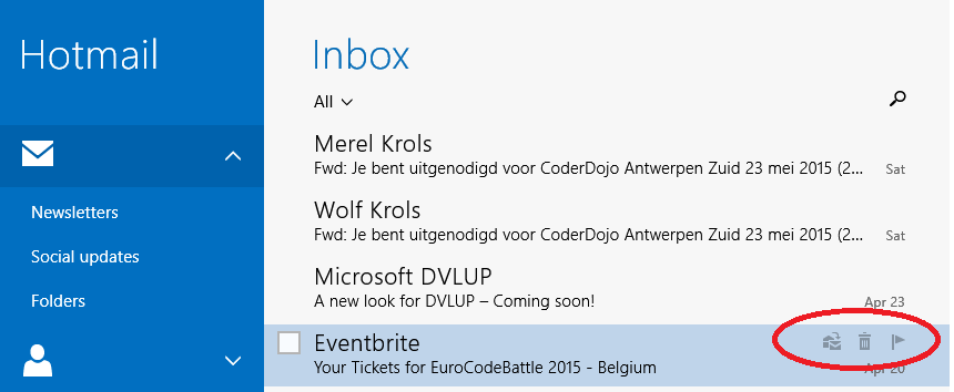
In touch mode, the inline buttons don’t appear, instead they appear in the ‘classic’ bottom app bar:
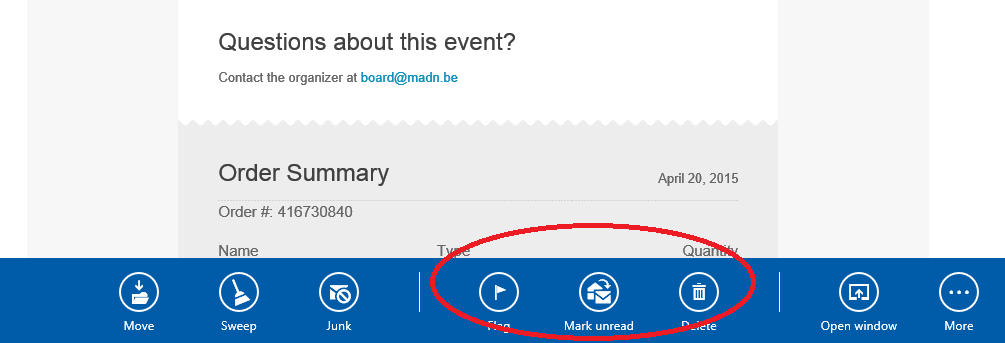
The presence of that app bar is indicated by a hint at the bottom of the screen (it’s actually more than a hint: if you click or tap on the ellipsis, the app bar opens):

This is one of the UI elements that has become a standard in my own apps. If you want one in your own app, just install the AppBarHint control by Dave Smits. Here’s how to use that control in XAML - just place it at the bottom. The control will lookup the app bar, and link to it:
<Grid>
    <!— Main UI ... -->

    <!-- AppBar Hint -->
    <local:CollapsedAppBar VerticalAlignment="Bottom"
                           Grid.RowSpan="10"
                           Grid.ColumnSpan="10" />
</Grid>
The Mail app experience inspired me to create some components to enhance the user experience –based on the device’s capabilities- for Windows 8.1 Store app pages that are built around a list of items.
Device Capabilities
Let’s start with an enumeration for the input modes:
public enum InputMode
{
    Desktop,
    TouchEnabled,
    TouchOptimized
}
Basically Desktop means ‘no touch screen detected’, TouchOptimized means ‘no mouse detected’, and TouchEnabled covers all other scenarios. The Device class exposes the input mode – in an MVVM architecture it would be part of a service. The initial input mode is detected automatically, based on calls to members in the Windows.Devices.Input namespace. It can be overridden by the user at any time, that’s why it comes as a Singleton with property change notification:
class Device : BindableBase
{
    private readonly static Device _instance;
    private InputMode _inputMode;

    /// <summary>
    /// Represents the device and its capabilities.
    /// </summary>
    static Device()
    {
        _instance = new Device();

        // No touch -> Desktop
        if (new Windows.Devices.Input.TouchCapabilities().TouchPresent == 0)
        {
            _instance._inputMode = InputMode.Desktop;
            return;
        }

        // No mouse -> Touch Optimized
        if (new Windows.Devices.Input.MouseCapabilities().MousePresent == 0)
        {
            _instance._inputMode = InputMode.TouchOptimized;
            return;
        }

        // Otherwise -> Touch Enabled
        _instance._inputMode = InputMode.TouchEnabled;
    }

    public static Device Instance
    {
        get { return _instance; }
    }

    public InputMode InputMode
    {
        get { return this._inputMode; }
        set { this.SetProperty(ref this._inputMode, value); }
    }
}
To make the input mode available to all view models in the app, we place it in the ViewModelBase base class:
class ViewModelBase : BindableBase
{
    public InputMode InputMode
    {
        get { return Device.Instance.InputMode; }
        set
        {
            Device.Instance.InputMode = value;
            this.OnPropertyChanged("InputMode");
        }
    }
}
Let’s start with the implementation of the different behaviors.
Desktop Mode
First comes Desktop mode, where the item specific commands are represented by app bar buttons in the item template. The buttons appear on the item on which the mouse hovers – without the need for actually selecting the item itself:

To deal with the hovering aspect, we introduce a HasPointer property. It’s in a base class for all viewmodels that represent an item. The property will only become true when the item has the mouse focus, but only in Desktop mode. That’s the only mode in which we are sure that the PointerEntered and PointerExited events that trigger the value change, are generated by the mouse. In touch or pen mode the exact same events are triggered, and unfortunately there’s no way to detect the source of the events: touch, pen, mouse, or other. In touch mode, the HasPointer property would create a very confusing behavior: when the user slides into an item the command buttons would appear. But when he lifts his finger to tap one of the buttons, the PointerExited event would fire and they would disappear. The same happens when an item is selected by touch or pen: both PointerEntered and PointerExited events would fire (well: PointerEntered only when the device detects a move), and the command bar will just briefly flash.
Here’s ItemViewModelBase class, hosting the HasPointer implementation:
/// <summary>
/// Base class for viewmodels that represent an item in a list.
/// </summary>
class ItemViewModelBase : ViewModelBase
{
    private bool hasPointer = false;

    // ... (other stuff)

    public bool HasPointer
    {
        get { return this.hasPointer; }
        set
        {
            // Property is only active in Desktop mode.
            if (this.InputMode == Services.InputMode.Desktop)
            {
                this.SetProperty(ref this.hasPointer, value);
            }
        }
    }
}
Here’s the XAML definition of the inline command bar. It’s using standard app bar buttons in a stackpanel of which the visibility is bound to the HasPointer property:
<ListView.ItemTemplate>
    <DataTemplate>
        <!-- ... (more stuff) -->
            <StackPanel Visibility="{Binding HasPointer, Converter={StaticResource BooleanToVisibilityConverter}}">
                <AppBarButton Label="Smell"
                                Command="{Binding SmellCommand}"
                                RequestedTheme="Dark">
                </AppBarButton>
                <AppBarButton Label="Eat"
                                Command="{Binding EatComand}"
                                RequestedTheme="Dark">
                </AppBarButton>
            </StackPanel>
        <!-- ... (more stuff) -->
    </DataTemplate>
</ListView.ItemTemplate>
The HasPointer property is changed by the view through a behavior:
<ListView.ItemTemplate>
    <DataTemplate>
        <Grid>
        <!-- ... (again more stuff) -->
            <i:Interaction.Behaviors>
                <core:EventTriggerBehavior EventName="PointerEntered">
                    <core:ChangePropertyAction PropertyName="HasPointer"
                                                Value="True"
                                                TargetObject="{Binding}" />
                </core:EventTriggerBehavior>
                <core:EventTriggerBehavior EventName="PointerExited">
                    <core:ChangePropertyAction PropertyName="HasPointer"
                                                Value="False"
                                                TargetObject="{Binding}" />
                </core:EventTriggerBehavior>
            </i:Interaction.Behaviors>
        </Grid>
    </DataTemplate>
</ListView.ItemTemplate>
For Visual Studio 2013, this implies that you need to install the Behaviors SDK through the Extensions menu, and add a reference to it:
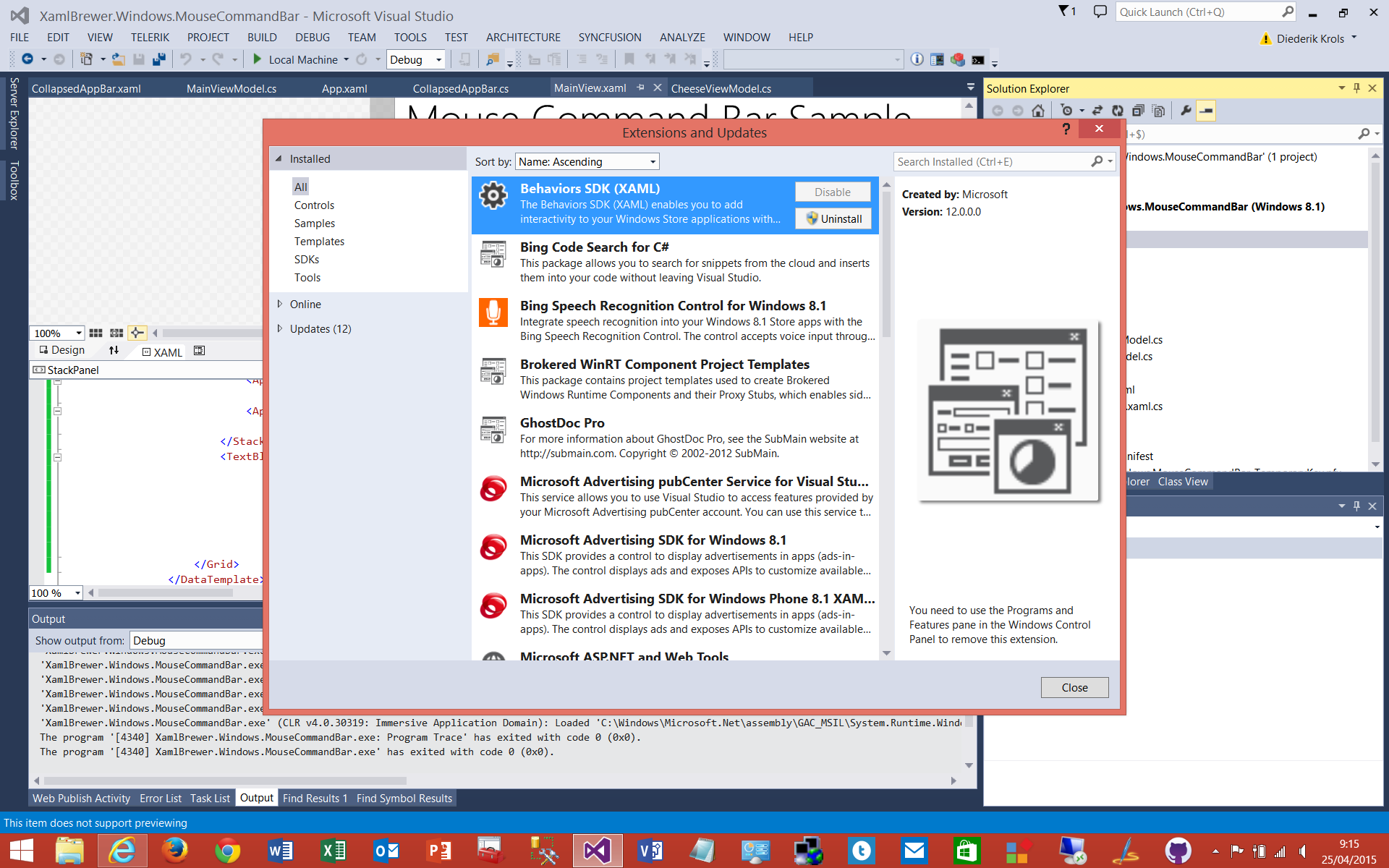
Visual Studio 2015 RC does not require a separate install: the SDK comes with the Visual Studio/Blend package.
For the sake of completeness: Desktop mode can probably also be implemented using a PointerOver visual state.
TouchEnabled Mode
The second input mode is TouchEnabled. In this mode, the item specific commands still appear still appear inside the item template, but only in the selected item:
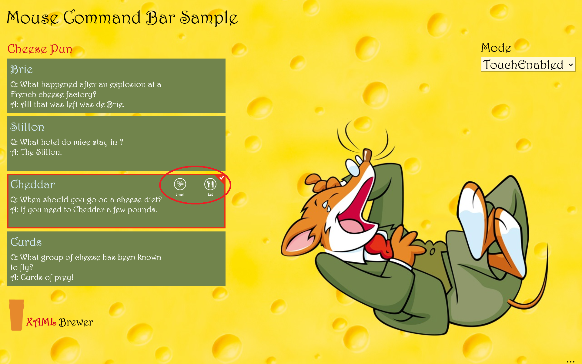
The notion of having an item selected (HasSelection) and the SelectedItem itself, are implemented ListViewModelBase<T>, a generic base class for the viewmodels that represent a list. When the selection changes, the previous item is unselected (if there was one), the new item is selected (if there is one), and all bindings to HasSelection are updated:
class ListViewModelBase<T> : ViewModelBase where T : ItemViewModelBase
{
    private T selectedItem;

    public T SelectedItem
    {
        get { return this.selectedItem; }
        set
        {
            if (this.selectedItem != null)
            {
                this.selectedItem.IsSelected = false;
            }

            this.SetProperty(ref this.selectedItem, value);

            if (this.selectedItem != null)
            {
                this.selectedItem.IsSelected = true;
            }

            this.OnPropertyChanged("HasSelection");
        }
    }

    public bool HasSelection
    {
        get { return this.selectedItem != null; }
    }
}
In the view, the selected item of the listview is two-way bound to the one in the viewmodel:
<ListView SelectedItem="{Binding SelectedItem, Mode=TwoWay}">
    <!-- (all the rest) -->
</ListView>
The item itself comes with an IsSelected property, again in the ItemViewModelBase class. When an item is selected in TouchEnabled mode, it updates the HasPointer property, and the inline commands become visible:
public bool IsSelected
{
    get { return this.isSelected; }
    set
    {
        this.SetProperty(ref this.isSelected, value);
        // Update HasPointer if in TouchEnabled mode.
        if (this.InputMode == Services.InputMode.TouchEnabled)
        {
            this.hasPointer = value;
            this.OnPropertyChanged("HasPointer");
        }
    }
}
TouchOptimized Mode
Let’s move on to the third input mode: TouchOptimized is chosen when no mouse is detected. In this mode we stick to the prescribed UI: an app bar at the bottom of the page:
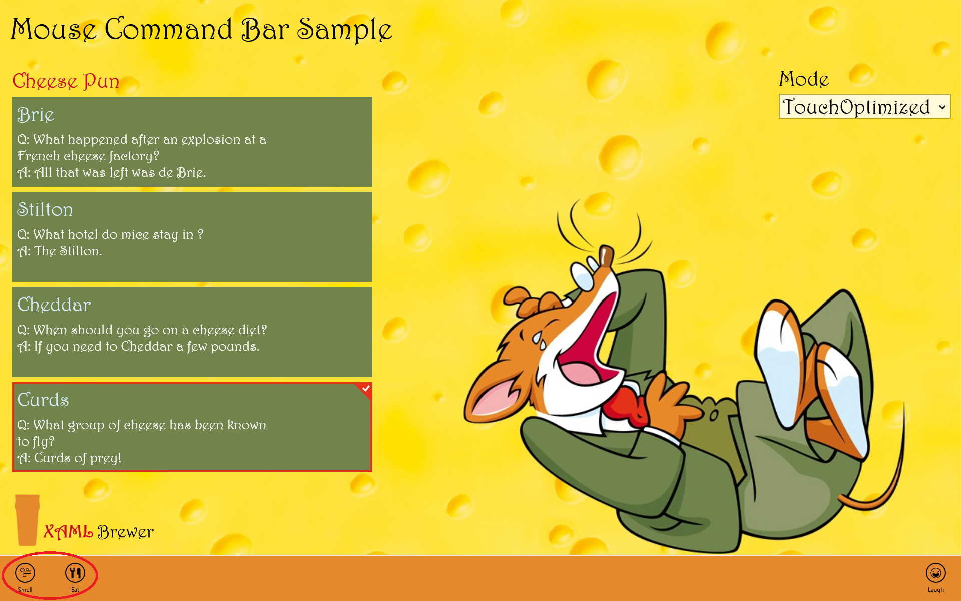
The item specific commands are part of the standard bottom app bar, but only appear in TouchEnabled mode, and only when there’s an item selected. For the implementation we cannot use a PrimaryCommands or SecondaryCommands element here, because these elements don’t have a Visibility property. So we have to help ourselves with some good old stack panels:
<StackPanel Orientation="Horizontal"
            Visibility="{Binding InputMode, Converter={StaticResource EnumToVisibilityConverter}, ConverterParameter='TouchOptimized'}">
    <StackPanel Orientation="Horizontal"
                Visibility="{Binding HasSelection, Converter={StaticResource BooleanToVisibilityConverter}}">
        <!-- AppBarButtons ... -->
    </StackPanel>
</StackPanel>
When the odds are high that the user is going to execute a command after he selected an item, then it makes sense to automatically open the command bar for him. That’s something that the view can handle:
<ListView SelectionChanged="CheesePlate_SelectionChanged">
  <!-- ... -->
</ListView>
When an item is selected we open the bottom app bar, and make it sticky. When the user taps on another item, the app bar remains open. In the standard (non-sticky) mode, when the user taps another item that item is not selected, but the tap event is wasted to close the app bar. I can assure you: most users don’t like that! Alternatively you could close the app bar using a timer. Anyway, here’s the event handler that opens and closes the bottom app bar:
private void CheesePlate_SelectionChanged(object sender, SelectionChangedEventArgs e)
{
    if (Device.Instance.InputMode == InputMode.TouchOptimized && e.AddedItems.Count == 1)
    {
        this.BottomAppBar.IsOpen = true;
        this.BottomAppBar.IsSticky = true;
    }
    else
    {
        this.BottomAppBar.IsOpen = false;
    }
}
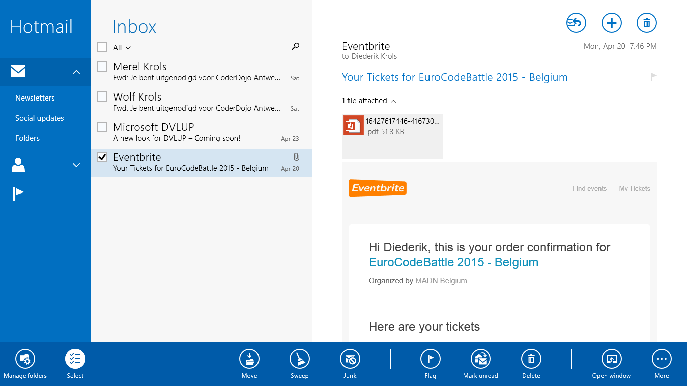
By the way, the Mail app uses yet another approach. When you tap a message, it is highlighted, but the command bar remains closed:
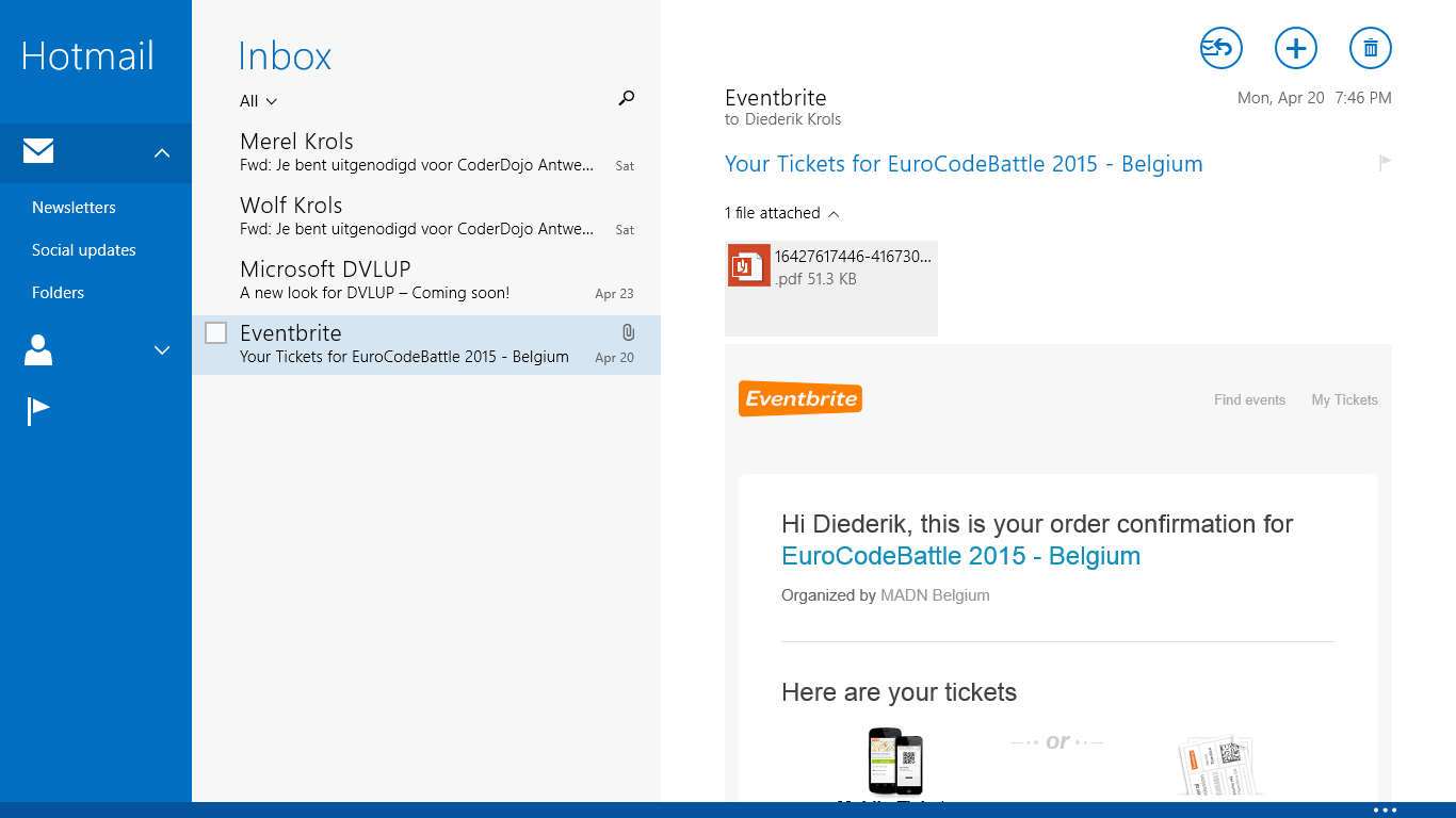
When you tap the check box in the item template, the command bar pops open:
As you see, there are a lot of options available to make the manipulation of a list of items more user friendly, based on the capabilities of the device. I focused on techniques that can be implemented easily in existing Windows 8.1 Store apps: all code is in the views and in high level framework classes.
The sample app is available on GitHub. It was built using Visual Studio 2013 Update 4 and Visual Studio 2015 RC (yes: the solution and project files are interchangeable).
Enjoy,
XAML Brewer