Sometimes we need to decorate our WPF or Silverlight applications with things like bar charts or pie charts. There's no need to create these from scratch, since a lot of charting solutions are available, some of which are free while other are ... less free. On CodePlex you find the Silverlight Toolkit and the WPF Toolkit. The charting controls of these toolkits share the same object model -well, they actually have even the same source code. Programming against these controls is easy, but you should revisit your source code after each release. It's fast moving beta software, but fortunately it's moving in the right direction: some of the components will eventually become part of the .NET 4.x framework. In their current implementation, the charting controls behave maturely at run time, but at design time you might encounter some issues. Don't worry too much about these: it's safe to simply ignore most of the XAML warnings and errors.
The Chart class allows you to build the following chart types:
- Bar Chart
- Column Chart
- Line Chart
- Pie Chart
- Scatter Chart
- Bubble Chart
- Area Chart
- Tree Map
Examples of each chart can be found here.
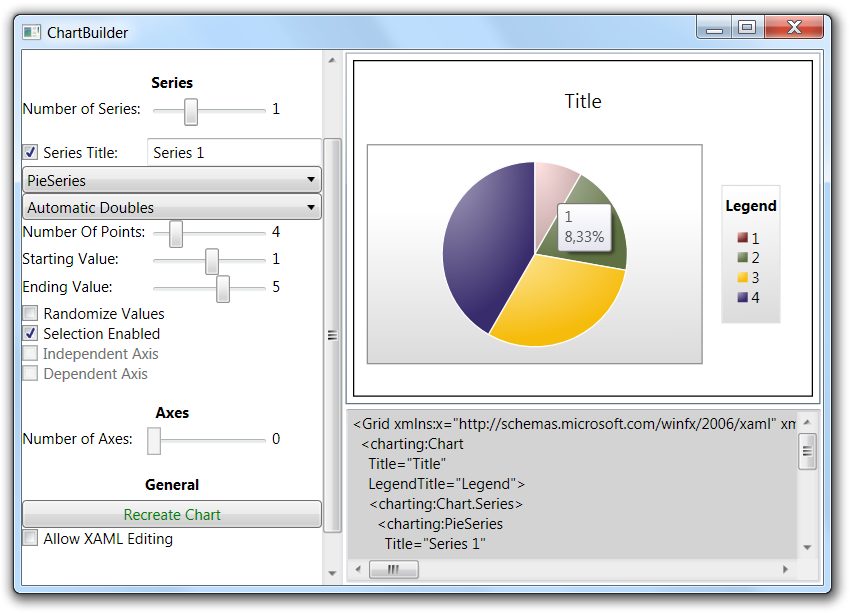
The fastest way to explore the charting controls is through the Chart Builder project. It's a wizard that allows you to generate the XAML for simple charts. Here's how it looks like:

Your next step would be to download the Data Visualizations Demo solution to figure out how more sophisticated charts can be generated. From then on, regularly check Delay's Blog to keep in touch with the latest developments.
Let's get our hands dirty and build two small samples.
1. Building a Pareto Chart in XAML
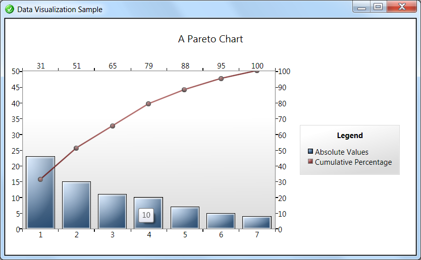
A Chart Control instance is not much more than a container for data series and axes. So it's easy to build combined charts like a standard Pareto chart. A standard Pareto chart combines a column chart displaying absolute values with a line chart representing the cumulative percentage, like this one:

A chart like this will certainly impress your end user! The corresponding XAML is amazingly straightforward. It's a chart with a column series and a line series that share the same X-axis. I'm just going to just let the XAML speak for itself:
<Window x:Class="U2UConsult.DockOfTheBay.ParetoChartWindow"
xmlns="http://schemas.microsoft.com/winfx/2006/xaml/presentation"
xmlns:x="http://schemas.microsoft.com/winfx/2006/xaml"
xmlns:sys="clr-namespace:System;assembly=mscorlib"
xmlns:collections="clr-namespace:System.Collections;assembly=mscorlib"
xmlns:charting="clr-namespace:System.Windows.Controls.DataVisualization.Charting;assembly=System.Windows.Controls.DataVisualization.Toolkit"
Title="Data Visualization Sample"
Icon="/DataVisualizationSample;component/dotbay.png">
<Grid>
<!-- Pareto Chart -->
<charting:Chart
Title="A Pareto Chart"
LegendTitle="Legend" >
<!-- Common X axis -->
<charting:Chart.Axes>
<charting:CategoryAxis Orientation="X" />
</charting:Chart.Axes>
<charting:Chart.Series>
<!-- Column series with absolute values -->
<charting:ColumnSeries Title="Absolute Values">
<!-- Y axis on the left side -->
<charting:ColumnSeries.DependentRangeAxis>
<charting:LinearAxis
Orientation="Y"
Minimum="0"
Maximum="50"
Location="Left" />
</charting:ColumnSeries.DependentRangeAxis>
<!-- Data -->
<charting:ColumnSeries.ItemsSource>
<collections:ArrayList>
<sys:Double>23</sys:Double>
<sys:Double>15</sys:Double>
<sys:Double>11</sys:Double>
<sys:Double>10</sys:Double>
<sys:Double>7</sys:Double>
<sys:Double>5</sys:Double>
<sys:Double>4</sys:Double>
</collections:ArrayList>
</charting:ColumnSeries.ItemsSource>
</charting:ColumnSeries>
<!-- Line series with cumulative percentage -->
<charting:LineSeries
Title="Cumulative Percentage"
IndependentValueBinding="{Binding}" >
<!-- Y axis on the right side -->
<charting:LineSeries.DependentRangeAxis>
<charting:LinearAxis
Orientation="Y"
Minimum="0"
Maximum="100"
Location="Right" />
</charting:LineSeries.DependentRangeAxis>
<!-- X axis reuses the same categories -->
<charting:LineSeries.IndependentAxis>
<charting:CategoryAxis
Orientation="X" />
</charting:LineSeries.IndependentAxis>
<!-- Data -->
<charting:LineSeries.ItemsSource>
<collections:ArrayList>
<sys:Double>31</sys:Double>
<sys:Double>51</sys:Double>
<sys:Double>65</sys:Double>
<sys:Double>79</sys:Double>
<sys:Double>88</sys:Double>
<sys:Double>95</sys:Double>
<sys:Double>100</sys:Double>
</collections:ArrayList>
</charting:LineSeries.ItemsSource>
</charting:LineSeries>
</charting:Chart.Series>
</charting:Chart>
</Grid>
</Window>
2. Building a Bubble Chart
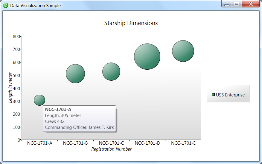
The bubble chart is one of my favorites, because it can easily display 4 values at a time:
- a value on the X axis,
- a value on the Y axis,
- the size of the bubble, and last but not least
- a value in the tooltip.
Here's an example:

For starters, let's build a class with four instance properties, and a static property returning a list:
namespace U2UConsult.DockOfTheBay
{
using System.Collections.Generic;
using System.Collections.ObjectModel;
/// <summary>
/// The starship that boldly went where nobody went before.
/// </summary>
public class Enterprise
{
/// <summary>
/// Gets a collection of all versions of the USS Enterprise.
/// </summary>
public static ObservableCollection<Enterprise> GetAll
{
get
{
return new ObservableCollection<Enterprise>()
{
new Enterprise() {
Name = "NCC-1701-A", Length = 305, CrewSize = 432, CommandingOfficer = "James T. Kirk"
},
new Enterprise() {
Name = "NCC-1701-B", Length = 511, CrewSize = 750, CommandingOfficer = "John Harriman"
},
new Enterprise() {
Name = "NCC-1701-C", Length = 526, CrewSize = 700, CommandingOfficer = "Rachel Garrett"
},
new Enterprise() {
Name = "NCC-1701-D", Length = 642, CrewSize = 1012, CommandingOfficer = "Jean-Luc Picard"
},
new Enterprise() {
Name = "NCC-1701-E", Length = 685, CrewSize = 855, CommandingOfficer = "Morgan Bateson"
}
};
}
}
/// <summary>
/// Gets or sets the registered name.
/// </summary>
public string Name { get; set; }
/// <summary>
/// Gets or sets the number of crew members.
/// </summary>
public int CrewSize { get; set; }
/// <summary>
/// Gets or sets the name of the initial commmanding officer.
/// </summary>
public string CommandingOfficer { get; set; }
/// <summary>
/// Gets or sets the lenght of the ship.
/// </summary>
/// <remarks>Expressed in metric meters.</remarks>
public int Length { get; set; }
}
}
The Lenght, Name, and CrewSize properties are respectively bound through
- a DependentValueBinding (Y axis),
- a IndependentValueBinding (X axis), and
- a SizeValueBinding (size of the bubble).
The initial version of the XAML looks like this:
<Window x:Class="U2UConsult.DockOfTheBay.ChartWindow"
xmlns="http://schemas.microsoft.com/winfx/2006/xaml/presentation"
xmlns:x="http://schemas.microsoft.com/winfx/2006/xaml"
xmlns:sys="clr-namespace:System;assembly=mscorlib"
xmlns:collections="clr-namespace:System.Collections;assembly=mscorlib"
xmlns:charting="clr-namespace:System.Windows.Controls.DataVisualization.Charting;assembly=System.Windows.Controls.DataVisualization.Toolkit"
xmlns:local="clr-namespace:U2UConsult.DockOfTheBay"
Title="Data Visualization Sample"
Icon="/DataVisualizationSample;component/dotbay.png">
<Grid>
<charting:Chart
Title="Starship Dimensions" >
<charting:Chart.Series>
<charting:BubbleSeries
Title="USS Enterprise"
ItemsSource="{x:Static local:Enterprise.GetAll}"
DependentValueBinding="{Binding Length}"
IndependentValueBinding="{Binding Name}"
SizeValueBinding="{Binding CrewSize}" />
</charting:Chart.Series>
<charting:Chart.Axes>
<charting:CategoryAxis
Orientation="X"
Title="Registration Number" />
<charting:LinearAxis
Orientation="Y"
Title="Length in meter"
Maximum="800"
Minimum="0" />
</charting:Chart.Axes>
</charting:Chart>
</Grid>
</Window>
If you also want to let the chart display a fourth property (say CommandingOfficer), then you should customize the template for the bubble itself. Unfortunately this will more than double the codebase. There is no TooltipValueBinding property or a stable style or template to inherit from (yet?). So if you want a customized tooltip then you have to override/duplicate the whole template. The safest option is to boldly copy/paste from the samples. First create a style, e.g. in Grid.Resources:
<Grid.Resources>
<Style
x:Key="CustomBubbleDataPointStyle"
TargetType="charting:BubbleDataPoint" >
<!-- Pretty background brush -->
<Setter Property="Background">
<Setter.Value>
<RadialGradientBrush>
<RadialGradientBrush.RelativeTransform>
<TransformGroup>
<ScaleTransform CenterX="0.5" CenterY="0.5" ScaleX="2.09" ScaleY="1.819"/>
<TranslateTransform X="-0.425" Y="-0.486"/>
</TransformGroup>
</RadialGradientBrush.RelativeTransform>
<GradientStop Color="#FF9DC2B3"/>
<GradientStop Color="#FF1D7554" Offset="1"/>
</RadialGradientBrush>
</Setter.Value>
</Setter>
<!-- Template with custom ToolTip -->
<Setter Property="Template">
<Setter.Value>
<ControlTemplate TargetType="charting:BubbleDataPoint">
<Grid>
<Ellipse
Fill="{TemplateBinding Background}"
Stroke="{TemplateBinding BorderBrush}"
StrokeThickness="{TemplateBinding BorderThickness}"/>
<Ellipse>
<Ellipse.Fill>
<LinearGradientBrush>
<GradientStop
Color="#77ffffff"
Offset="0"/>
<GradientStop
Color="#00ffffff"
Offset="1"/>
</LinearGradientBrush>
</Ellipse.Fill>
</Ellipse>
<ToolTipService.ToolTip>
<StackPanel>
<TextBlock Text="{Binding Name}" FontWeight="Bold" />
<StackPanel Orientation="Horizontal">
<TextBlock Text="Length: " />
<ContentControl Content="{TemplateBinding FormattedDependentValue}"/>
<TextBlock Text=" meter" />
</StackPanel>
<StackPanel Orientation="Horizontal">
<TextBlock Text="Crew: " />
<ContentControl Content="{TemplateBinding Size}"/>
</StackPanel>
<StackPanel Orientation="Horizontal">
<TextBlock Text="Commanding Officer: " />
<TextBlock Text="{Binding CommandingOfficer}"/>
</StackPanel>
</StackPanel>
</ToolTipService.ToolTip>
</Grid>
</ControlTemplate>
</Setter.Value>
</Setter>
</Style>
</Grid.Resources>
To make use of this style, just add this to the chart's properties:
DataPointStyle="{StaticResource CustomBubbleDataPointStyle}"
As you see the charting controls in both WPF and Siverlight toolkits allow you to rapidly embed powerful charting features into your application. To be honest: it actually took me more time to collect sample data than to build these charts .
.