Relationship between house price and income
A few days ago the media reported that Belgium was amongst one of the most expensive European countries to buy a house, if you compare the house price relative to the income. A few days ago I wrote a blog post on how we could analyze the Belgian house market using Microsoft Excel PowerBI and public data from the Belgian federal government (http://statbel.fgov.be). Inspired by the news that the house price relative to the income is an important indicator, let’s try to mimick this research, but then specifically for the Belgian house market.
With PowerPivot one cannot only model data coming from a single data source, it is also easy to combine different data sources into a single model. For this blog post, I took the model made in the previous Belgian house market analysis (with house prices per city) and then looked for a dataset with income information per city.
On http://statbel.fgov.be/nl/modules/publications/statistiques/arbeidsmarkt_levensomstandigheden/Fiscale_inkomens_-_per_gemeente_-_2008.jsp we can get fiscal income per Belgian city in 2008 (unfortunately I’m not aware of more recent public datasets on this). Using PowerQuery we can filter and convert the data such that we the total fiscal income, number of taxpayers and number of inhabitants per city.
Combining the data sets: a risky business
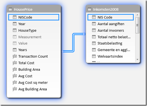
After we loaded this data in the model, we need to setup the proper relationships between the two data sources. Since both data sources are using the same city identifier (NIScode), this link is easily made. However, if we would directly link the table with the house prices per city (which contains a row per city per year per house type per measurement) with the table with the incomes per city (which contains a row per city per year), we can get errors. PowerPivot does not allow many-to-many relationships! In our model it is even worse. Since we currently only loaded data for 2008, we do only have one row per city in the income table. But as soon as we load data for multiple years, our model would become invalid!

The proper way to link data together
Even with a small data set (just 2 tables) as we have in this example, it is already important to stick to some of the core ideas in business intelligence: dimensional modeling. This boils down to splitting up data into dimensions (things you group or filter upon, typically the nouns in the business story) and facts (things you aggregate upon in your reports, typically the verbs in the business story). In our analysis we have two dimensions: Cities and years. So we must create a table with only one row per city (with all the information regarding that city: code, name, county, country), and another with one row per year. Since there is not much more to tell about a year than just its value, we can easily generate the latter table in PowerQuery:
1: let
2: Source = List.Numbers(1990,25),
3: TableFromList = Table.FromList(Source, Splitter.SplitByNothing(), {"Year"}, null, ExtraValues.Error)
4: in
5: TableFromList
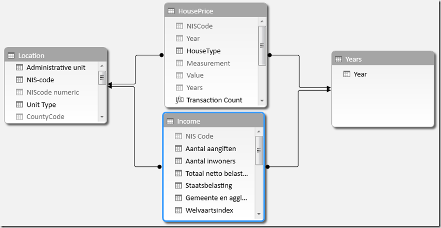
After these tables get created, we can now link them in PowerPivot in this way:

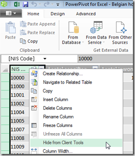
From the perspective of linking the tables, the solution is fine. But we still run the risk that users will for instance grab the Years or NIScode column from either the HousePrice or the income table in one of their reports. This would be problematic, since this would only filter data from the table from which it was choosen, not from the other table. However, if we can force our users to select years only from the Years table and NIScodes only from the Location table, we don’t face this problem, since both our fact tables (HousePrice and Income) are related to both these dimension tables (Years and Location). This can easily be obtained by just hiding these columns in the fact tables:

After we made the model, we can now start defining DAX measures which are calculated over both fact tables. A very interesting one is the average house price expressed in terms of the average income: How many years of average income in a city do people need to spend to buy an average house in that city.
Why Bruges isn’t the most expensive area after all
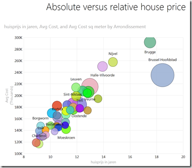
Now we can start building PowerView reports on top of this data. In this way we can for instance see that Bruges is much more expensive than Brussels, but if we express the houseprice in terms of the income of its inhabitants, Bruges becomes cheaper than Brussels:

Download the Excel sheet from my OneDrive, and start building lots of interesting reports on top of this data set! Check out our Excel PowerBI course to learn more about building models and reports in Excel.