This blog post explains the latest features present in the most recent version of our online platform, online.u2u.be, which we, as trainers, fondly refer to as 'U2U Online'. In case you are unfamiliar with U2U Online, it is likely that you have not attended any of our training courses, as that is where the true magic happens.
U2U Online serves as our in-house online learning platform, granting our students access to all the necessary materials linked to their ongoing trainings. This includes theoretical resources, practical exercises, videos, references, general information, and even a group chat to communicate with each other. By exhibiting all these resources in a centralized location, we strive to ensure an optimal user-friendly experience for our students.
To provide context, it is crucial to understand the rationale behind the online learning platform.
Have you ever encountered the Learning Pyramid Model? This model explains various modes of learning and assesses their efficacy in retaining knowledge. Notably, the model differentiates between passive and active learning methods, with the latter exhibiting a higher rate of knowledge retention compared to the former.
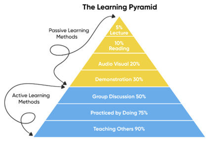
Figure 1: Learning Pyramid : https://www.arlo.co/blog/overview-of-the-learning-pyramid-for-training-providers
While it is imperative to incorporate active learning methods, it is equally important not to disregard the passive learning techniques. A well-rounded training program entails a balance between the two. At U2U, we have carefully combined passive and active learning methods to optimize the learning retention for our students.
Merely providing demonstrations may facilitate a 30 percent recall of the theory, but this alone does not suffice. Therefore, we complement our approach with active learning methods. For instance, we initiate classroom discussions by encouraging participants to share their existing knowledge on the subject matter or by posing thought-provoking questions such as 'What do you think will happen and can you explain why?'.
Furthermore, students are provided ample time to engage in detailed exercises that allow them to put the theory into practice, resulting in a remarkable 75 percent retention rate. As such, it is crucial for us to prioritize a seamless user experience including both theoretical and practical aspects. To this end, we have strived to optimize the user experience by developing and improving our online learning platform, U2U Online.
It has been a few weeks since the implementation of U2U Online V2.1. As is customary with any software program or product, we conducted thorough testing to rectify any remaining minor bugs before unrolling it to the wider audience. Those initial challenges are now behind us, and on behalf of the entire U2U team, Now that those initial challenges are behind us, the entire U2U team is delighted and proud of the result. That's why I'm writing this blog post to walk you through the major differences between V2.0 and V2.1, along with the exciting new features.
Separation of Theory and Labs
Each of our courses consist of modules including both theoretical and practical components. The theory portion involves PowerPoint slides, while the lab segment involves hands-on exercises corresponding to the recently acquired knowledge. In the previous version of U2U Online, theory and labs were combined into a single Word document with numerous pages, requiring considerable scrolling to locate the exercises.
In the newest iteration of U2U Online, we have divided each module into distinct theory and lab sections. Bid farewell to the arduous task of searching for exercise starting points within lengthy documents! Within each module, theory and lab materials are elegantly displayed side by side, facilitating seamless transition between theory and practical applications. Thus, we have successfully resolved Issue 1.

Figure 2: Side by Side rendered Theory and Labs
Enhanced Rendering of Theory Presentations
In U2U Online V2.0, the theory portion of each module comprised screenshots of PowerPoint slides, arranged in a web layout with two slides per page. This approach presented several challenges, such as the inability to click on hyperlinks, copy-paste text, or navigate through subsections smoothly.
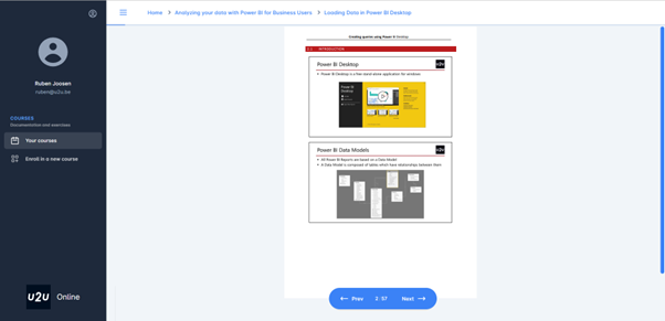
Figure 3: Theory rendering in V2.0 (old)
To rectify these limitations, we now render each slide individually in the new version of U2U Online. Moreover, we have incorporated a subsection navigator on the left-hand side for effortless navigation to specific subsections as needed. With this direct slide rendering approach, interactive features such as hyperlink functionality and text copying are fully enabled.
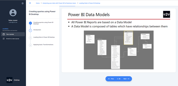
Figure 4: Theory rendering in V2.1 (new)
Enhanced Rendering of Labs
Enhanced Rendering of Labs
Similar to the theory portion, labs were previously rendered within a single Word document comprising multiple pages. Each lab typically encompassed multiple exercises belonging to different subsections, without the ability to navigate between them easily. While it was possible to interact with the text, such as copying specific code snippets, the discrepancy between Word and the rendering engine introduced frustrations in selecting specific text regions.
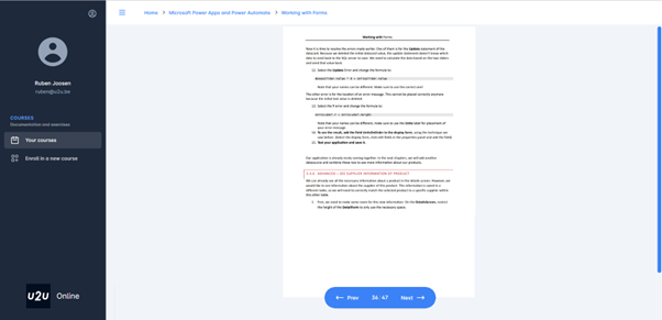
Figure 5: Lab rendering in V2.0 (old)
To address these issues, we now directly render labs within the U2U Online platform, eliminating the need for Word as an intermediate source. We employ Markdown to visualize text, images, and code snippets in a clear format. This approach empowers end-users to interact effortlessly with the exercise materials. Text automatically scales in relation to the available screen space, and each lab subsection is presented as a separate scrollable page, ensuring a coherent visualization of all associated steps. Furthermore, the section navigator allows swift navigation between sections when necessary.
Additionally, lab files associated with a given exercise, such as starter files, resources, and solutions, previously required users to navigate back to the menu, download the files, and then manually find their place in the exercise again. To mitigate this inconvenience, we have incorporated a solution in the new version. At the top of the Section Navigator, users can now directly download lab files associated with the current exercise, eliminating the need to leave the page or lose track of progress. All necessary resources are conveniently accessible from within the current page.
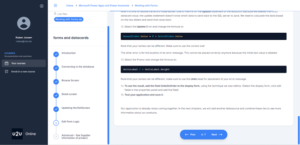
Figure 6: Rendering Labs in V2.1 (new)
Streamlined Evaluations
At the conclusion of each training course, we kindly request that students complete an evaluation form. This valuable feedback allows us to continually enhance our course materials and ensure alignment with student expectations. As a token of appreciation for completing the evaluation, students are granted access to a digital certificate for their course participation.
In U2U Online V2.0, students had to click a link within the course to be redirected to an external webpage for evaluation submission. After completing the evaluation, they needed to manually return to U2U Online to download their certificate, potentially sharing it on social media or saving it as a PDF. However, in U2U Online V2.1, we have integrated the entire evaluation process within the platform itself. There is no longer a need for redirection or returning to U2U Online after submitting the evaluation. The entire process is now centralized.

Figure 7: Evaluations included in V2.1 (new)

Figure 8: Integrated sharing of the obtained certificate in V2.1 (new)
These four improvements constitute the most significant enhancements in U2U Online V2.1. If you haven't explored these features yet, I highly recommend taking a look and experiencing them firsthand. Of course, there is always room for further improvements, and we are actively working on designing V2.2 with additional features that will prove advantageous. Stay tuned for updates on these new features and their anticipated release date.