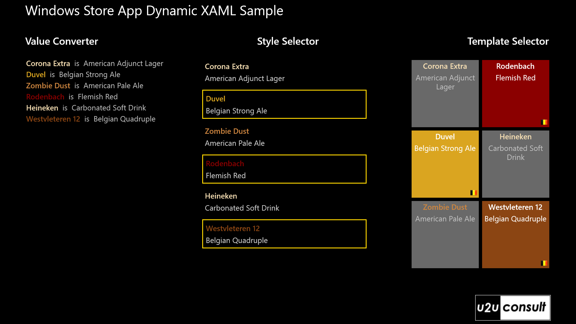
This article describes a couple of techniques that you can apply to dynamically change the look-and-feel of data-bound XAML controls in a Windows 8 Store App. You’ll be introduced to value converters, style selectors, template selectors, and the XamlReader class. I created a light-weight MVVM app that displays a list of beers. Although all items belong to the same class –Beer- they will be displayed differently. Here’s how the sample app looks like:

Using a Value Converter
Dependency properties of a XAML control can be directly bound to properties of the ViewModel. Sometimes a conversion of value and/or data type needs to take place; and that’s exactly what a ValueConverter does. A value converter is a class that implements the IValueConverter interface, with just Convert and ConvertBack functions. Here's an example of a string-to-string converter that translates official beer colors into HTML named colors (the Beer Color Meter app in the Windows Store has a much more advanced version of this):
public class BeerColorConverter : IValueConverter
{
    public object Convert(object value, Type targetType, object parameter, string language)
    {
        switch (value.ToString())
        {
            case "Yellow":
                return "LemonChiffon";
            case "Straw":
                return "Wheat";
            case "Gold":
                return "GoldenRod";
            case "Amber":
            case "LightCopper":
            case "Copper":
                return "Peru";
            case "LightBrown":
                return "Chocolate";
            case "Brown":
                return "Brown";
            case "DarkBrown":
                return "darkRed";
            case "VeryDarkBrown":
                return "SaddleBrown";
            case "Black":
                return "Black";
            default:
                return "Lime";
        }
    }

    public object ConvertBack(object value, Type targetType, object parameter, string language)
    {
        return value;
    }
}
Just define an instance of the converter as a resource:
<Page.Resources>
    <local:BeerColorConverter x:Key="BeerColorConverter" />
</Page.Resources>
And use it in the Binding:
<DataTemplate>
    <TextBlock Foreground="{Binding Color, Converter={StaticResource BeerColorConverter}}"
                FontWeight="SemiBold"
                Margin="2">
            <Run Text="{Binding Name}" />
            <Run Text=" is "
                    Foreground="Silver"
                    FontWeight="Normal" />
            <Run Text="{Binding Category}"
                    Foreground="Silver"
                    FontWeight="Normal" />
    </TextBlock>
</DataTemplate>
Unfortunately the Store App Runtime doesn't ship with MultiBinding, and bindings don't come with a StringFormat option. That restricts the usage of a value converter, at least when compared to WPF. When populating a TextBlock, you can avoid some of these restrictions by cutting it up in individual Run elements.
Using a Style Selector
One way of dynamically styling items in a XAML items control, is with a StyleSelector. This allows you to apply a style for each item in a collection, based on custom logic. This seems to be the only way to create a dynamic style in Metro, due to the absence of DataTriggers. All you need to do is create a subclass of the StyleSelector class and implement the SelectStyleCore method. The bound item is the first parameter, the item's style is the return value. Here's a small example on how to modify the style for a list view item. Belgian beers (category name contains ‘Belgian’ or ‘Flemish’) will be decorated with a golden border:
public class BeerStyleSelector : StyleSelector
{
    protected override Style SelectStyleCore(object item, DependencyObject container)
    {
        Beer beer = item as Beer;

        // Default Style
        if (!(beer.Category.Contains("Belgian") || beer.Category.Contains("Flemish")))
        {
            return null;
        }

        // Custom Style
        Style style = new Style(typeof(ListViewItem));
        style.Setters.Add(new Setter(ListViewItem.BorderBrushProperty, new SolidColorBrush(Colors.Gold)));
        style.Setters.Add(new Setter(ListViewItem.BorderThicknessProperty, new Thickness(2.0)));
        return style;
    }
}
Again, the class containing the logic should be defined as a resource:
<Page.Resources>
    <DataTemplate x:Key="DefaultDataTemplate">
        <StackPanel Background="DimGray"
                    Height="160"
                    Width="160"
                    Margin="4">
            <TextBlock Text="{Binding Name}"
                        Foreground="{Binding Color, Converter={StaticResource BeerColorConverter}}"
                        FontWeight="SemiBold"
                        FontSize="18"
                        HorizontalAlignment="Center"
                        Margin="4" />
            <TextBlock Text="{Binding Category}"
                        Foreground="Silver"
                        FontSize="18"
                        HorizontalAlignment="Center"
                        TextAlignment="Center"
                        TextWrapping="Wrap"
                        Margin="2" />
        </StackPanel>
    </DataTemplate>
    <local:BeerStyleSelector x:Key="BeerStyleSelector" />
</Page.Resources>
You can then assign the ItemContainerStyleSelector to an instance of it:
<ListView ItemsSource="{Binding BelgianBeers}"
            ItemContainerStyleSelector="{StaticResource BeerStyleSelector}">
    <!-- ... -->
</ListView>
When using a Style Selector, you’re restricted to modifying Dependency Properties.
Using a Data Template Selector
With a DataTemplate you can assign a look-and-feel to an item based on its type. Sometimes that’s just not good enough. Using a DataTemplateSelector you can choose or generate a DataTemplate based on the entire data object and its container – not just on its type. To create a template selector, create a class that inherits from DataTemplateSelector and override the SelectTemplateCore method. Once your class is defined you can assign an instance of the class to the template selector property of your element.
The business logic could be as simple a selecting an existing template from a resource, like this.DefaultTemplate in the following code snippet. But the entire template could also be generated on the spot through a XamlReader. This class allows you create a XAML element by concatenating it into a string; in many cases that’s a lot more convenient than talking to the object model in C#. The following code creates a colored stackpanel including a Belgian flag for the Belgian beers, and applies the default template to the rest. It also shows how to use a value converter programmatically:
public class BeerTemplateSelector : DataTemplateSelector
{
    public DataTemplate DefaultTemplate { get; set; }

    protected override DataTemplate SelectTemplateCore(object item, DependencyObject container)
    {
        Beer beer = item as Beer;

        // Default Template
        if (!(beer.Category.Contains("Belgian") || beer.Category.Contains("Flemish")))
        {
            return this.DefaultTemplate;
        }

        // Custom Template
        BeerColorConverter converter = new BeerColorConverter();
        string backGroundColor = converter.Convert((item as Beer).Color, null, null, null).ToString();

        string template = @"
            <DataTemplate xmlns='http://schemas.microsoft.com/winfx/2006/xaml/presentation'>
                <Grid Background='" + backGroundColor + @"' Width='160' Height='160' Margin='4'>
                    <StackPanel>
                        <TextBlock Text='{Binding Name}' FontWeight='SemiBold' FontSize='18' Margin='4' Foreground='White' HorizontalAlignment='Center' />
                        <TextBlock Text='{Binding Category}' Margin='2' FontSize='18' Foreground='White' HorizontalAlignment='Center' />
                    </StackPanel>
                        <Image Source='../Assets/belgianFlag.png' Margin='4' HorizontalAlignment='Right' Stretch='None' VerticalAlignment='Bottom' />
                </Grid>
            </DataTemplate>";
        return XamlReader.Load(template) as DataTemplate;
    }
}
Again, register the class containing the logic as a resource:
<Page.Resources>
    <local:BeerTemplateSelector x:Key="BeerTemplateSelector"
                                DefaultTemplate="{StaticResource DefaultDataTemplate}" />
</Page.Resources>
Then use an instance as ItemTemplateSelector:
<ItemsControl ItemsSource="{Binding BelgianBeers}"
                ItemTemplateSelector="{StaticResource BeerTemplateSelector}">
    <!-- ... -->
</ItemsControl>
Source Code
Here’s the sample project, it was written with Visual Studio 2012 Express Edition: U2UConsult.Win8.DynamicXaml.zip (89.56 kb)
Enjoy!
Diederik