The SplitView is a new XAML control that provides a top-level navigation service to apps that target the Universal Windows 10 Platform (UWP). It’s an empty container with room for two views:
- The Pane hosts the menu items. It can be docked to the left or to the right. It can be opened to its full width (displaying icons and labels), entirely collapsed, or collapsed to a compact mode (displaying only icons). This is controlled through the DisplayMode and IsPaneOpen properties.
- The Content displays the main content of your page. It is always shown, but can be partly covered by the Pane.
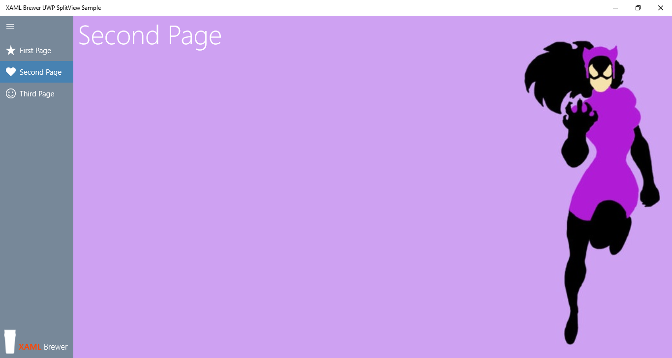
I built a sample app that contains several pages, and uses a menu-like SplitView to navigate between these. The SplitView pane can also host non-navigational menu items. Here’s how the sample app looks like:
Here is the project’s as-light-as-possible MVVM structure:
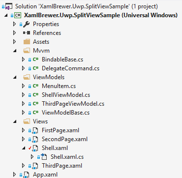
Main Page Structure
The app’s start-up page is just a Shell, so that’s how it’s called - like in classic Prism. It has a SplitView with the menu infrastructure in its Pane, and an empty Frame as its Content to provide navigation support between the app’s pages. Here’s how the basic XAML looks like:
<SplitView x:Name="MySplitView"
            IsPaneOpen="False"
            CompactPaneLength="40"
            OpenPaneLength="150"
            PaneBackground="{StaticResource JustOneShadeOfGray}"
            DisplayMode="Overlay">
    <SplitView.Pane>
        <Grid x:Name="SplitViewPane"
              VerticalAlignment="Stretch"
              HorizontalAlignment="Stretch"
              Background="{StaticResource JustOneShadeOfGray}">
            <ListView ItemsSource="{Binding Menu}"
                      SelectionChanged="Menu_SelectionChanged"
                      Margin="0 48 0 0"
                      VerticalAlignment="Top">
            </ListView>
        </Grid>
    </SplitView.Pane>
    <SplitView.Content>
        <Grid>
            <Frame x:Name="SplitViewFrame">
            </Frame>
        </Grid>
    </SplitView.Content>
</SplitView>
Menu Layout
I created a little helper class for menu items, with Label, Glyph, DestinationType (for navigational items), and Command (for other items) properties:
class MenuItem : BindableBase
{
    private string glyph;
    private string text;
    private DelegateCommand command;
    private Type navigationDestination;

    public string Glyph
    {
        get { return glyph; }
        set { SetProperty(ref glyph, value); }
    }

    public string Text
    {
        get { return text; }
        set { SetProperty(ref text, value); }
    }

    public ICommand Command
    {
        get { return command; }
        set { SetProperty(ref command, (DelegateCommand)value); }
    }

    public Type NavigationDestination
    {
        get { return navigationDestination; }
        set { SetProperty(ref navigationDestination, value); }
    }

    public bool IsNavigation
    {
        get { return navigationDestination != null; }
    }
}
To display these menu items, I'm using a ListView with a DataTemplate that looks nice in both full and compact state:
<ListView.ItemTemplate>
    <DataTemplate>
        <StackPanel Orientation="Horizontal">
            <FontIcon x:Name="Glyph"
                      Glyph="{Binding Glyph}"
                      VerticalAlignment="Center"
                      HorizontalAlignment="Center"
                      Foreground="White"
                      ToolTipService.ToolTip="{Binding Text}" />
            <TextBlock Text="{Binding Text}"
                        Margin="8 0 0 0"
                        Foreground="White" />
        </StackPanel>
    </DataTemplate>
</ListView.ItemTemplate>
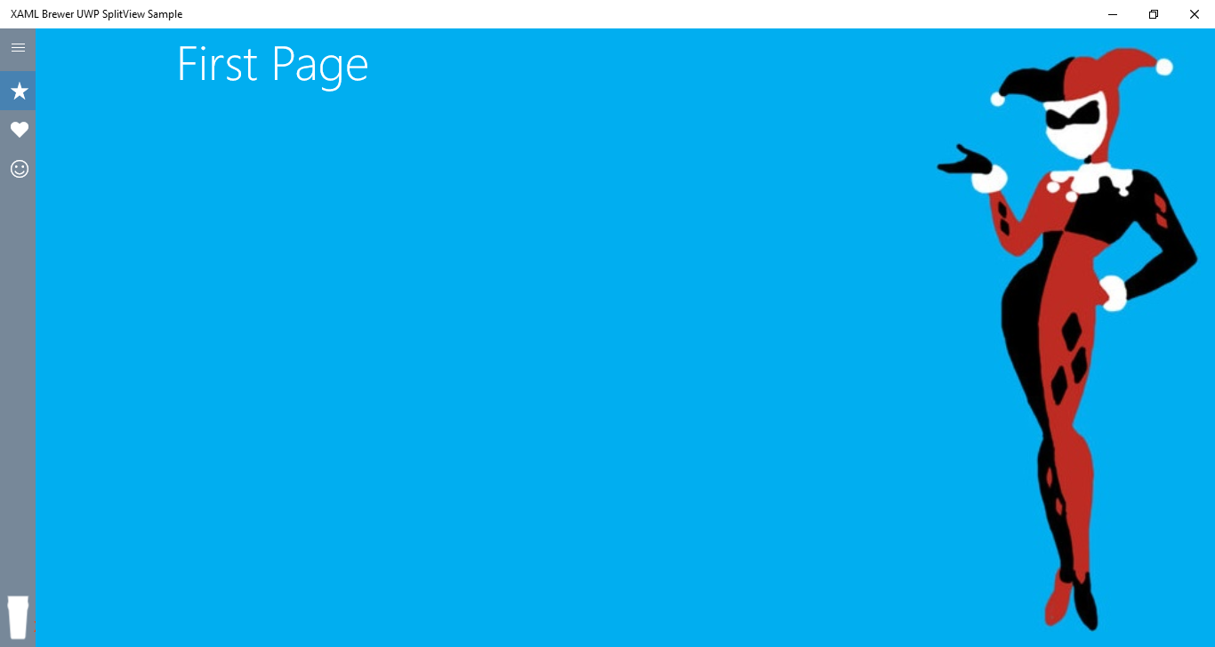
The screenshot above shows the fully expanded menu, this is how the compact version looks like:
The look-and-feel of the SplitView Pane, and how it is implemented, is entirely up to you. A ListView is not mandatory: this project by Jerry Nixon uses templated and view state managed radio buttons. Just make sure to follow the navigation design basics for UWP apps in general and the guidelines for navigation panes in particular.
Populating the Menu
The Menu itself is implemented as a Singleton in ViewModelBase:
class ViewModelBase : BindableBase
{
    private static ObservableCollection<MenuItem> menu = new ObservableCollection<MenuItem>();

    public ObservableCollection<MenuItem> Menu {
        get { return menu; }
    }
}
In a real-world MVVM app you would probably expose it through some kind of Service.
Here’s how the ShellViewModel adds all navigation items:
class ShellViewModel : ViewModelBase
{
public ShellViewModel()
{
// Build the menu
Menu.Add(new MenuItem() { Glyph = "", Text = "First Page", NavigationDestination = typeof(FirstPage) });
Menu.Add(new MenuItem() { Glyph = "", Text = "Second Page", NavigationDestination = typeof(SecondPage) });
Menu.Add(new MenuItem() { Glyph = "", Text = "Third Page", NavigationDestination = typeof(ThirdPage) });
}
}
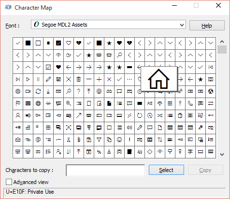
The icons are taken from the new Segoe MDL2 Assets font:
Here’s how a View can add and remove a non-navigational command that is defined in its ViewModel:
public sealed partial class ThirdPage : Page
{
private MenuItem myItem;
public ThirdPage()
{
this.InitializeComponent();
myItem = new MenuItem() { Glyph = "", Text = "Conclusion", Command = (DataContext as ThirdPageViewModel).ThirdPageCommand };
}
protected override void OnNavigatedTo(NavigationEventArgs e)
{
(this.DataContext as ViewModelBase).Menu.Add(myItem);
base.OnNavigatedTo(e);
}
protected override void OnNavigatedFrom(NavigationEventArgs e)
{
(this.DataContext as ViewModelBase).Menu.Remove(myItem);
base.OnNavigatedFrom(e);
}
}
We're using the OnNavigatedTo and OnNavigatedFrom events to ensure that the corresponding menu items are only displayed when the page is in the frame:
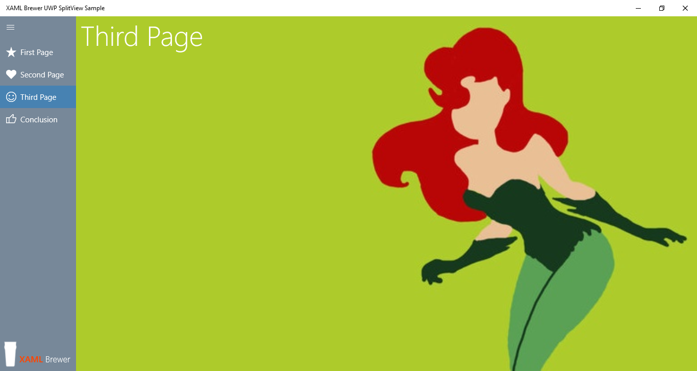
In a real-world MVVM app this would look more like this:
MenuService.Register(NavigateToPage3Command);
MenuService.Register(MyCustomCommand);
There’s nothing in the SplitView that prevents such an approach.
Menu Item Execution
Menu item execution is triggered by the ShellViewModel, when the selection in the menu listview was changed:
private void Menu_SelectionChanged(object sender, SelectionChangedEventArgs e)
{
    if (e.AddedItems.Count > 0)
    {
        var menuItem = e.AddedItems.First() as MenuItem;
        if (menuItem.IsNavigation)
        {
            SplitViewFrame.Navigate(menuItem.NavigationDestination);
        }
        else
        {
            menuItem.Command.Execute(null);
        }
    }
}
Navigation in a real-world MVVM application would probably look more like this:
NavigationService.NavigateTo(type);
… and that’s exactly what you would code when using Template10 – a set of brand-new design-pattern-driven Visual Studio project templates.
Here's the result of the non-navigational command execution in the sample app. The ViewModel updates the UI by updating a data-bound property:
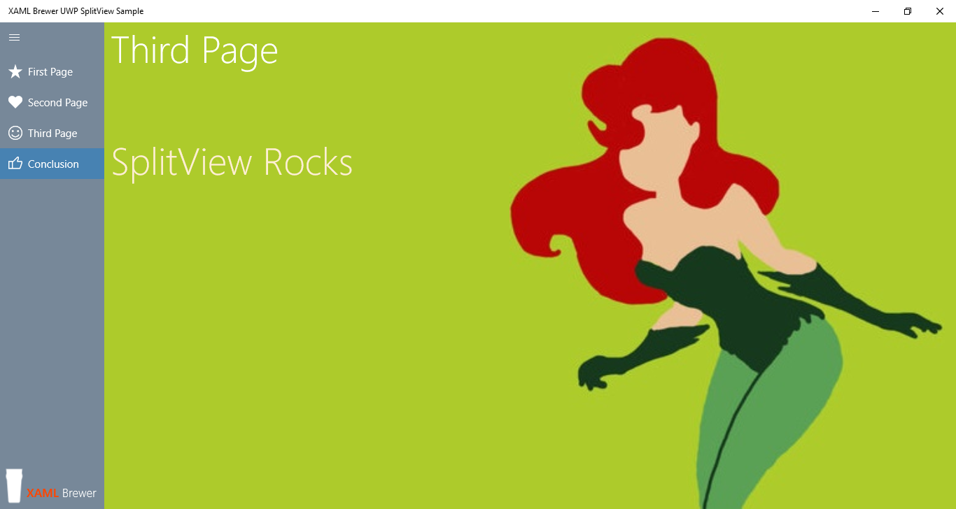
Opening and Closing the Pane
The SplitView itself contains no infrastructure to open or close the menu Pane, you have to provide that yourself. I see two options here, and they’re not mutually exclusive: the ubiquitous Hamburger button, and a swipe movement.
Hamburger Button
The obvious way to open and close the SplitView’s Pane would be … a Hamburger button. So I added one, not to the Pane itself, but directly in the Shell. This makes sure that the button always stays visible, even when the Pane is closed:
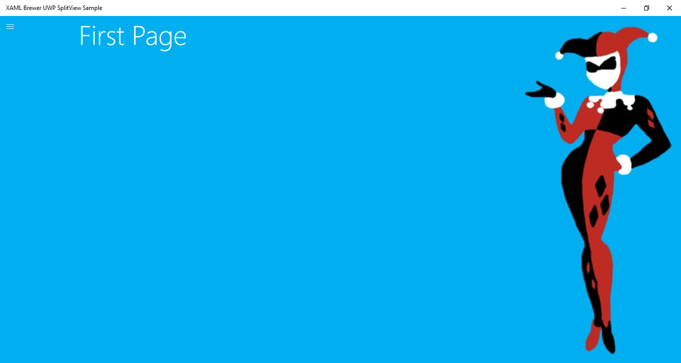
Here’s the button's XAML, it’s always on top of everything:
<Grid>
<SplitView x:Name="MySplitView" />
<!-- Hamburger Button -->
<Button x:Name="HamburgerButton"
FontFamily="Segoe MDL2 Assets"
Content=""
Width="40"
Height="40"
Background="Transparent"
Foreground="White"
VerticalAlignment="Top"
BorderThickness="0"
Click="HamburgerButton_Click" />
</Grid>
And here’s its event handler:
private void HamburgerButton_Click(object sender, RoutedEventArgs e)
{
    MySplitView.IsPaneOpen = !MySplitView.IsPaneOpen;
}
Swipe
‘Other platforms’ allow you to open the main menu by swiping in from the left (assuming that the menu is docked to the left). In Windows 10 this manipulation is already used for opening the Task View.
But any manipulation that starts inside your view, can be captured. So here’s my alternative opening/closing procedure:
- To open the collapsed menu, put a finger on where it’s supposed to be (left of right side of the screen) and swipe horizontally in the direction of the center of the screen.
- To close the menu again, put your finger on it and swipe horizontally toward the (closest) edge of the screen.
I implemented this, and it actually feels very natural.
Here’s how both manipulations are defined – closing from the Pane, opening from the Content:
<SplitView x:Name="MySplitView">
  <SplitView.Pane>
    <Grid x:Name="SplitViewPane"
          ManipulationMode="TranslateX"
          ManipulationCompleted="SplitViewPane_ManipulationCompleted"
          Background="{StaticResource JustOneShadeOfGray}">
      <ListView />

    </Grid>
  </SplitView.Pane>
  <SplitView.Content>
    <Grid>
      <!-- Navigation Frame -->
      <Frame x:Name="SplitViewFrame" />
      <!-- SplitViewOpener -->
      <Grid ManipulationMode="TranslateX"
            ManipulationCompleted="SplitViewOpener_ManipulationCompleted"
            Width="150"
            Background="Transparent"
            HorizontalAlignment="Left"
            VerticalAlignment="Stretch">
      </Grid>
    </Grid>
  </SplitView.Content>
</SplitView>
And here are the handlers – for a Pane that is docked on the left side:
private void SplitViewOpener_ManipulationCompleted(object sender, ManipulationCompletedRoutedEventArgs e)
{
    if (e.Cumulative.Translation.X > 50)
    {
        MySplitView.IsPaneOpen = true;
    }
}

private void SplitViewPane_ManipulationCompleted(object sender, ManipulationCompletedRoutedEventArgs e)
{
    if (e.Cumulative.Translation.X < -50)
    {
        MySplitView.IsPaneOpen = false;
    }
}
When going for the swipe solution, you need to visually indicate to the user that there is a hidden menu (remember the Windows 8 days where users didn't find the app bar or the charms). The best way to do that is … by keeping that Hamburger button on the screen. After all, it’s just three thin lines. As I mentioned: swipe and hamburger button are not mutually exclusive. I would even say: "swipe and hamburger button: better together".
What about the phone?
Good question, I’m glad you asked it :-). Well: it should work the same. Unfortunately I’m currently working on a HW/OS/VS/SDK/Emulators combination that doesn’t allow me to successfully run the new phone emulators, so I can't verify this.
What about pre-Windows-10 platforms?
If you like the SplitView concept, but you’re building apps for Windows 8.*, here’s some good news. There is a straight backport of the SplitView to the 8.* Runtimes & Silverlight. You could also go for the Navigation Drawer Layout for Windows Phone, which supports slide-to-open.
The Code
The code for the sample app is available on GitHub. It's focused on a SplitView with a left-docked Pane in regular (non-compact) overlay mode.
Enjoy,
XAML Brewer