This article describes how to build user controls for XAML-based Windows 8 Store apps. User controls –or composite controls- are the easiest controls that you can roll yourself, since they're defined in plain XAML and come with design-time support in Visual Studio. Basically a user control is just a XAML panel on which you drag and drop a group of controls that belong together. You create a user control only if you want to reuse that XAML panel in multiple places in your app. If you want to reuse the group of controls in more than one app, then you store the user control in a separate library. Typical examples of user controls are a media player button bar (with play, pause and stop buttons), a paging control (with next, previous, goto buttons etc.) and an address panel (with labels, textboxes, and comboboxes for street, number, zip code, city, country, and so on).
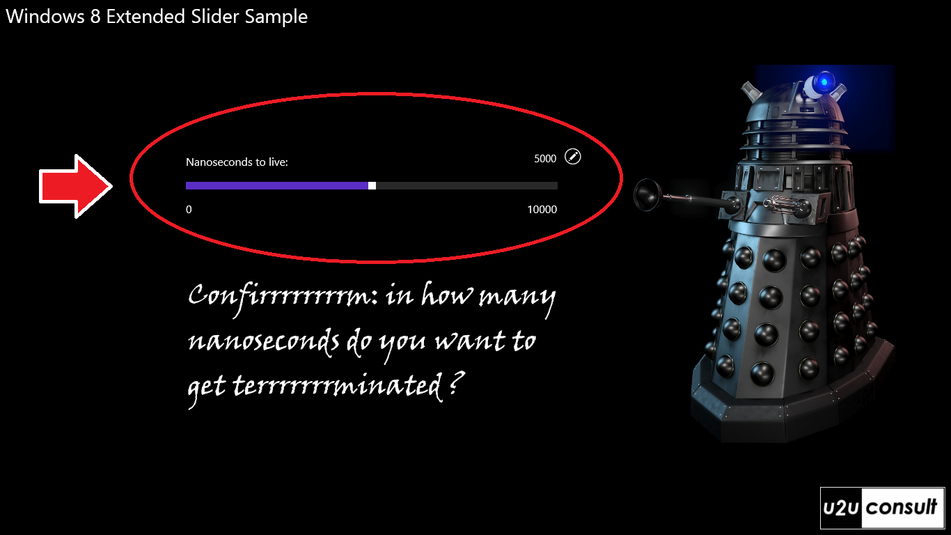
The sample control for this article will be a new version of my EnhancedSlider. It's a plain vanilla slider that is surrounded with some extra textblocks. The slider comes with support for direct input through a textbox that is enabled by a button. I've been using that group of controls quite often lately, so I decided to package it as a reusable user control. Here's how the original looks like, it started as a non-reusable bunch of controls on the main page of an app:
Here’s how to roll your own user control.
In a Windows Store app project –or a separate library- add an item of the type ‘User Control’.
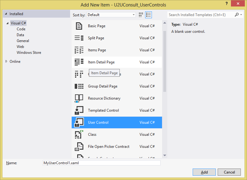
Visual Studio will create a class for you. It inherits from UserControl and comes with a XAML file and an associated code behind file. You can drag and drop individual controls into the XAML design surface. Here's how the simplified XAML for the enhanced slider looks like:
<UserControl x:Class="U2UConsult_UserControls.EnhancedSlider">
    <Grid>
        <TextBlock HorizontalAlignment="Left" />
        <StackPanel HorizontalAlignment="Right">
            <Button Style="{StaticResource EditRoundButtonStyle}" />
            <TextBox />
            <TextBlock />
        </StackPanel>
        <Slider Grid.Row="1" />
        <TextBlock HorizontalAlignment="Left" Grid.Row="2" />
        <TextBlock HorizontalAlignment="Right" Grid.Row="2" />
    </Grid>
</UserControl>
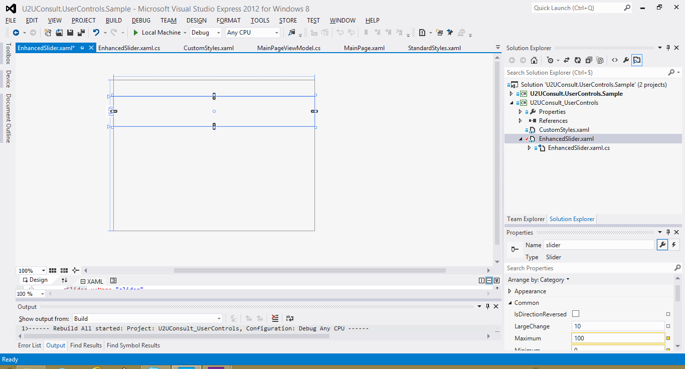
With a little luck the Visual Studio Designer will support you, but don't expect too much from it. In many cases you'll end up with a blank surface - but at least you have IntelliSense in the XAML and an operational properties editor:
Your next step is to connect control properties through bindings. Use the ElementName property to define the source of the binding. In the EnhancedSlider, I hooked the Text property of the surrounding text controls to the corresponding properties of the central slider:
<Slider x:Name="slider" />
<TextBlock Text="{Binding Minimum, ElementName=slider}"  />
<TextBlock Text="{Binding Maximum, ElementName=slider}" />
The XAML is ready. Time to focus on the code behind. We embrace encapsulation, so your user control should behave as a black box to its hosting page or control. That page shouldn't see the individual controls, but only talk to the composite. In code behind, decorate your user control with the appropriate properties. Regular properties don't interact with the binding engine, you have to use Dependency Properties. The EnhancedSlider has the following properties: Minimum, Maximum, Value, Header, and ValueSuffix. ValueSuffix represents the unit measure and is displayed in a separate textblock in the upper right corner of the control. I’ve been trying very hard to use a StringFormatConverter in the textbox displaying the Value. That value should only be formatted when the texbox is disabled (when it looks like a label), not when the user is typing in it. Unfortunately, changing the converter or even the converter parameter programmatically doesn't work because bindings are immutable. So I had to pull the formatting out of the textbox and into an other control as a suffix. It will stil do the job in most scenario's...
Anyway, here’s one example of a dependency property (tip: use the propdp code snippet to create these):
public static readonly DependencyProperty MinimumProperty =
    DependencyProperty.Register("Minimum", typeof(int), typeof(EnhancedSlider), new PropertyMetadata(0));

public int Minimum
{
    get { return (int)GetValue(MinimumProperty); }
    set { SetValue(MinimumProperty, value); }
}
All you need to do now is to bind the subcontrol’s properties to the user control's dependency properties. You may be tempted to set the DataContext of the control to itself (with RelativeSource Self as binding source) to get this done, but then you loose the ability to bind it to something else (e.g. a ViewModel). It's better to give the control a name, and use yet another ElementName in the binding:
<UserControl x:Class="U2UConsult_UserControls.EnhancedSlider" x:Name="userControl">
...
    <Slider x:Name="slider"
        Minimum="{Binding Minimum, ElementName=userControl}"
        Maximum="{Binding Maximum, ElementName=userControl}"
        Value="{Binding Value, Mode=TwoWay, ElementName=userControl}" />
...
</UserControl>
And there we are: we just built our own a reusable composite control.
If you want to use the control inside a page or another control, all you need to do is declare the namespace in the hosting container:
<Page x:Class="U2UConsult.UserControls.Sample.MainPage"
         xmlns:uc="using:U2UConsult_UserControls" >
...
</Page>
You're ready to use the control in the page. Don’t forget to set the bindings with the ViewModel:
<uc:EnhancedSlider Value="{Binding Roasted, Mode=TwoWay}"
                           Header="Roasted"
                           Maximum="1000"
                           Foreground="Orange"
                           ValueSuffix=" civilizations" />
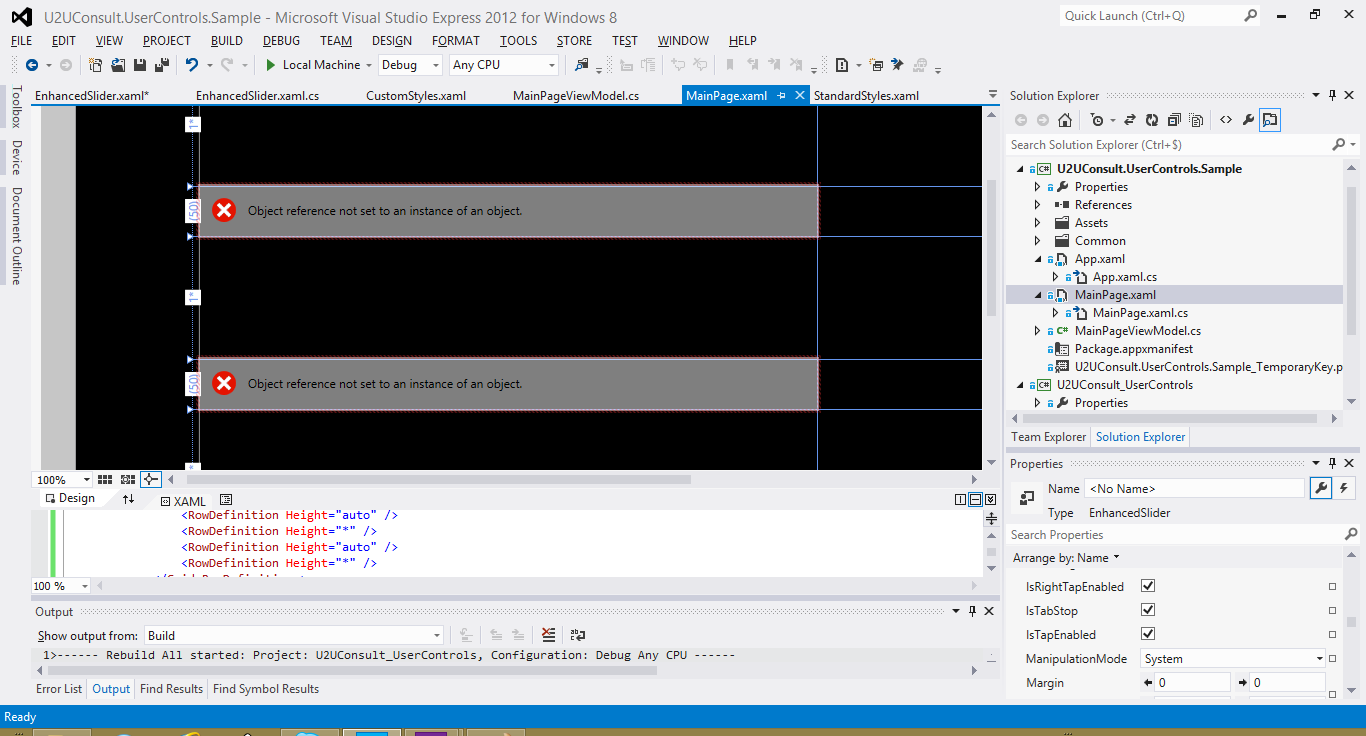
Again, don't expect too much help from the Visual Studio Designer. Here's how my main page looks at design time:
Fortunately at runtime everything comes through. Here’s a screen shot of the attached sample application:
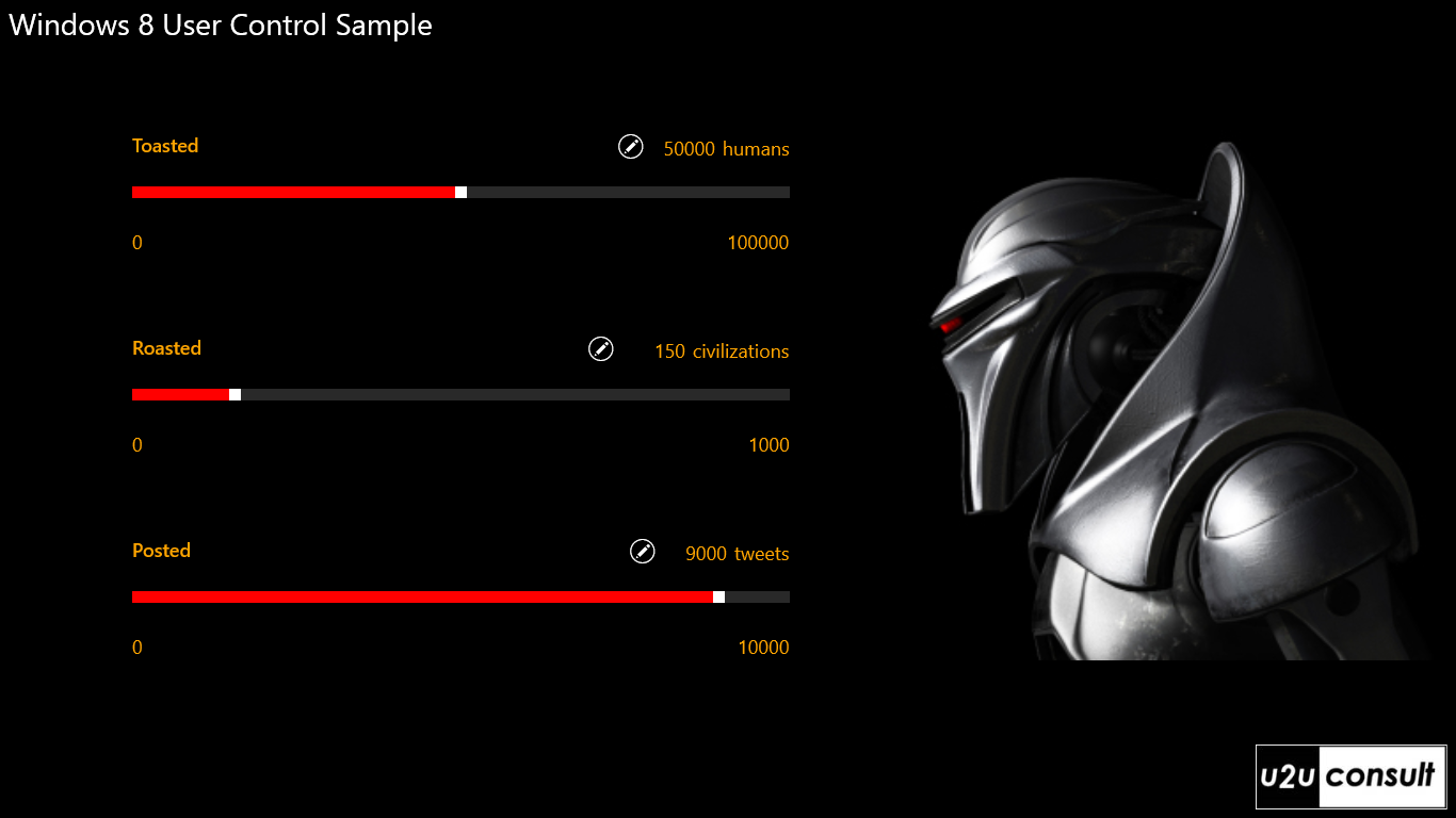
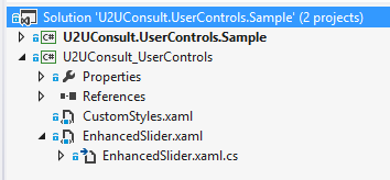
The app contains two projects: a GUI, and a library with the user control.
Oh, there’s something you should know about storing user controls in a separate assembly: that assembly may not have dots in its name. I assume that’s a bug that will be fixed very soon.
Here’s the code for the sample solution. It was written in Visual Studio 2012 Express: U2UConsult.UserControls.Sample.zip (132.73 kb)
Enjoy!
Diederik