The RelativePanel is a new XAML layout control for the Universal Windows Platform (UWP). It allows you to decorate its elements with attached properties to position them relative to each other, and align them relative to each other or to the panel itself. That allows for a flexible graph-like layout instead of the current strictly tabular or list layouts.
Here’s the list of new attached properties:
- Positioning of an element relative to another:
- Above
- Below
- LeftOf
- RightOf
- Alignment of an element with another:
- AlignBottomWith
- AlignHorizontalCenterWith
- AlignLeftWith
- AlignRightWith
- AlignTopWith
- AlignVerticalCenterWith
- Alignment of an element with the panel itself:
- AlignBottomWithPanel
- AlignHorizontalCenterWithPanel
- AlignLeftWithPanel
- AlignRightWithPanel
- AlignTopWithPanel
- AlignVerticalCenterWithPanel
It’s pretty clear what these properties stand for, so let’s dive into code.
The basics
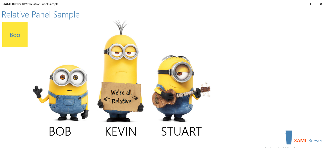
I created a small sample app around this new panel. Here’s how it looks on startup:

Cute, but … nothing spectacular, right?
Indeed any XAML layout or items control can draw this: Grid, StackPanel, ListView, … you name it. True, but these controls would require you to do an upfront design and configuration step where you define the number of rows and columns, orientation, and data templates. A RelativePanel doesn’t require this.
Here’s what I had in mind for the layout in the sample app:
- Draw an empty relative panel
- Draw Bob
- Draw Kevin to the right of Bob
- Align the images at their bottom
- Draw Stuart to the right of Kevin
- Align the images at their bottom
- Draw Bob’s name under the image
- Center the name under the image
- Repeat the previous two steps for Kevin and Stuart
And this is the corresponding declarative XAML:
<RelativePanel x:Name="MinionPanel">

    <!-- Images -->
    <Image x:Name="Bob"
           Source="Assets/Bob.png" />
    <Image x:Name="Kevin"
           Source="Assets/Kevin.png"
           RelativePanel.RightOf="Bob"
           RelativePanel.AlignBottomWith="Bob" />
    <Image x:Name="Stuart"
           Source="Assets/Stuart.png"
           RelativePanel.RightOf="Kevin"
           RelativePanel.AlignBottomWith="Kevin" />

    <!-- Labels -->
    <TextBlock Text="BOB"
               RelativePanel.Below="Bob"
               RelativePanel.AlignHorizontalCenterWith="Bob" />
    <TextBlock Text="KEVIN"
               RelativePanel.Below="Kevin"
               RelativePanel.AlignHorizontalCenterWith="Kevin" />
    <TextBlock Text="STUART"
               RelativePanel.Below="Stuart"
               RelativePanel.AlignHorizontalCenterWith="Stuart" />
</RelativePanel>
Very straightforward, right? Well, there are a couple of things to consider.
The pitfalls
Circular dependencies
Under the hood, the layout algorithm builds up a directed graph (I guess). That graph doesn’t allow direct or indirect circular dependencies. The following definition would create such a dependency (I aligned Bob to Stuart, instead of Stuart to Kevin:
<Image x:Name="Bob"
        Source="Assets/Bob.png"
        RelativePanel.AlignBottomWith="Stuart"/>
<Image x:Name="Kevin"
        Source="Assets/Kevin.png"
        RelativePanel.RightOf="Bob"
        RelativePanel.AlignBottomWith="Bob"/>
<Image x:Name="Stuart"
        Source="Assets/Stuart.png"
        RelativePanel.RightOf="Kevin" />
So “X AlignWith Y” may behave different than “Y AlignWith X”, and “X LeftOf Y” does never imply “Y RightOf X” (that would definitely create a direct circular dependency).
When you create a circular dependency in XAML, the Visual Studio designer will warn you. It’s not an error however: your code will compile, start to run, and then crash…
Elements not showing
Elements that don’t have the attached properties filled out, will be placed at the upper left corner of the panel. If you use these as anchor, some elements might be pushed out of the panel.
My first idea for the sample app layout was:
- Draw Kevin (after all he’s the leader)
- Draw Bob to the left of him
- Draw Stuart to the right of him
This was my initial XAML:
<Image x:Name="Kevin"
       Source="Assets/Kevin.png"/>
<Image x:Name="Bob"
       Source="Assets/Bob.png"
       RelativePanel.LeftOf="Kevin"/>
<Image x:Name="Stuart"
       Source="Assets/Stuart.png"
       RelativePanel.RightOf="Kevin" />
This draws Kevin at the left side of the panel, and pushes poor Bob out of it. [And it took me way to long to figure out what was happening here.]
Conflicting relationships
When you define conflicting relationships, the panel alignment relationships (AlignTopWithPanel, AlignLeftWithPanel, …) have priority over the element alignment relationships (AlignTopWith, AlignLeftWith, …), which in turn have priority over the element positional relationships (Above, Below, RightOf, LeftOf). The following example has conflicting properties for Kevin; I defined him at the left of the panel, but to the right of Bob:
<Image x:Name="Bob"
       Source="Assets/Bob.png" />
<Image x:Name="Kevin"
       Source="Assets/Kevin.png"
       RelativePanel.RightOf="Bob"
       RelativePanel.AlignLeftWithPanel="True" />
<Image x:Name="Stuart"
       Source="Assets/Stuart.png"
       RelativePanel.RightOf="Kevin" />
The AlignLeftWithPanel wins, so Bob is again pushed out of the panel.
My 2 cents
Defining a layout based on the RelativePanel does require some upfront design. Here are some tricks that may help you:
- Consider the UI inside the panel as a set of directed graphs that each start with an anchor element.
- If appropriate, align the anchors with the panel itself.
- Align the non-anchor elements (graph nodes) relative to each other, not to the panel.
- Make a simple drawing of the positional and alignment relationships to detect cycles.
Here’s the final layout of the sample app. I have two nodes, the ‘Boo’ button –more on that later- and the XAML Brewer logo. Both are aligned with the panel. All minion elements are positioned (red arrows) and aligned (blue dotted lines) relative to each other and to the button, but never to the panel:

The true power
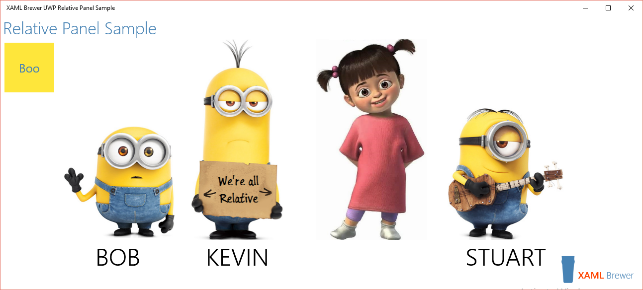
The static layout of a RelativePanel’s elements can be easily achieved by other panels and controls. But the RelativePanel really shines at runtime, when you start modifying the graphs. Let’s put some code behind the ‘Boo’ button to insert a new element right between Kevin and Stuart.
In all XAML platforms, attached properties can be programmatically assigned by static Set* methods, and UWP is not an exception. The RelativePanel class comes with methods such as SetAbove, SetAlignLeftWithPanel, SetAlignTopWith and so on. Here’s the logic to add a new image to the graph:
- Create the image
- Define all graph edges that start from the image
- Add the image to the graph
- Relay all edges that arrive in the new image
This is the corresponding C# code:
// Create Boo
var boo = new Image()
{
    Source = new BitmapImage(new Uri("ms-appx:/Assets/Boo.png")),
    Width = 300,
    Tag = "Boo"
};

// Prepare Boo
RelativePanel.SetRightOf(boo, Kevin);
RelativePanel.SetAlignBottomWith(boo, Kevin);

// Add Boo
MinionPanel.Children.Add(boo);

// Relay the graph edge
RelativePanel.SetRightOf(Stuart, boo);
That last statement can only be executed after the new image was added to the panel, since the panel does not allow you to define relationships towards elements outside of it.
This is the result:

Again, this is cute. But this time it's also spectacular. If you programmatically add a column in the middle of an existing grid, you would be forced to modify all column widths, and the Column attached property on everything to the right of Boo (including Stuart’s name field). Not really flexible.
For the sake of completeness, here’s the code to remove Boo from the Panel. RelativePanel also comes with static Get* methods to retrieve the value of its attached properties, such as GetRightOf:
// Check if Stuart is right of Boo.
var theRightStuff = RelativePanel.GetRightOf(Stuart);
if ((theRightStuff as Image)?.Tag?.ToString() == "Boo")
{
    // Reconnect Stuart to Kevin.
    RelativePanel.SetRightOf(Stuart, Kevin);
    // Remove Boo
    MinionPanel.Children.Remove((UIElement)theRightStuff);
}
Last but not least, the attached properties of RelativePanel can also be modified at runtime through the new UWP Adaptive Triggers, to create a responsive design. But I’m keeping that for a next blog post.
The code
The code for the sample app is on GitHub. It was written with Visual Studio Enterprise 2015 RC on a Windows 10 fast ring box.
Enjoy!
XAML Brewer