The accordion is a musical instrument invented in Europe in the beginning of the 19th century. It produces music (or rather noise) by expanding and collapsing it while pressing buttons. This metaphor is applied to software: you may know the Accordion user interface control from Microsoft Outlook's navigation bar. In the last couple of years the control appeared in an ASP.NET AJAX implementation and a SilverLight implementation. Recently, the latter was ported to WPF and published as part of the February 2010 release of the WPF Toolkit. This article describes how to use this great WPF control.
Introduction
The Accordion is an ItemsControl that allows you to provide multiple panes and expand them one at a time (well, by default). The items shown are instances of AccordionItem. Clicking on a header will expand (actually 'select') or collapse the item's content. The Accordion class carries the usual responsibilities of an ItemsControl, like providing templates for header and content, and managing the selected items (plural, that is). On top of that, it supports the following extra properties:
- SelectionMode: One, OneOrMore, ZeroOrOne, or ZeroOrMore
- ExpandDirection: Left, Right, Up, or Down
- SelectionSequence: Simultaneous or CollapseBeforeExpand [I'm pretty sure that this one doesn't work in the WPF version]
Hello World
Let's go for a first test-drive. Download the toolkit, create a new WPF project, and add the following two references:
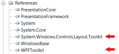
Register the namespace in your xaml:
xmlns:layoutToolkit="clr-namespace:System.Windows.Controls;assembly=System.Windows.Controls.Layout.Toolkit"
Then drop the following code in the window:
<layoutToolkit:Accordion>
<layoutToolkit:AccordionItem Header="Red">
<Rectangle Fill="Red" Height="120" Width="200" />
</layoutToolkit:AccordionItem>
<layoutToolkit:AccordionItem Header="Orange">
<Rectangle Fill="Orange" Height="120" Width="200" />
</layoutToolkit:AccordionItem>
<layoutToolkit:AccordionItem Header="Yellow">
<Rectangle Fill="Yellow" Height="120" Width="200" />
</layoutToolkit:AccordionItem>
<layoutToolkit:AccordionItem Header="Green">
<Rectangle Fill="Green" Height="120" Width="200" />
</layoutToolkit:AccordionItem>
<layoutToolkit:AccordionItem Header="Blue">
<Rectangle Fill="Blue" Height="120" Width="200" />
</layoutToolkit:AccordionItem>
<layoutToolkit:AccordionItem Header="Indigo">
<Rectangle Fill="Indigo" Height="120" Width="200" />
</layoutToolkit:AccordionItem>
<layoutToolkit:AccordionItem Header="Violet">
<Rectangle Fill="Violet" Height="120" Width="200" />
</layoutToolkit:AccordionItem>
</layoutToolkit:Accordion>
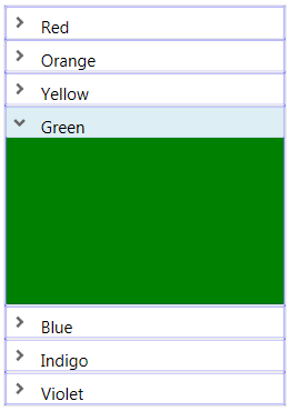
You end up with sir Isaac Newton's 7 colors of the rainbow:
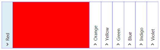
The ExpandDirection property -unsurprisingly- changes the direction in which the items expand. Under the hood, a rotation transformation is applied to the header, so be careful when using images. This code:
<layoutToolkit:Accordion ExpandDirection="Right">
will transform our accordion like this:
In some applications you may want to open an item just by hovering over its header, instead of clicking. This behavior doesn't come out of the box, but it's easy to implement: just register a handler for the MouseEnter event for each AccordionItem:
C#
private void AccordionItem_MouseEnter(object sender, MouseEventArgs e)
{
AccordionItem item = sender as AccordionItem;
item.IsSelected = true;
}
XAML
<layoutToolkit:Accordion ExpandDirection="Right">
<layoutToolkit:Accordion.Resources>
<Style TargetType="{x:Type layoutToolkit:AccordionItem}">
<EventSetter Event="MouseEnter" Handler="AccordionItem_MouseEnter" />
</Style>
</layoutToolkit:Accordion.Resources>
<layoutToolkit:AccordionItem Header="Red">
Deeper dive
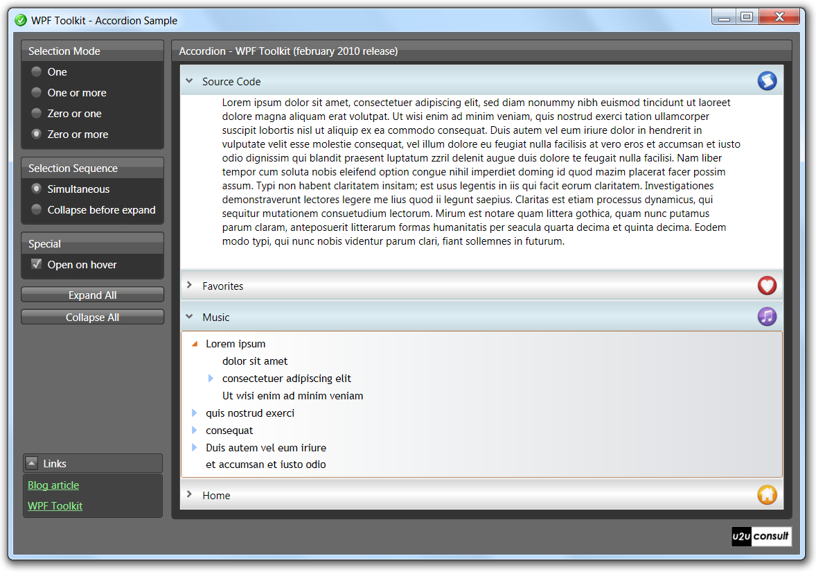
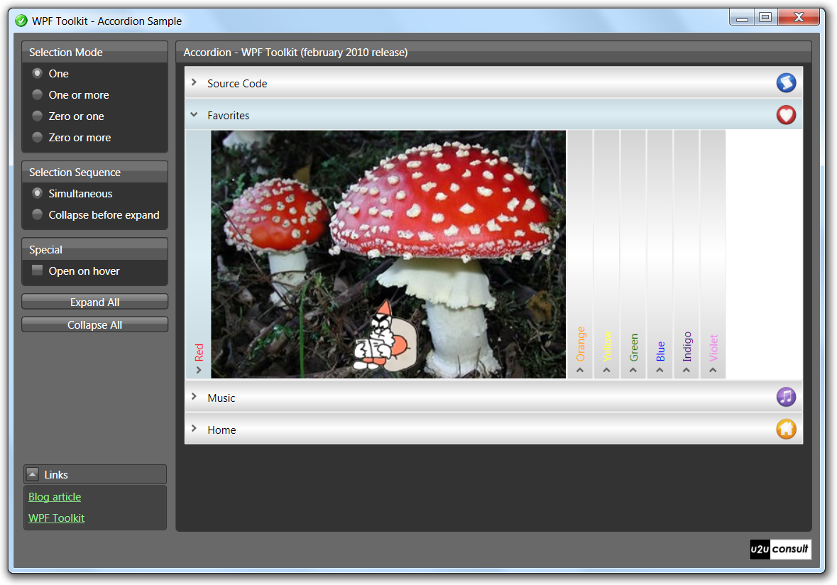
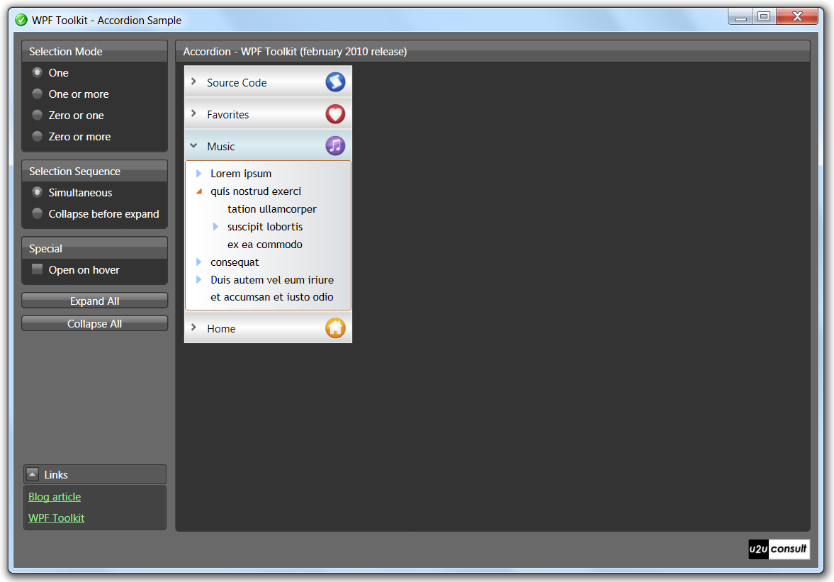
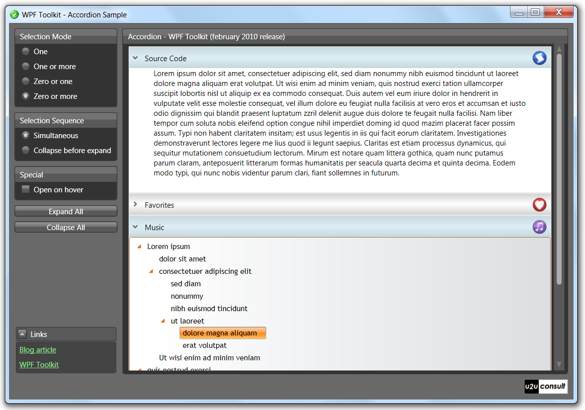
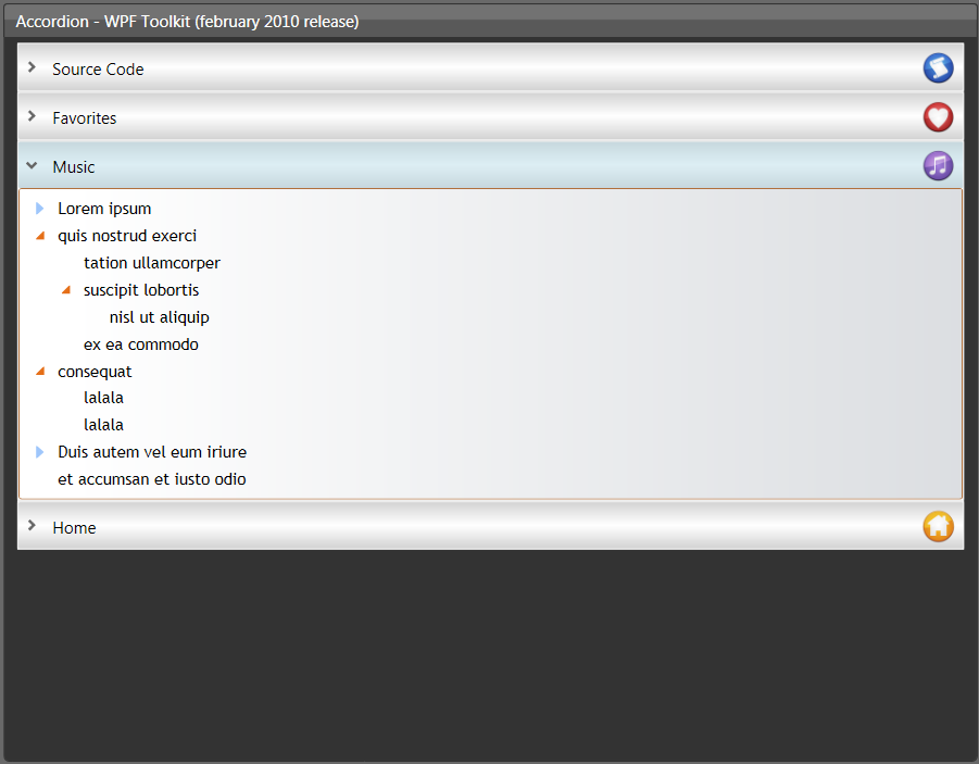
I decided to build a test application (or torture chamber) to figure out whether or not the control is ready to be used in a production application. An Accordion is used a main navigation control, displaying more than just rectangles: a TextBox, a picture library inspired by the rainbow accordion, a control with a variable height (a TreeView), and a control that behaves badly in any WPF application (the WPF WebBrowser is just a thin wrapper around the IE ActiveX). Here are a couple of screenshots:
Sizing
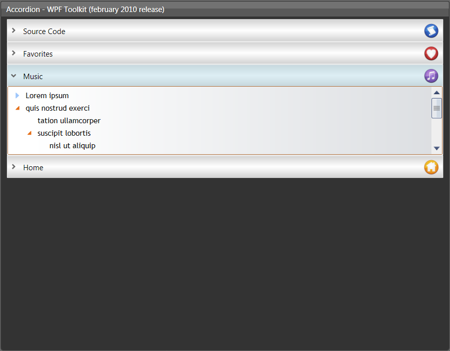
In their default style, the accordion and its items only occupy the space they need, so smaller content also shrinks the headers:
That's why the main navigation accordion has its HorizontalAlignment set to Stretch. While the width of the main navigation accordion is fixed, its height will remain unpredictable - specifically if multiple items can be selected/expanded. A good old scrollbar will do:
By the way, the size of an item doesn't change dynamically. In our sample application, the expansion of treeview items will just add a scrollbar, not push down the accordion's headers:
Only when the same item is unselected and then reselected, the new height is applied:
The picture library needs a more predictable behavior (fixed height and width), otherwise you end up with unacceptable looks - like a shrunk accordion, or headers being pushed out of sight:
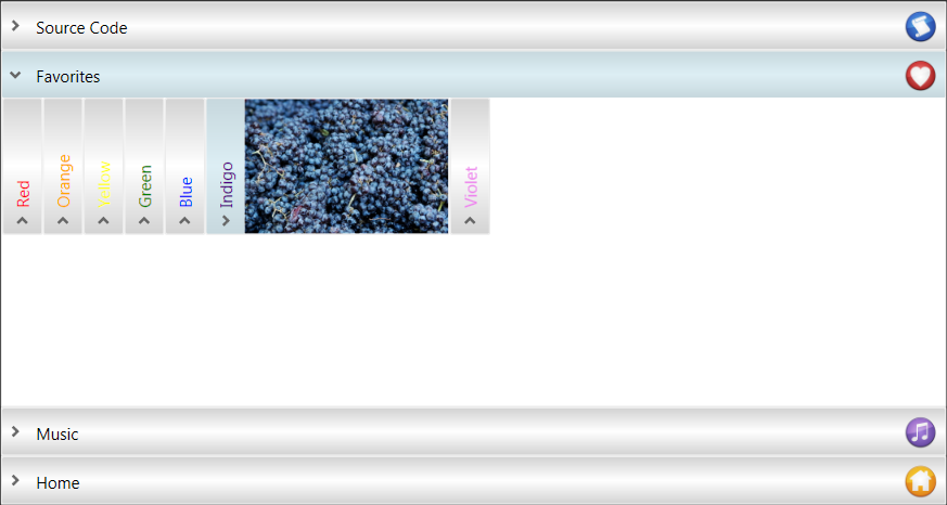
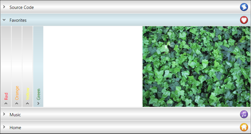
Here's how to deal with this:
<Style TargetType="Image">
<Setter Property="Stretch" Value="UniformToFill" />
<Setter Property="Height" Value="280" />
<Setter Property="Width" Value="400" />
</Style>
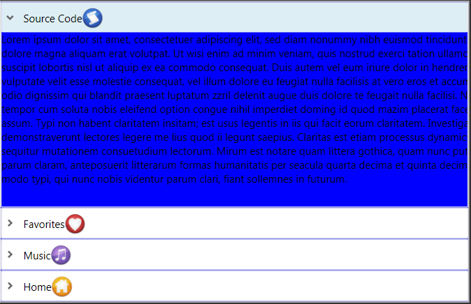
Styling
The application is styled through the very popular WPF Themes, yet another port from SilverLight. Unfortunately the libraries don't contain styles for Toolkit controls (yet). The default styles for the Accordion are not really innovative - the selected item gets the same style as the selected date in a Calendar control:
So download the WPF Toolkit's source code, and copy-paste the relevant styles into a resource dictionary:
These are the relevant styles:
- AccordionButton: displays the animated arrow in the header,
- ExpandableContentControl: displays the item's content,
- Accordion: displays the container,
- AccordionItem: displays the item, basically a 2x2 grid, and
- TransitioningContentControl: starts the animation when content changes.
Now you have access to the whole look and feel of the control. Just don't forget to register the resource dictionary in your XAML:
<Grid.Resources>
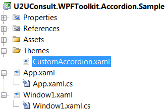
<ResourceDictionary Source="Themes\CustomAccordion.xaml" />
</Grid.Resources>
Source Code
Here's the full source code of the sample project: U2UConsult.WPFToolkit.Accordion.Sample.zip (1,98 mb).
Enjoy !