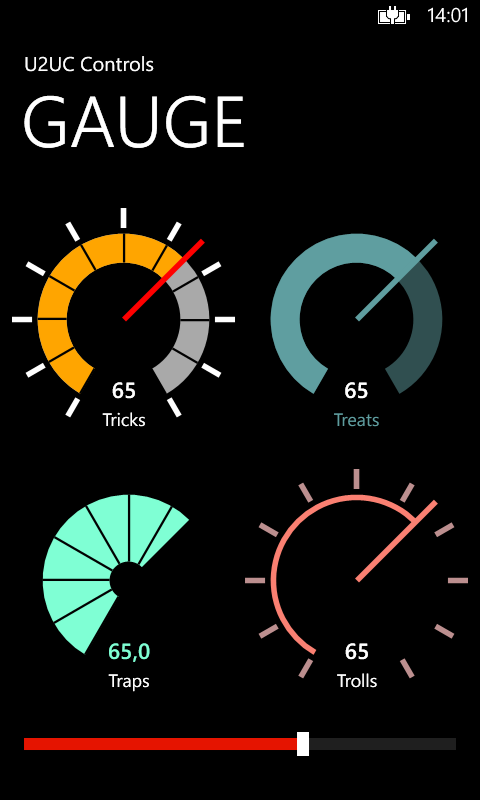
In this short article I proudly present the Windows Phone 8 version of the Modern UI Radial Gauge. This control was designed by Arturo Toledo during a UI Design Review of this Windows 8 Store app. I made a custom control of it, that I recently ported to Windows Phone 8. That went a lot easier than expected: the implementation is almost identical to the WinRT version. Here's how it looks like. These are four instances of the same control, bound to the slider at the bottom:
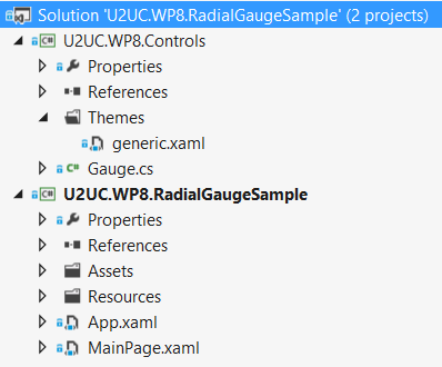
There seems to be no Visual Studio template for a custom control, so I had to manually create the Themes folder, the generic.xaml file, and a class that inherits from Control:
I changed some of the default colors, assuming that phone apps prefer a black background to save the battery. For the rest, I only had to solve two minor issues:
* I had to make the (getter of the) Tick property public instead of protected, since the control's Style didn't find it.
* I had to create an overload of OnValueChanged without a DependencyPropertyChangedEventArgs parameter, since WP8 (and WPF) don't allow a null value here.
I guess that the resulting code can be used in most XAML platforms (well, at least WinRT, WP8 and WPF, I didn't try Silverlight). The only difference is in the namespaces, so a cross-platform Visual Studio solution could be an option in the near future. But I'm eager to already share the WP8 version of this elegant gauge.
This is the list of public (dependency) properties:
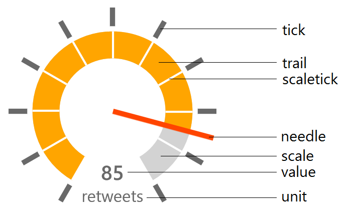
* Minimum: minimum value on the scale (double)
* Maximum: maximum value on the scale (double)
* Value: the value to represent (double)
* ValueStringFormat: StringFormat to apply to the displayed value (string)
* Unit: unit measure to display (string)
* NeedleBrush: color of the needle (Brush)
* TickBrush: color of the outer ticks (Brush)
* ScaleWidth: thickness of the scale in pixels – relative to the control’s default size (double)
* ScaleBrush: background color of the scale (Brush)
* ScaleTickBrush: color of the ticks on the scale (Brush)
* TrailBrush: color of the trail following the needle (Brush)
* ValueBrush: color of the value text (Brush)
* UnitBrush: color of the unit measure text (Brush)
Here's an example from the attached sample project, showing you how to configure and instantiate a gauge in XAML:
<controls:Gauge Value="{Binding Value, ElementName=TheSlider}"
                Unit="Treats"
                Grid.Column="1"
                Margin="5 0 0 10"
                NeedleBrush="CadetBlue"
                TickBrush="Transparent"
                ScaleTickBrush="Transparent"
                TrailBrush="CadetBlue"
                UnitBrush="CadetBlue">
    <controls:Gauge.ScaleBrush>
        <SolidColorBrush Color="CadetBlue"
                            Opacity=".5" />
    </controls:Gauge.ScaleBrush>
</controls:Gauge>
Here's the source code. It was written in Visual Studio 2012: U2UC.WP8.RadialGaugeSample.zip (55.18 kb).
Enjoy!
Diederik