Power BI Desktop contains since the October 2016 release a binning option (under the group option). With this option it becomes super-easy to create a histogram. Let’s demonstrate:
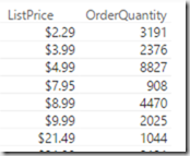
First assume you made a data model containing the DimProduct and the FactInternetSales table of the AdventureworksDW sample database. If we would request the sum of the order quantity grouped by ListPrice we would get numbers like these:

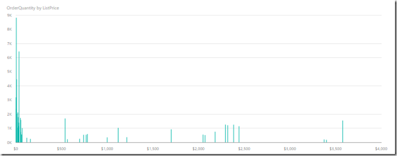
But if we would plot these numbers in e.g. a bar chart, it becomes hard to read due to the large number of distinct list prices:

This is where a histogram would come in handy. With the new release of Power BI Desktop all we have to do is right click the ListPrice column in our field well and select Group:

In the Groups dialog we select the bin size. Unfortunately we cannot set the number of bins, so we still need to do a bit of math for that. In our case we want to group Listprices in 100$ groups, so we set the Group Type to Bin and the bin size to 100. Notice this only works on columns which are numerical or of type date/datetime. Other columns require the list group type.

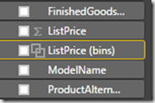
As soon as we click OK, we now get a new field in our field well: ListPrice (bins):

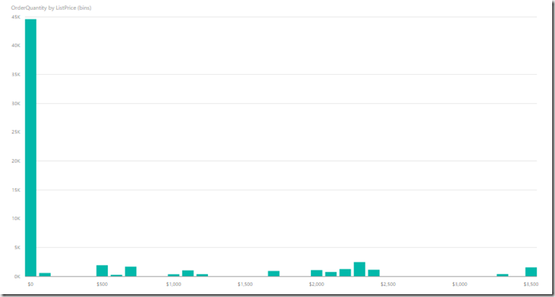
By using this new field in our charts and reports, we get the data per bin. For a histogram chart, just plug it into a column chart:

See, that was easy!